23 Moody Blue Bathroom Ideas for a Dramatic Look
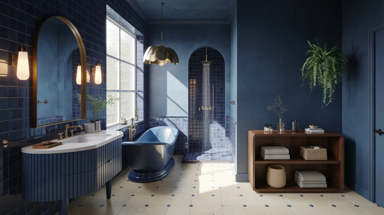
Ready to give your bathroom a dramatic makeover without making it feel dark or overwhelming? These moody blue bathroom ideas bring rich color, elegant contrast, and inviting depth into everyday spaces.
Deep navy walls, glossy blue tile, dramatic vanities, warm brass accents, and natural wood can completely change the atmosphere of a bathroom. Whether you are refreshing a tiny powder room or redesigning a spacious primary bath, the right shade and material combination can make the space feel intentional and beautifully finished. In my experience, even one carefully chosen blue feature can create a surprisingly big transformation. This collection shares practical, visually inspiring ideas to help you find a look that feels stylish, comfortable, and realistic for your own home.
Navy Painted Walls
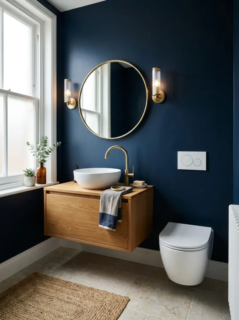
- Creates an instantly dramatic backdrop without changing the bathroom layout.
- Works beautifully with white fixtures, warm metals, and natural textures.
- A soft-sheen finish helps the walls handle everyday bathroom moisture.
- Keeping the floor simple prevents the deep color from feeling overwhelming.
Deep navy walls can turn an ordinary bathroom into a sophisticated retreat without making the room feel closed in. A saturated blue backdrop creates instant depth, especially when paired with crisp white fixtures and warm metal accents. In smaller bathrooms, painting the ceiling the same shade can make the color feel intentional rather than overwhelming. Choose a durable bathroom paint with a soft sheen to handle moisture and simplify cleaning. The result is a cocoon-like setting that still feels polished, bright, and practical. This approach works particularly well when the flooring and countertop stay visually simple.
Want drama without a complicated renovation? Start with the walls, because changing their color can completely alter how the room feels. A rich navy shade makes white ceramic fixtures appear brighter and gives ordinary hardware more presence. I’ve noticed this combination works especially well in bathrooms that receive decent daylight, because sunlight softens the intensity of the blue throughout the day. Add one warm element, such as a wood vanity or brass mirror frame, to keep the palette welcoming. Even a compact powder room can benefit from this treatment, creating a memorable space without requiring expensive structural changes.
Blue Zellige Tile
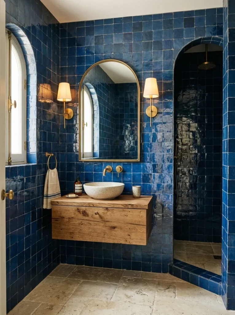
- Adds handmade character through irregular edges and subtle surface variation.
- Reflective glaze helps bounce light around darker bathroom spaces.
- Looks especially refined with simple fixtures and natural wood.
- Small-format tile can bring texture without making the room visually busy.
Few materials create as much visual texture as glossy blue zellige tile. Each handmade-looking piece catches light differently, giving the walls movement without introducing another strong pattern. The uneven edges and subtle shade variations make the surface feel collected rather than overly polished. For a balanced bathroom, pair these tiles with creamy stone, pale grout, or natural wood instead of adding several competing finishes. The reflective glaze is also useful in rooms with limited daylight because it helps distribute available light. I’ve seen this treatment make even simple bathrooms feel custom-designed while keeping the overall color story beautifully controlled.
For a more dramatic result, continue the blue tile from the vanity wall into the shower area so the room feels visually connected. This creates a strong backdrop while allowing the fixtures to remain simple and functional. A floating wood vanity can soften the darker palette, while brushed brass hardware adds a subtle warm contrast. Keep accessories minimal because the tile itself becomes the main decorative feature. In my experience, this approach is particularly effective when the floor has a quieter texture, such as limestone or large-format porcelain. The finished room feels layered, tactile, and intentionally designed rather than simply dark.
Cobalt Vanity Cabinet
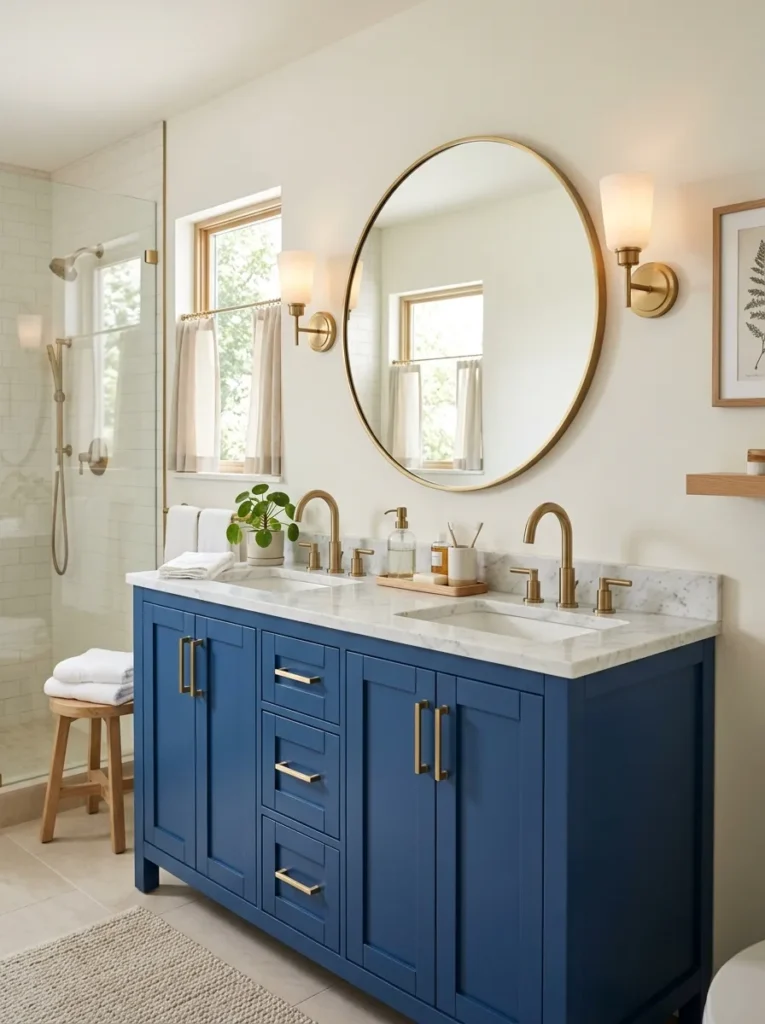
- Introduces rich color while keeping the surrounding walls lighter.
- Gives a basic vanity a stronger focal point and more personality.
- Pairs naturally with brass, chrome, marble, and warm wood accents.
- Works well when you want color without committing to fully painted walls.
A cobalt vanity can deliver the drama of a dark bathroom while keeping the surrounding space visually lighter. The concentrated color creates a natural focal point, especially when the cabinet sits beneath a large mirror. Pairing the saturated blue with a white or pale stone countertop gives the furniture a crisp finish and prevents the room from becoming too heavy. Brass hardware adds warmth, while chrome can create a cooler contemporary look. This solution is especially practical for renters or homeowners who prefer smaller design changes. You can transform the room’s personality simply by replacing or repainting the vanity cabinet.
The strongest results usually come from treating the vanity as the room’s anchor rather than adding bold color everywhere. Keep the walls soft white, warm gray, or muted blue so the cabinet remains visually important without competing with surrounding surfaces. A marble countertop can introduce delicate veining, while a round mirror breaks up the straight cabinet lines. I’ve noticed that adding one natural material, such as a small oak stool or woven basket, makes saturated cabinetry feel much more approachable. The finished bathroom has personality and contrast, yet it remains practical enough for everyday routines and easy to update later.
Blue Marble Shower
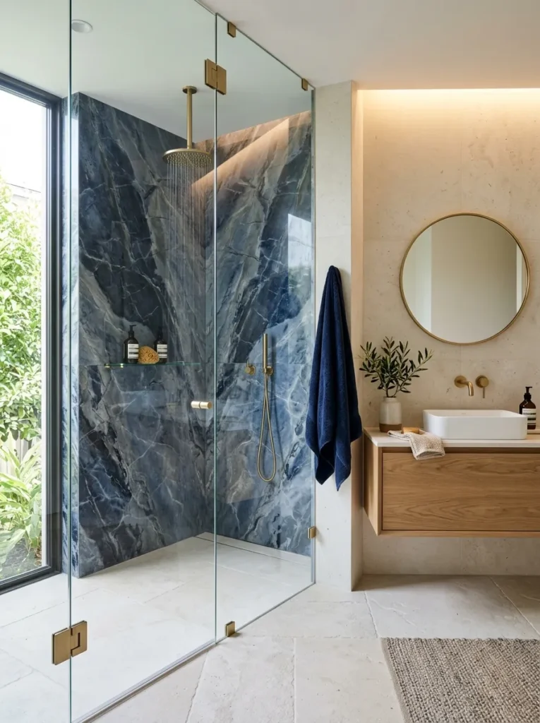
- Creates a luxurious focal point with naturally varied blue veining.
- Makes the shower area feel visually richer without adding many accessories.
- Works beautifully with brushed brass, polished chrome, or matte black fixtures.
- Large-format slabs reduce grout lines for a cleaner, more spacious appearance.
Blue marble can make the shower feel like the centerpiece of the entire bathroom. Its layered veining adds movement and depth while keeping the palette naturally cohesive. Large-format slabs are especially effective because fewer grout lines allow the stone pattern to remain uninterrupted. Pair the dramatic surface with simple glass doors and streamlined fixtures so the material stays visually dominant. A pale floor can brighten the surrounding space, while warm brass details introduce contrast. In my experience, this approach works best when the rest of the room stays restrained, allowing the marble’s natural variation to provide most of the decoration.
A dramatic shower does not need to look overly formal or difficult to maintain. Choose porcelain marble-look slabs if natural stone maintenance feels impractical, and use the same finish across the shower walls for a seamless appearance. Clear glass keeps the enclosure visually open, which is especially useful in smaller bathrooms. Add a recessed niche with matching blue tile for shampoos and everyday essentials rather than relying on external shelves. Soft lighting above the shower can emphasize the veining beautifully. The finished space feels sophisticated and immersive while still supporting the practical needs of daily bathing.
Blue and Brass Accents
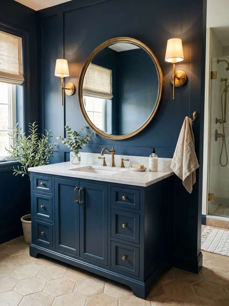
- Brings warmth to darker blue surfaces without overwhelming the palette.
- Creates polished contrast through small, intentional hardware details.
- Easy to introduce through faucets, mirrors, lighting, and cabinet pulls.
- Helps cool blue tones feel more welcoming and balanced.
Warm brass accents can instantly soften the cooler character of deep blue bathroom surfaces. Instead of introducing another dominant color, use brass in smaller elements such as the faucet, cabinet pulls, mirror frame, and wall sconces. These details catch the light and create small points of warmth throughout the room. A white marble countertop can provide another layer of contrast without competing with the blue. I’ve noticed that aged or brushed brass often feels more relaxed than highly polished finishes, especially in traditional or transitional spaces. The combination creates a refined bathroom that feels rich without becoming overly decorated.
The key is to repeat the metal finish consistently rather than scattering several different metallic tones around the room. For example, matching the faucet, mirror frame, and light fixtures creates a deliberate visual rhythm. Deep navy cabinetry can reinforce the color story, while pale flooring keeps the lower portion of the room lighter. If your bathroom already has chrome fixtures, you do not need to replace everything at once; start with one or two accessories and build gradually. This simple update can give an existing bathroom a more sophisticated appearance without requiring major construction or expensive changes.
Moody Blue Ceiling
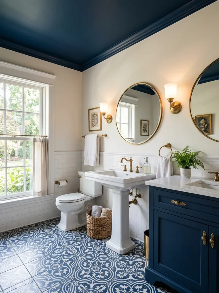
- Draws attention upward and gives the room a more finished character.
- Creates an enveloping effect without covering every wall in dark color.
- Works especially well with lighter walls and crisp white fixtures.
- Can visually connect ceiling color with cabinetry, tile, or accessories.
A blue ceiling is an unexpected way to introduce drama while keeping the walls bright and airy. The color draws the eye upward and gives the bathroom a more finished, intentional appearance. This technique works particularly well in rooms with white walls because the contrast feels crisp rather than heavy. Repeating the same shade in a vanity, artwork, or small accessory can make the ceiling feel connected to the rest of the design. The result is especially striking in powder rooms, where a bold ceiling can create personality without changing the room’s basic layout or sacrificing valuable visual space.
For a successful ceiling treatment, choose a shade that relates to another element already present in the bathroom. A deep navy ceiling can echo a cabinet, while a softer dusty blue can connect with patterned floor tile. Keep the lighting warm enough to prevent the blue from looking too cold at night. Recessed fixtures, a central pendant, or wall sconces can all work depending on the ceiling height and layout. I’ve seen this idea transform plain bathrooms because it adds interest in an area people often overlook. It feels creative, but the overall effect remains surprisingly sophisticated and balanced.
Blue Patterned Floor
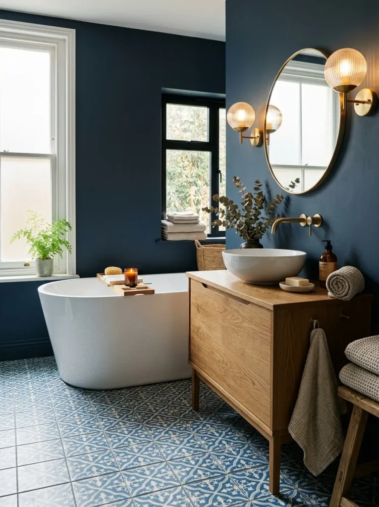
- Adds visual interest while keeping the walls relatively calm.
- Gives the bathroom a grounded focal point beneath lighter fixtures.
- Geometric patterns can make a simple layout feel more intentional.
- A blue-and-white palette keeps the floor dramatic without feeling too dark.
A patterned blue floor can anchor the bathroom beautifully while allowing the walls to remain calmer. Geometric tiles, encaustic-style patterns, or subtle floral motifs add character beneath the main fixtures without requiring bold decoration everywhere else. Blue and white is particularly effective because the lighter portions reflect light and prevent the darker pattern from visually shrinking the room. Keep the vanity and bathtub relatively simple so the floor remains the star. This approach is practical when you want personality underfoot but prefer not to commit to dramatic wall treatments or permanent-looking color across the entire bathroom.
The scale of the pattern matters more than many people expect. In a compact bathroom, smaller repeating designs can feel charming, while larger geometric shapes often look cleaner in spacious layouts. Use a matte porcelain tile for dependable bathroom performance and easier everyday care. I’ve noticed that repeating one floor color in towels, artwork, or a small vanity detail helps the room feel coordinated without becoming matchy-matchy. If the walls are already blue, choose a floor pattern with plenty of lighter space. That balance keeps the room visually layered while preserving a comfortable sense of openness.
Navy Wainscoting
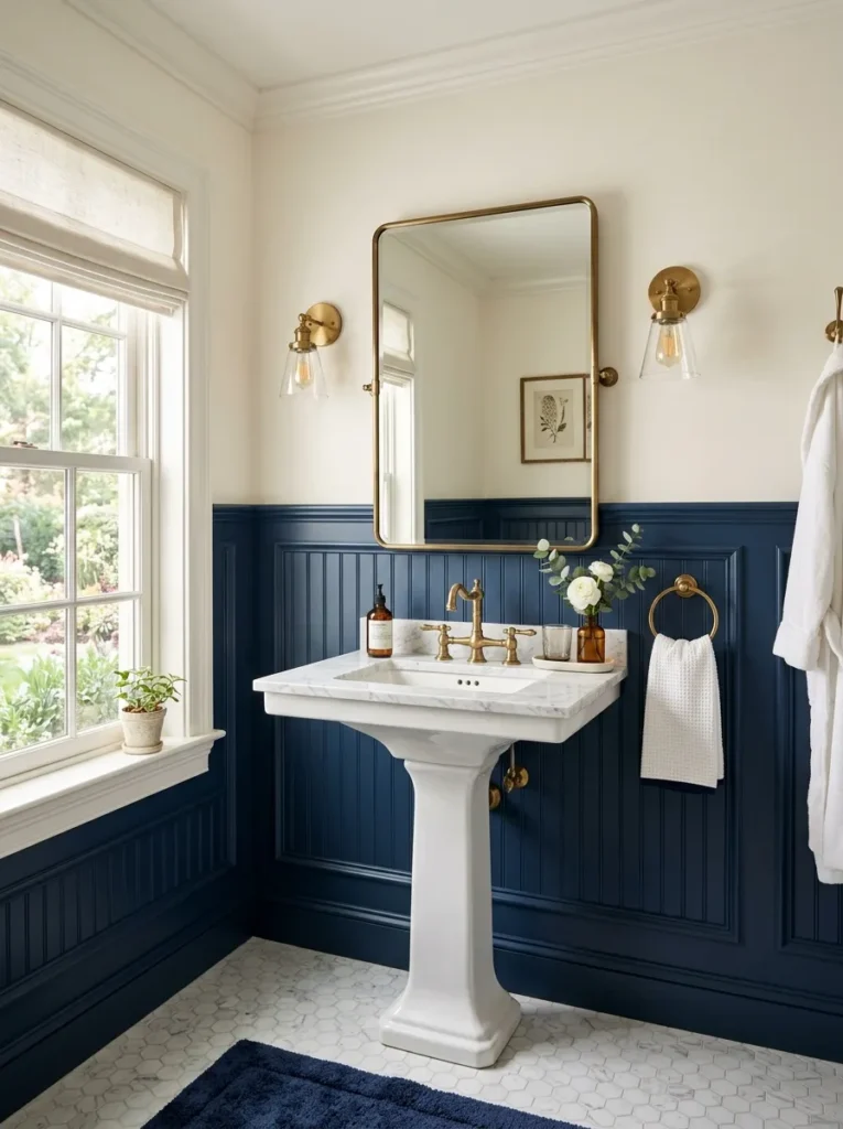
- Adds architectural detail while keeping the upper walls visually lighter.
- Creates a tailored look that suits traditional and transitional bathrooms.
- Protects lower walls from everyday splashes and scuffs.
- Works beautifully with white tile, marble, and warm wood accents.
Navy wainscoting gives the bathroom architectural character while keeping the upper half of the room light and open. The strong lower section creates a defined visual base, making white sinks, marble surfaces, and light-colored walls stand out beautifully. This treatment is especially appealing in older homes or bathrooms where traditional detailing feels natural. Use painted beadboard, panel molding, or moisture-resistant wall panels depending on your style and maintenance needs. The result feels more thoughtfully designed than a plain painted wall, yet it does not require covering the entire room in a dark finish to achieve noticeable contrast.
Wainscoting is also a practical choice for busy bathrooms because the lower wall can be easier to wipe and protect from everyday splashes. Keep the upper walls warm white or a very pale blue to maintain brightness. Brass fixtures can reinforce a classic direction, while chrome gives the same treatment a fresher, cooler appearance. In my experience, this combination works particularly well with patterned floor tile because the wainscoting provides a solid visual block between the floor and ceiling. The finished room feels layered, polished, and comfortable without relying on excessive accessories or complicated decoration.
Blue Freestanding Tub
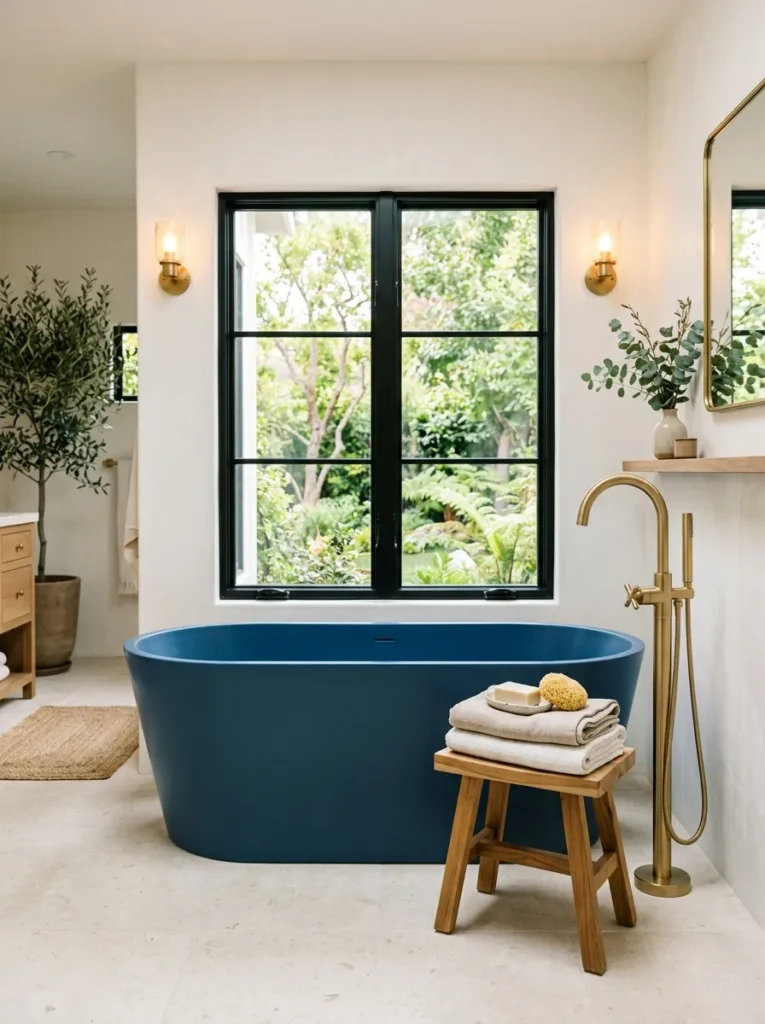
- Creates a striking centerpiece without requiring elaborate wall decoration.
- Works especially well against neutral or softly colored walls.
- A glossy finish adds reflection, while matte blue feels more contemporary.
- Provides an easy way to introduce color through one major fixture.
A blue freestanding tub can become the defining feature of the bathroom with very little additional decoration. Set against warm white, cream, or pale gray walls, the saturated tub creates a strong focal point while leaving the rest of the room visually calm. A sculptural oval shape feels contemporary, while a traditional roll-top design can create a more classic atmosphere. Pair it with a floor-mounted brass or chrome faucet and keep nearby accessories minimal. This approach works especially well when the bathroom layout already has enough open floor space to let the tub breathe around it.
Placement is important because a freestanding tub needs enough clearance to look intentional rather than crowded. Positioning it beneath a window can provide beautiful natural light, while a nearby stool offers a practical place for towels or bath essentials. Keep the flooring quiet, such as pale stone or large-format porcelain, so the saturated fixture remains prominent. I’ve seen this technique work particularly well in bathrooms where homeowners want a dramatic focal point but do not want dark walls throughout. One carefully chosen fixture can establish the entire color direction while keeping the space functional.
Blue Floral Wallpaper
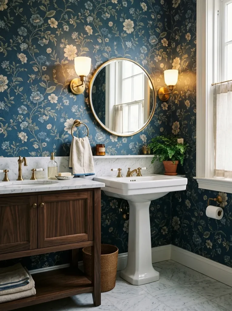
- Adds pattern and personality without requiring permanent tile changes.
- Soft floral motifs can make deep blue feel more inviting.
- Pairs beautifully with brass fixtures and traditional wood furniture.
- Choose bathroom-rated wallpaper for better moisture resistance and longevity.
Blue floral wallpaper can bring pattern, depth, and personality to a bathroom without the expense of extensive tile work. Choose a design with a deep blue background and softer botanical details so the walls feel dramatic but not visually chaotic. White fixtures provide a clean contrast, while brass hardware adds warmth to the cooler palette. This approach is especially effective in powder rooms, where bolder patterns can make a small space feel intentional. For bathrooms with regular moisture, look for products specifically designed for humid areas and follow the manufacturer’s installation recommendations for lasting performance.
The pattern should guide the rest of the room rather than compete with it. If the wallpaper includes cream or beige flowers, repeat those lighter tones through towels, stone surfaces, or a small rug. A dark wood vanity can reinforce the richer atmosphere, while a round mirror helps soften the repeated pattern. I’ve noticed that botanical wallpaper feels most sophisticated when the accessories are edited carefully. Avoid filling every surface with decorative objects. Let the walls provide the visual interest, then use lighting and hardware to highlight the pattern and create a comfortable, layered bathroom environment.
Blue Subway Tile
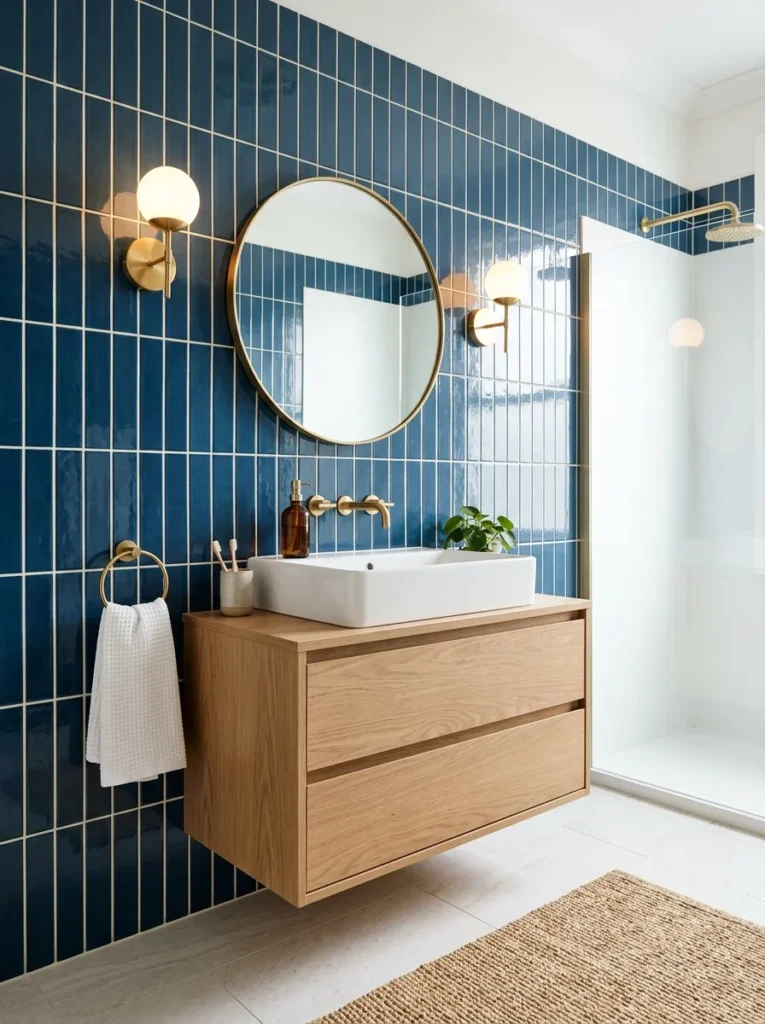
- Gives walls a classic shape with a richer, more dramatic color.
- Glossy surfaces reflect light and keep deeper shades from feeling flat.
- Works with both traditional and modern bathroom fixtures.
- Staggered or vertical layouts can change the room’s visual proportions.
Blue subway tile combines a familiar shape with a much stronger color presence. The classic rectangular format keeps the walls visually organized, while a deep blue glaze creates the richer atmosphere many dramatic bathrooms need. Glossy tile can bounce natural and artificial light across the room, helping saturated colors feel more dimensional. Try a traditional staggered layout for a timeless appearance or a vertical installation to emphasize ceiling height. Keep the grout subtle so the individual tiles do not overpower the space. This is a versatile choice for shower walls, vanity backsplashes, or full-height bathroom surfaces.
The surrounding materials can completely change how the tile feels. Pairing it with white fixtures and pale stone creates crisp contrast, while oak cabinetry and brushed brass make the space warmer and more relaxed. In smaller bathrooms, extending the tile through the shower area can create continuity and reduce visual breaks. I’ve seen vertical blue tile work particularly well in bathrooms with modest ceiling heights because the installation naturally directs the eye upward. Whether used across one feature wall or throughout the room, this treatment provides texture, color, and durability in one cohesive design decision.
Blue Stone Vanity Top
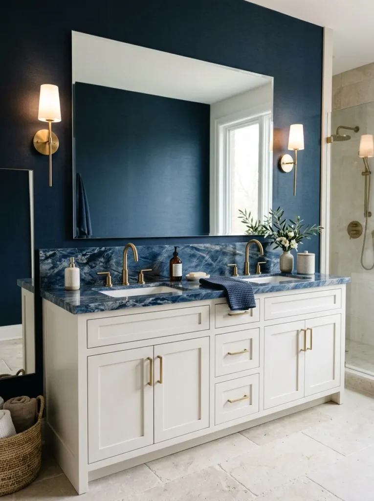
- Adds natural-looking depth without covering the entire room in dark color.
- Creates a sophisticated focal point around the sink area.
- Pairs well with pale cabinetry, dark wood, and warm metal fixtures.
- Stone-look porcelain offers a practical alternative to natural stone.
A blue stone vanity top creates concentrated drama exactly where the eye naturally looks first. Deep blue surfaces with subtle white or gray veining can make an ordinary vanity feel custom and luxurious without changing the entire bathroom palette. Pair the countertop with warm white cabinetry for crisp contrast or natural wood for a more organic appearance. Keep the backsplash simple if the stone has strong movement. This approach works especially well when you want a sophisticated color statement but prefer the walls and larger surfaces to remain relatively neutral and bright.
Think of the vanity top as a piece of visual furniture rather than just a functional surface. A large mirror above it can reflect the stone and make the color more noticeable from different angles. Brushed brass hardware adds warmth, while simple white ceramics keep the composition clean. For easier maintenance, consider a porcelain slab with a realistic stone pattern if natural stone care feels demanding. In my experience, concentrating a bold material around the vanity creates a polished result because it gives the bathroom a focal point while leaving enough visual breathing room elsewhere.
Blue Plaster Walls
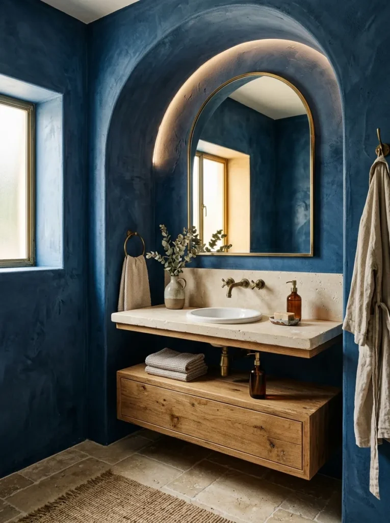
- Creates soft, imperfect texture that feels more organic than flat paint.
- Works beautifully with natural stone, wood, and aged metal finishes.
- Subtle variations prevent deep blue walls from looking one-dimensional.
- A moisture-appropriate plaster finish can add character without excessive decoration.
Blue plaster walls create a softer kind of drama by combining saturated color with natural surface movement. Unlike perfectly smooth paint, plaster introduces subtle variations that catch light differently throughout the day. This makes the blue feel layered rather than flat. Pair the textured walls with limestone, oak, or aged brass to emphasize the organic quality. Keep the fixtures streamlined so the surface remains the main feature. For bathrooms, choose a plaster system specifically suitable for humid environments and follow its sealing requirements. The result is atmospheric, tactile, and sophisticated without relying on busy patterns or excessive decoration.
The lighting becomes especially important when using a textured wall finish. Natural daylight can reveal small shifts in the plaster, while warm sconces create a softer appearance after sunset. A simple rounded mirror can break up the broad wall surface and introduce another gentle shape. I’ve noticed that this approach looks best when the room contains a few honest materials rather than many decorative layers. Think stone, wood, metal, and ceramic rather than numerous accessories. The finished bathroom feels grounded and handcrafted, while the deep blue provides enough contrast to make ordinary fixtures and surfaces feel considerably more distinctive.
Navy Shower Niche
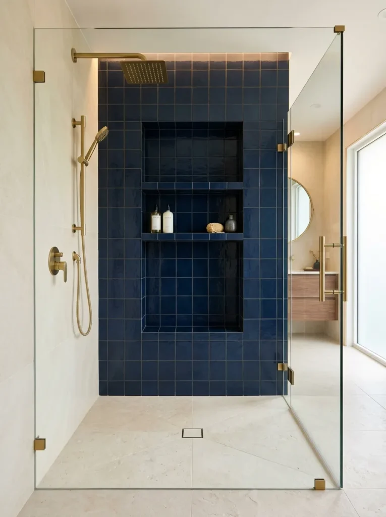
- Adds a concentrated color moment without covering every wall in blue.
- Creates a useful storage area that also functions as a design feature.
- Matching tile makes bottles and accessories look more organized.
- A recessed niche keeps everyday shower essentials off the floor.
A navy shower niche is a small detail that can make the entire bathing area feel more intentional. Instead of treating storage as an afterthought, use the recessed niche as a concentrated design feature with dark blue tile inside. The deeper color naturally frames bottles and accessories while adding contrast against lighter shower walls. Matching the niche tile to another blue element, such as the vanity or floor pattern, helps create continuity throughout the room. This solution is especially useful in compact bathrooms because it adds storage without taking up valuable floor space or making the shower feel crowded.
For the cleanest appearance, keep the niche shelves simple and avoid displaying too many brightly colored bottles. Neutral containers can make the blue surround look more refined, while a small ledge provides space for frequently used products. Large-format wall tile around the niche can minimize visual interruptions, allowing the darker recess to stand out. In my experience, recessed storage is one of those improvements that looks decorative but also makes everyday routines easier. You gain a practical place for essentials while creating a strong architectural detail that gives the shower area more depth and personality.
Blue Mosaic Backsplash
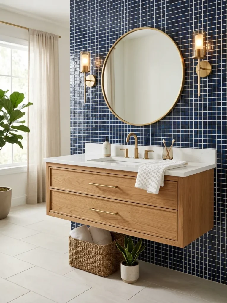
- Adds small-scale texture around the sink without overwhelming the room.
- Creates a colorful focal point behind an otherwise simple vanity.
- Glass or ceramic mosaics can reflect light beautifully.
- Works well when the surrounding walls and fixtures remain understated.
A blue mosaic backsplash can bring rich texture to the vanity area without committing the entire bathroom to a bold surface. Small ceramic or glass tiles create hundreds of tiny reflections, giving deeper shades of blue surprising dimension. Keep the countertop and cabinetry relatively simple so the backsplash remains the visual focus. White quartz, pale marble, or warm wood can provide enough contrast to prevent the composition from feeling too dark. This is a particularly useful option when you want to introduce color through one defined zone rather than redesigning every wall and surface.
Tile size can dramatically influence the final effect. Tiny square mosaics create a more detailed, traditional appearance, while elongated pieces or irregular shapes can feel more contemporary. Choose grout carefully because high contrast can emphasize every individual tile, while a closer grout color creates a smoother visual field. A large round mirror can soften the grid-like pattern and reflect the glossy surface. I’ve seen this idea work especially well in bathrooms with simple cabinetry because the backsplash supplies the personality. It adds depth behind the sink while keeping the rest of the room easy to maintain and visually calm.
Blue Fluted Vanity
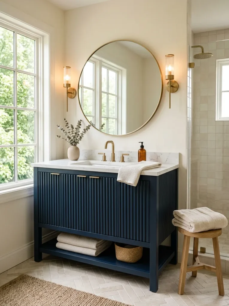
- Adds vertical texture while keeping the color palette sophisticated.
- Makes a standard vanity feel more custom and architectural.
- Fluted detailing catches light and creates subtle shadow lines.
- Pairs beautifully with rounded mirrors and simple stone countertops.
A fluted blue vanity adds texture and architectural interest while keeping the bathroom’s color story beautifully focused. The vertical grooves create subtle shadows across the cabinet doors, making the deep shade appear more dimensional as the lighting changes. Pair the vanity with a pale stone countertop and a rounded mirror to balance the stronger linear texture. Brushed brass hardware introduces warmth, while white ceramic fixtures keep the composition fresh. This treatment works particularly well when you want a statement piece without covering every surface in a bold finish. The result feels custom, polished, and visually substantial.
The surrounding details should stay relatively quiet so the fluting remains noticeable. A large round mirror can soften the vertical lines, while simple wall sconces provide light without introducing another complicated shape. Choose a matte or satin cabinet finish if you prefer a contemporary appearance, or a slightly glossier surface for more reflection. I’ve noticed that fluted cabinetry looks especially effective in smaller bathrooms because its texture adds interest without requiring additional artwork or accessories. It also provides practical enclosed storage, helping countertops stay uncluttered while giving the room a strong and memorable focal point.
Blue Terrazzo Floor
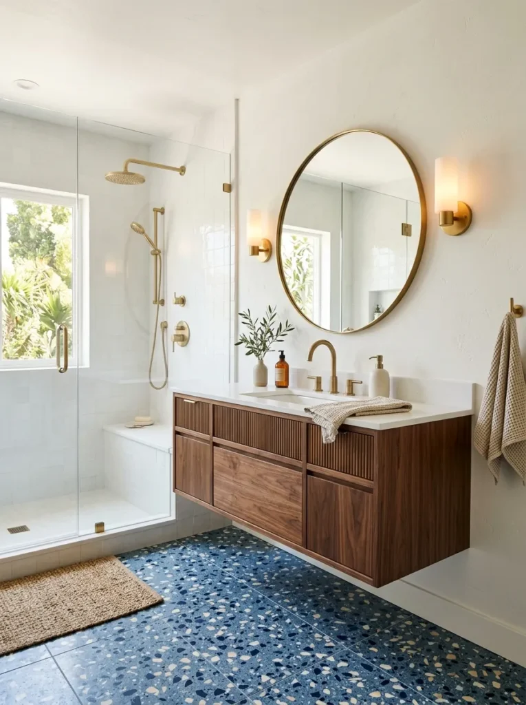
- Combines blue tones with small flecks of contrasting stone for added depth.
- Creates a durable foundation that can handle everyday bathroom use.
- Works well with simple walls because the flooring already provides pattern.
- Subtle neutral flecks make it easier to coordinate fixtures and accessories.
A blue terrazzo floor brings color and pattern together in one durable surface, giving the bathroom a distinctive foundation without making the walls compete for attention. The scattered stone chips can include cream, gray, white, or darker blue, creating natural connections between different finishes in the room. Keep the walls relatively quiet so the floor remains the main visual feature. Terrazzo-inspired porcelain is another practical option when you want easier installation or maintenance. This approach works especially well in bathrooms that need personality underfoot while still benefiting from a clean, streamlined overall design.
Use the smaller flecks in the terrazzo as a guide for selecting the rest of the palette. If the floor contains warm cream tones, repeat them through towels or walls; if it includes gray, coordinate with cooler stone or hardware. A walnut vanity can add warmth without introducing another competing pattern. I’ve seen terrazzo floors work particularly well with simple white fixtures because the colorful surface provides enough visual interest on its own. Choose a matte or textured finish where appropriate for bathroom flooring, helping create a practical surface that still feels stylish and thoughtfully considered.
Midnight Blue Fixtures
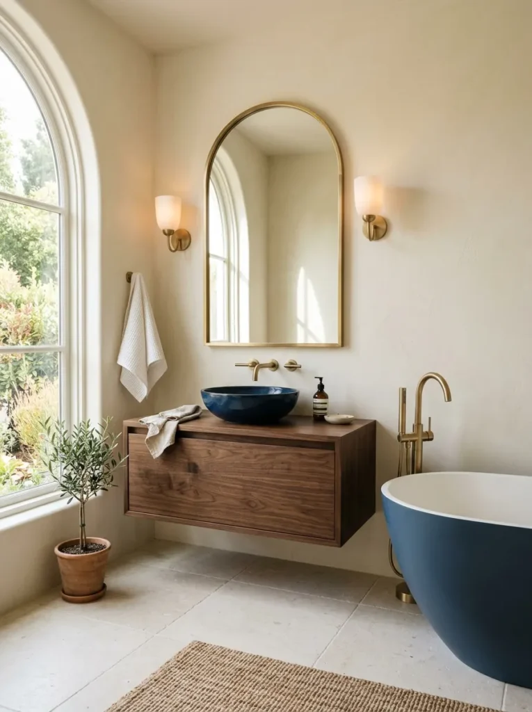
- Creates a coordinated look through deeper-colored sinks, tubs, or toilets.
- Adds personality without requiring dramatic wall treatments.
- Looks especially striking against pale stone and warm neutral finishes.
- Repeating the same fixture color can make the room feel intentionally designed.
Midnight blue fixtures can turn everyday bathroom pieces into intentional design features. A deep blue sink, bathtub, or even a coordinated toilet creates a distinctive focal point against warm white walls and pale stone surfaces. Because the color is concentrated on functional fixtures, the room can remain visually simple while still feeling dramatic. Warm brass or brushed nickel hardware can complement the darker ceramic beautifully. This approach is ideal when you want something more memorable than standard white fixtures but do not want to repaint walls or install extensive decorative tile. It delivers character through carefully chosen essentials.
Balance is the key to making colored fixtures look sophisticated rather than novelty-driven. Choose one major blue fixture and repeat the shade subtly elsewhere through a towel, artwork, or small accessory. A walnut vanity can introduce warmth, while pale limestone flooring keeps the lower portion of the room light. I’ve noticed that deep blue fixtures look particularly refined when surrounded by natural materials rather than glossy synthetic finishes everywhere. If replacing plumbing fixtures, check compatibility and installation requirements carefully. With thoughtful coordination, even one unusual fixture can establish a confident design direction for the entire bathroom.
Blue Arched Alcove
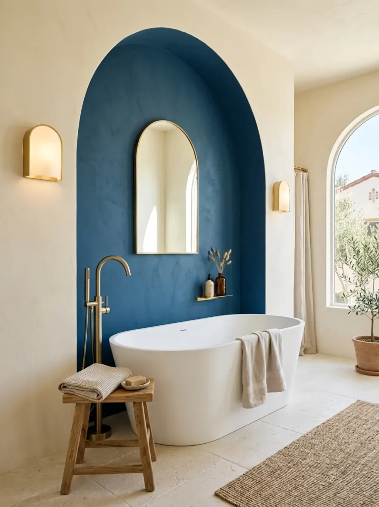
- Creates a distinctive architectural focal point around the tub or vanity.
- Uses curved lines to soften darker colors and harder surfaces.
- Works well for highlighting a mirror, artwork, or bathing area.
- Makes an ordinary wall feel more custom without major structural changes.
A blue arched alcove can give the bathroom a custom architectural feel without filling every surface with dramatic color. Paint or tile the recessed area in a deep blue shade, then use its curved outline to frame a bathtub, vanity, or decorative mirror. The rounded shape softens the richness of the color and creates a natural focal point. Pale stone and warm white surfaces around the alcove keep the composition balanced. This idea is especially effective in bathrooms with otherwise plain walls because one carefully defined architectural zone can provide depth, character, and visual structure.
You can create a similar effect even without building a true recessed niche. A painted arch behind the vanity or bathtub can produce the same visual emphasis with far less work. Use painter’s tape for a crisp outline, or choose a slightly textured finish for a softer handcrafted appearance. I’ve noticed that repeating the arch shape through a mirror or wall sconce makes the feature feel much more intentional. Keep the accessories minimal and let the curved silhouette do the decorating. The finished bathroom feels distinctive and layered while maintaining a clean, practical layout.
Blue and Marble Contrast
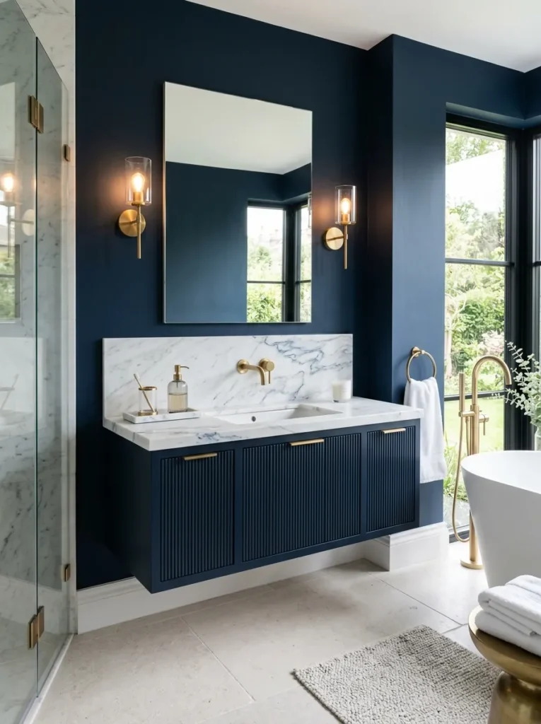
- Combines saturated blue with light stone for immediate visual balance.
- Marble veining can introduce subtle gray, cream, or blue connections.
- Creates a luxurious appearance without requiring many decorative objects.
- Works across vanities, shower walls, floors, and smaller accent areas.
Deep blue and pale marble create one of the easiest ways to make a bathroom feel luxurious without filling it with unnecessary decoration. The saturated blue provides depth, while marble introduces brightness and natural movement through its veining. Use the combination around the vanity, shower, or bathtub depending on the room’s layout. A white marble countertop against dark cabinetry creates especially strong contrast, while marble wall panels can make a shower feel more expansive. The key is allowing each material enough space to be appreciated rather than covering every surface with competing patterns or textures.
Look for marble with subtle gray or blue veining when you want the materials to feel connected. Warm brass hardware can bridge the cooler stone and blue tones, while natural wood introduces another layer of warmth. In my experience, this palette works particularly well when the flooring stays quiet and matte, allowing the polished stone to provide the necessary reflection. If natural marble maintenance is a concern, high-quality porcelain can offer a similar visual effect with simpler care. The finished room feels dramatic and refined, yet the palette remains versatile enough to suit different decorating styles.
Blue Glass Shower
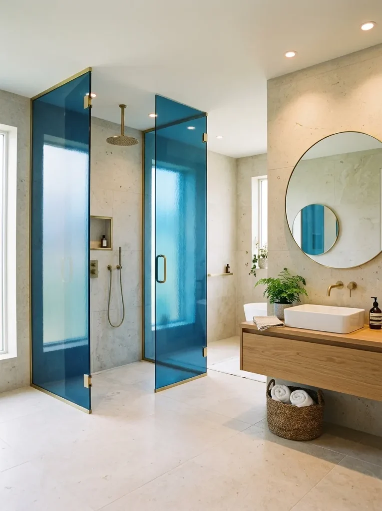
- Adds color while preserving an open, light-filled shower enclosure.
- Translucent blue glass creates subtle depth without heavy visual weight.
- Works beautifully with simple tile and streamlined fixtures.
- Can introduce a dramatic accent without covering the entire shower in dark material.
A blue glass shower enclosure can introduce dramatic color while keeping the bathroom visually open. Instead of using dark tile across every shower wall, translucent or lightly tinted blue glass creates a softer layer that changes with the surrounding light. Pair it with pale stone or warm neutral tile so the color remains noticeable without dominating the entire room. Brushed brass fixtures can add warmth, while clear glass details elsewhere maintain an airy appearance. This idea is particularly useful when you want a distinctive shower but still want natural light to travel through the space and reach nearby areas.
Consider the intensity of the glass color carefully because darker tinting can affect how bright the shower feels. A softer blue often provides enough personality while preserving visibility and openness. Keep the shower fixtures streamlined and avoid excessive patterns nearby so the glass remains the primary feature. I’ve seen this approach work especially well in contemporary bathrooms where clean lines are important. Pairing the blue glass with pale flooring and a simple wood vanity creates a balanced composition that feels modern, sophisticated, and slightly dramatic without making the entire room visually heavy.
Blue Herringbone Tile
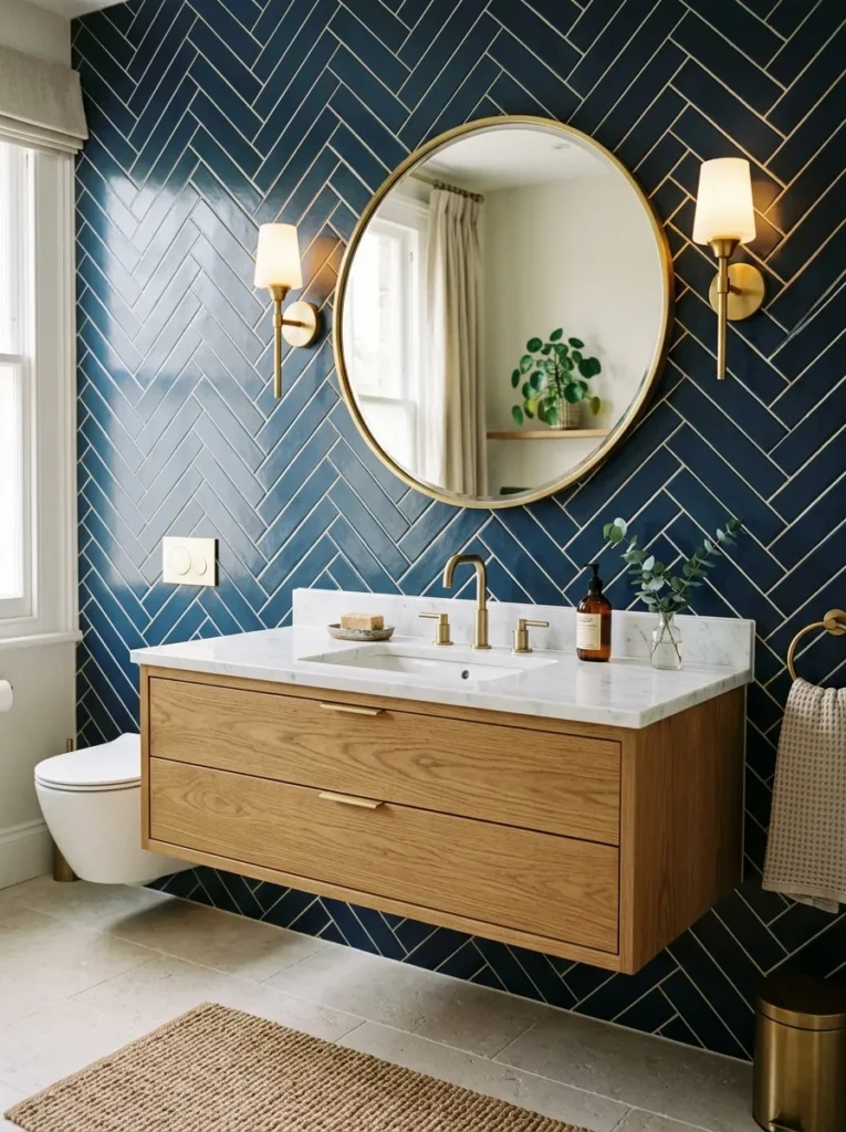
- Adds movement through a classic pattern with a modern color.
- Creates a strong feature wall without needing additional decoration.
- Works beautifully behind a vanity, bathtub, or shower.
- Light grout can emphasize the herringbone shape and brighten deep blue tile.
Blue herringbone tile brings pattern, depth, and movement to a bathroom while keeping the color palette focused. The angled arrangement naturally draws the eye across the wall, making even a compact surface feel more detailed and intentional. Use it behind a vanity, inside the shower, or around a bathtub as a defined feature. White or pale grout can make the pattern more visible, while matching grout creates a quieter effect. Pair the tile with simple fixtures and light stone so the geometric layout remains the main visual feature rather than competing with several decorative elements.
The direction of the herringbone can also influence how the room feels. A vertical arrangement can emphasize height, while a traditional horizontal layout creates a more established, classic appearance. Warm wood cabinetry can soften the saturated blue, while brass hardware adds small points of contrast. I’ve noticed that this pattern looks most polished when used on one strong surface instead of every wall. If you want the effect without extensive installation, consider using the tile only behind the vanity. This creates a memorable focal point while keeping the rest of the bathroom lighter, calmer, and easier to coordinate.
Blue and Wood Warmth
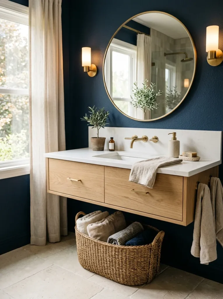
- Softens deep blue with natural texture and warmer undertones.
- Creates a relaxed contrast between saturated color and organic materials.
- Wood vanities and stools add useful warmth without overwhelming the room.
- Works well with stone, linen, woven baskets, and aged metal finishes.
Blue and natural wood create a beautifully balanced bathroom because each material offsets the other. Deep blue provides richness and depth, while oak, walnut, or teak introduces warmth and visible grain. Use wood through a vanity, stool, shelving, or framed mirror rather than adding several unrelated pieces. Pale stone countertops and warm white fixtures can keep the composition bright. This combination works especially well when a darker palette feels too cool or formal. The wood adds an approachable quality, making the bathroom feel comfortable and lived-in while the blue maintains the dramatic character that gives the space its visual identity.
For a cohesive result, choose one dominant wood tone and repeat it in small places rather than mixing several finishes. A woven basket or linen stool can extend the natural texture without creating clutter. Warm lighting will also bring out the grain and make the blue appear softer after sunset. In my experience, this pairing is particularly useful for bathrooms that need more warmth but cannot accommodate major architectural changes. Even replacing a plain vanity with a wood-fronted version can noticeably change the atmosphere, giving the room a richer, more welcoming appearance without sacrificing clean lines or practical storage.
Conclusion
A dramatic bathroom does not require a complete renovation or an overwhelming amount of color. From rich tile and painted walls to blue cabinetry, marble, warm wood, and brass accents, these moody blue bathroom ideas show how small or focused changes can create remarkable depth and personality. I’ve seen how thoughtful color choices can completely transform an ordinary space while keeping it practical for everyday life. Save this post on Pinterest so you can revisit your favorite ideas when planning your makeover. Try one detail that inspires you, and share this collection with someone ready to create a bathroom they truly love.