24 Thanksgiving Chalkboard Ideas for a Festive Touch
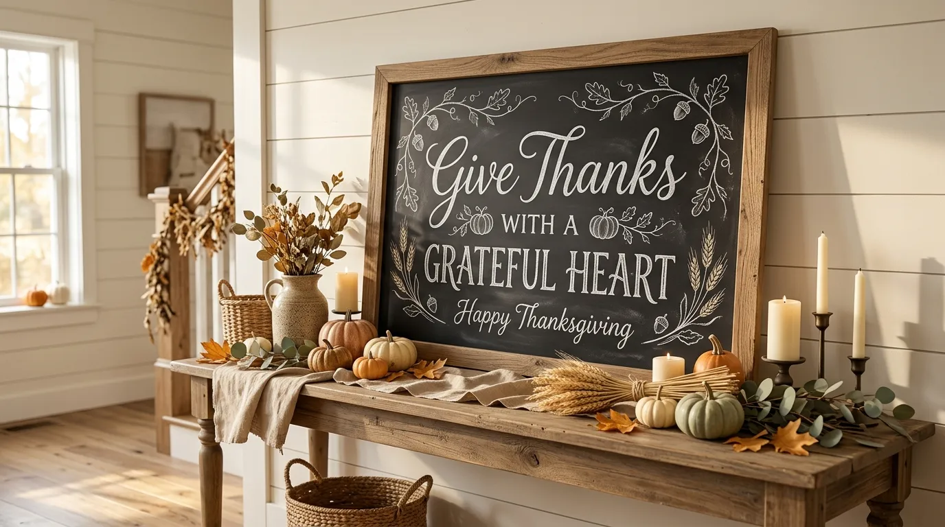
Ready to give your Thanksgiving decor a charming, personal touch? Thanksgiving chalkboard ideas can turn an ordinary corner into a festive focal point with just a little creativity. From welcoming entry signs and harvest menus to playful pumpkin art and gratitude displays, these ideas make seasonal decorating feel warm, inviting, and easy to recreate.
A chalkboard is especially useful when you want holiday decor that feels personal without spending a lot on new accessories. You can change the message, add simple drawings, or pair it with pumpkins, dried leaves, wheat, candles, and natural wood. I’ve noticed that even a small handwritten sign can make a dining room or entryway feel much more thoughtfully decorated. Whether your style is farmhouse, rustic, minimalist, or traditional, these ideas can help you create a memorable Thanksgiving atmosphere that guests will enjoy.
Rustic Welcome Sign
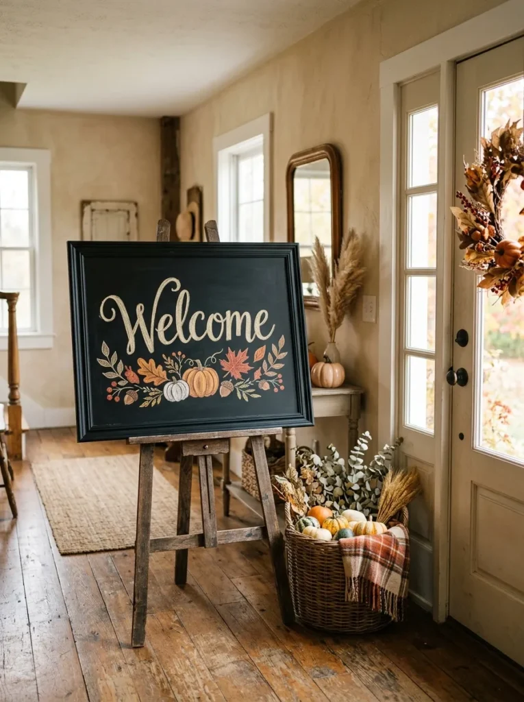
- Creates an inviting focal point near the entrance.
- Adds seasonal personality without taking much space.
- A wooden frame makes the board feel warmer and more rustic.
- Small chalk-drawn leaves keep the design simple and approachable.
A simple welcome message can instantly make a Thanksgiving gathering feel more thoughtfully prepared. One of the easiest thanksgiving chalkboard ideas is a rustic sign placed where guests naturally enter, such as beside the front door, foyer table, or dining room entrance. Choose a dark chalkboard with a warm wood frame to create contrast against lighter walls. White lettering keeps the design crisp, while tiny drawings of leaves, acorns, or pumpkins add seasonal detail. The finished look feels personal without becoming cluttered, making it especially useful for homes with farmhouse, cottage, or traditional decor.
Placement matters just as much as the lettering itself when creating a welcoming seasonal display. Set the board on a wooden easel, lean it against a console, or mount it securely near the entryway where it can be noticed immediately. I’ve noticed that simple lettering often looks more polished than filling every corner with decorations. Leave generous empty space around the main message, then add only a few small autumn sketches for balance. Warm lighting from a nearby lamp or wall fixture can make the black surface stand out beautifully during evening gatherings while keeping the entrance cozy.
Pumpkin Message Board
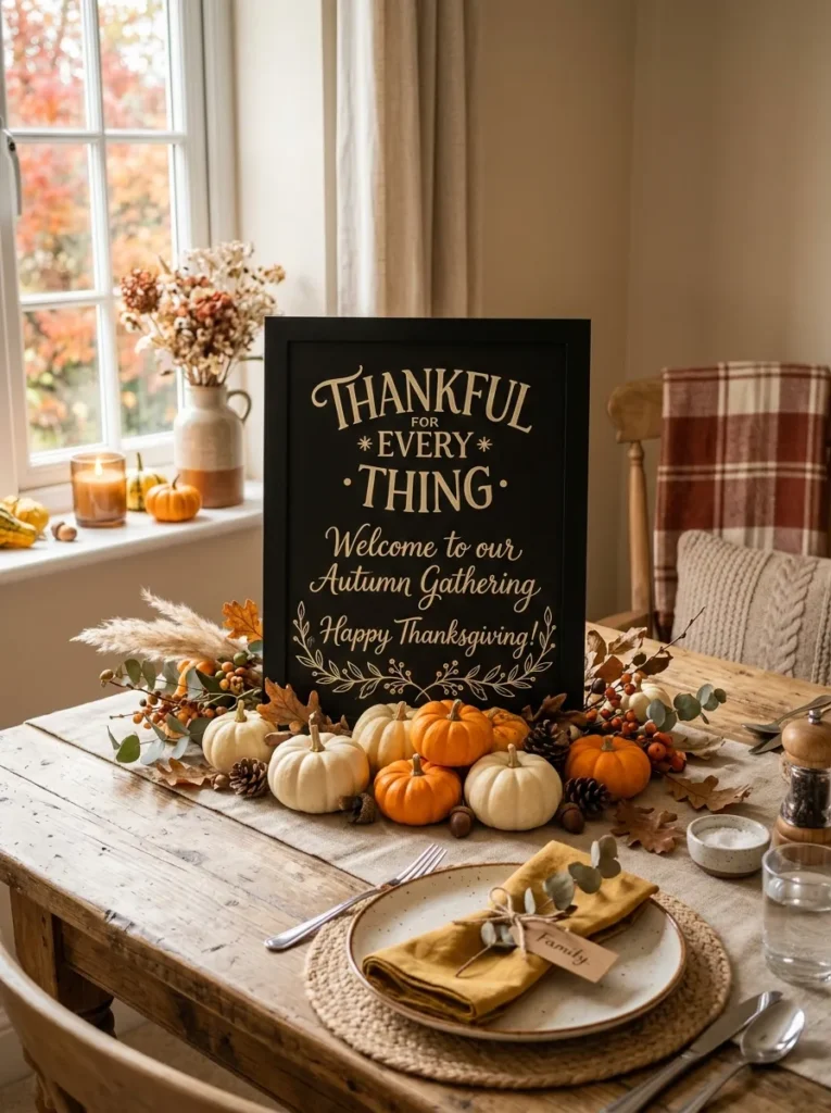
- Turns a basic chalkboard into a seasonal centerpiece.
- Small pumpkins add dimension without overwhelming the message.
- Cream or white chalk creates a soft contrast against black.
- Works beautifully on dining tables, sideboards, or kitchen counters.
Nothing says autumn quite as clearly as a chalkboard surrounded by tiny pumpkins and warm seasonal accents. A pumpkin message board brings a playful focal point to a dining room, kitchen, or entryway while keeping the overall arrangement relaxed. Write a short phrase in large cream or white lettering, then surround the board with miniature pumpkins in orange, ivory, or muted green. The layered arrangement adds height and texture without requiring expensive decorations. For a cohesive display, repeat one or two pumpkin colors elsewhere in the room through napkins, candles, ceramics, or small decorative objects.
The most attractive displays usually combine the chalkboard with objects that vary in height and texture. Place the board slightly behind the pumpkins, then add a linen runner underneath to soften the arrangement. I’ve seen this work especially well on long dining tables because the board creates a clear visual anchor without blocking conversation across the table. Keep the message short enough to read from several feet away, and use simple leaf or vine drawings around the lettering. A few dried stems in a small vase can complete the arrangement while maintaining that relaxed, gathered-for-the-holiday appearance.
Harvest Menu Display
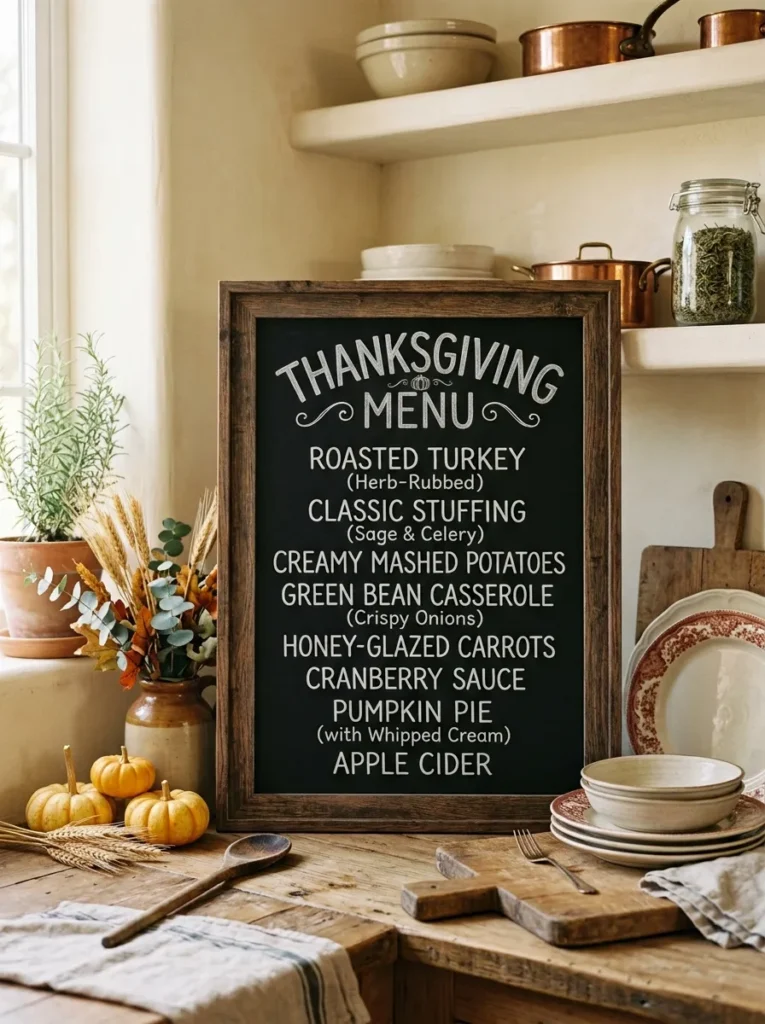
- Gives guests an easy way to see the holiday menu.
- Makes the kitchen or dining area feel intentionally decorated.
- Handwritten dish names add a personal, homemade touch.
- A restrained layout keeps the board readable from across the room.
A handwritten menu can turn an ordinary kitchen corner into a charming holiday feature. A harvest menu display gives guests a quick glimpse of what will be served while adding visual interest to the room. List the main dishes in clean, readable lettering, then use tiny wheat stems, leaves, or dots to separate sections. Keep the board near the dining table, buffet, or kitchen counter so it feels connected to the meal rather than placed randomly. The dark background also creates a strong contrast against cream walls, light countertops, wooden furniture, and other warm autumn materials.
A menu board becomes even more useful when it is designed for quick reading rather than decoration alone. Start with a larger heading, then write the dishes beneath it using consistent spacing and similar letter sizes. In my experience, leaving plenty of black space around the words makes handmade chalk lettering look more intentional. Add a small cluster of dried wheat or eucalyptus beside the frame rather than drawing too many details directly on the board. This approach creates a balanced farmhouse display that feels festive, practical, and easy to recreate with inexpensive materials already found around the home.
Autumn Quote Board
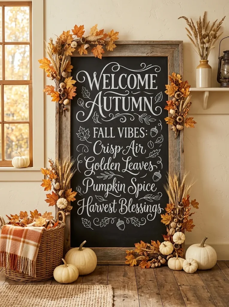
- Adds personality without requiring a complicated arrangement.
- Short lettering keeps the display easy to read.
- Dried leaves and wheat create natural seasonal texture.
- Works well in entryways, dining rooms, or living spaces.
A beautiful autumn quote can make a plain wall feel instantly more intentional. Choose a short phrase about gratitude, gathering, or the season, then write it in large, relaxed lettering across the center of the chalkboard. This approach is one of the easiest thanksgiving chalkboard ideas because the message itself becomes the main decoration. Surround the frame with a few dried leaves, wheat stems, or miniature pumpkins for added texture. The combination works especially well against neutral walls, where the dark board creates contrast without making the room feel visually heavy or overly decorated.
Keep the surrounding accessories simple so the lettering remains the star of the display. A wooden frame can soften the strong black surface, while a small basket or vase nearby introduces another natural texture. I’ve noticed that handwritten lettering looks most inviting when it has slight imperfections rather than appearing overly precise. Try mixing one larger word with smaller supporting words to create visual hierarchy. If the board sits in a hallway or entryway, position it at comfortable eye level so guests can easily read the message as they move through the space during the holiday gathering.
Layered Leaf Border
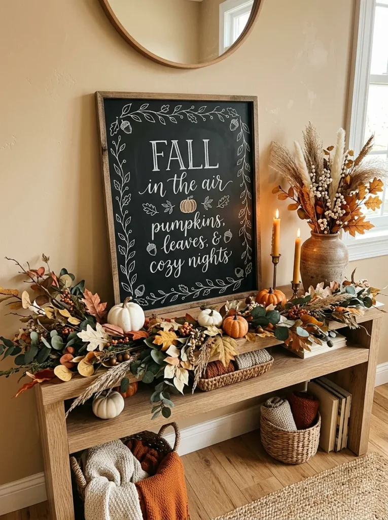
- Frames the message without filling the entire board.
- Adds seasonal detail using simple hand-drawn shapes.
- Repeating leaves create a polished visual rhythm.
- The design can be recreated with basic chalk skills.
A simple leaf border can make even basic chalk lettering look thoughtfully designed. Draw small maple, oak, or simple rounded leaves around the outer edges of the board, leaving the center open for a short message. Use white chalk for a clean farmhouse look, or add muted orange and mustard chalk for subtle color. This border technique gives the display structure while keeping the main wording easy to read. It also works particularly well when the surrounding room already contains autumn colors, because the chalk details can quietly repeat those tones without introducing another major decorative element.
The key is keeping the border slightly irregular so it feels handmade rather than mechanically patterned. Start with larger leaves near the corners, then add smaller shapes between them to create a natural flow. In my experience, leaving a little breathing room between the drawings and the lettering makes the whole board look more refined. Place the finished piece on a console, buffet, or shelf where it can sit beside candles, ceramics, or a small vase. The result is a festive display that adds character while using very little physical space or expensive holiday decor.
Gratitude List Board
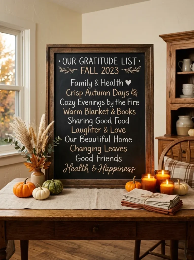
- Encourages guests to participate in the holiday display.
- Creates a meaningful activity without complicated supplies.
- Looks attractive even when only a few notes are added.
- Works well beside dining areas, buffets, or gathering spaces.
Turn a chalkboard into an interactive gratitude station that guests can enjoy throughout the celebration. Write a simple heading at the top, then leave plenty of blank space underneath for family members and friends to add short thoughts. Place chalk pieces in a small bowl or container beside the board so participation feels effortless. This setup adds more than decoration because it gives guests something personal to contribute. It can work beside the dining table, near a buffet, or in a quiet corner where people naturally pause between meals, conversations, and other Thanksgiving activities.
A gratitude board also becomes a visual keepsake as more messages appear throughout the day. Use a sturdy framed board with enough writing space, and avoid placing it where food or drinks could easily splash onto the surface. I’ve seen interactive displays work best when instructions are short and friendly, such as asking guests to write one thing they appreciate. Keep nearby decorations low and simple so people have room to stand comfortably while writing. At the end of the gathering, photograph the completed board before erasing it, creating a simple memory of the celebration.
Turkey Sketch Board
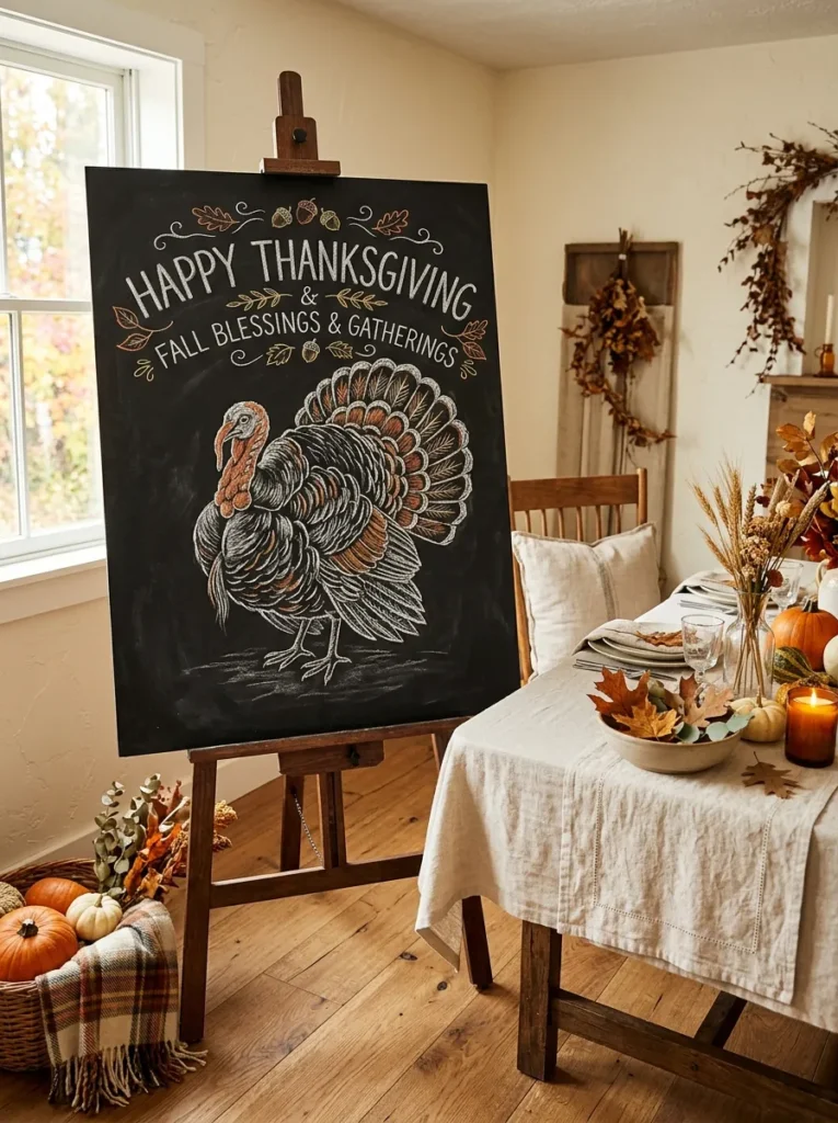
- Adds a playful focal point for family-friendly spaces.
- A simple turkey drawing keeps the design approachable.
- Warm chalk colors introduce subtle seasonal contrast.
- Works especially well near dining areas or children’s spaces.
A cheerful turkey illustration can instantly give a chalkboard a playful Thanksgiving personality. Keep the drawing simple, using rounded shapes, expressive eyes, layered feathers, and a few autumn colors rather than attempting detailed artwork. Place the turkey near the center and surround it with tiny leaves, dots, or wheat stems for balance. This type of display works beautifully in a dining room, kitchen, breakfast nook, or family room where children and adults can enjoy the design. The black background makes white chalk stand out clearly, while small touches of orange, brown, and mustard create seasonal warmth.
You do not need advanced drawing skills to make this board look attractive. Sketch the turkey lightly first, then build the main shapes with thicker chalk lines and add a few colored details afterward. I’ve noticed that slightly oversized illustrations are easier to appreciate from across a room than tiny, intricate drawings. Place the board on an easel beside the dining table or buffet rather than directly in the middle of the meal setup. A few miniature pumpkins and dried leaves around the base can connect the artwork naturally with the rest of your seasonal decorations.
Candlelit Chalk Sign
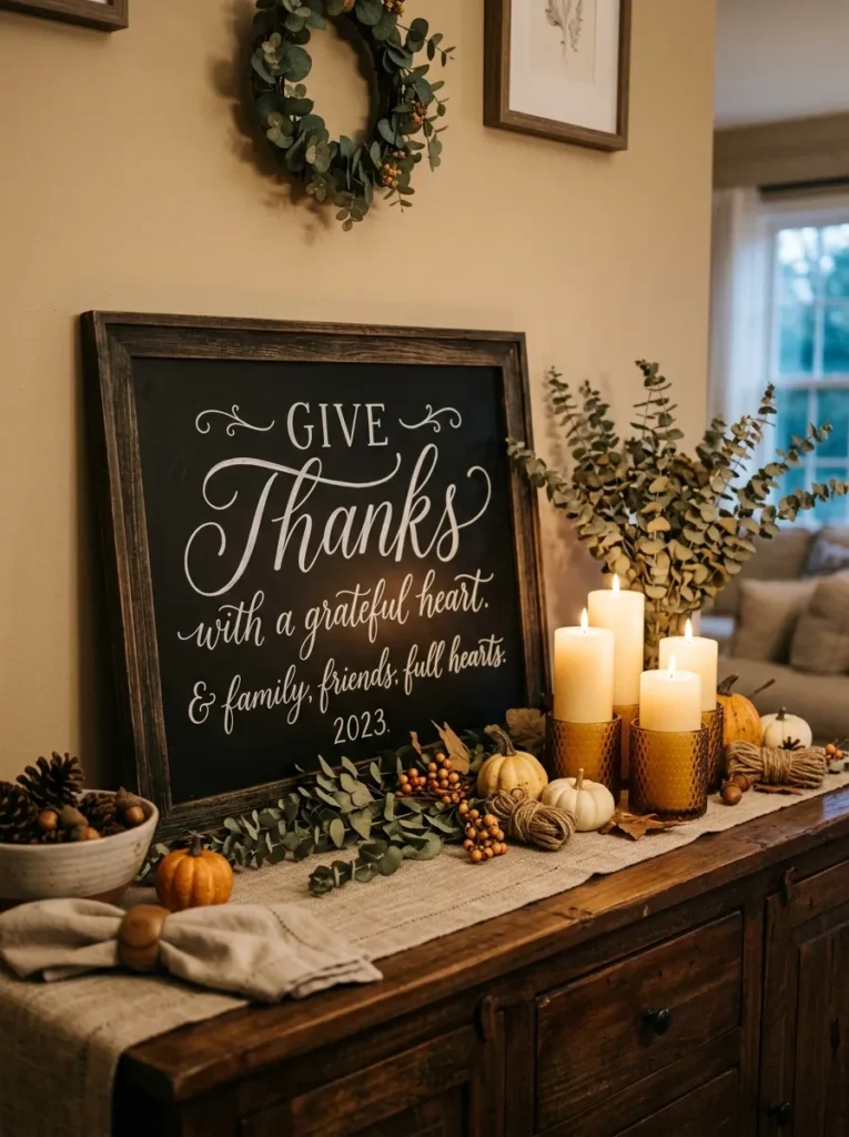
- Creates a warm focal point for evening gatherings.
- Candlelight makes the dark chalkboard feel softer.
- Simple lettering prevents the arrangement from becoming busy.
- Layered heights add dimension to a small surface.
Few things create a cozy holiday atmosphere as quickly as candlelight beside handwritten chalk lettering. Place a dark chalkboard on a sideboard, buffet, or console, then arrange ivory pillar candles and small amber holders around it. Choose a short seasonal message so the words remain readable even when the surrounding light becomes softer. The contrast between glowing candles and a matte black surface creates an inviting focal point without requiring elaborate decorations. Add a few dried leaves, eucalyptus stems, or miniature pumpkins to connect the arrangement with the natural colors already used throughout the room.
Layering the accessories at different heights will make the display feel fuller without taking up excessive space. Position the chalkboard slightly behind shorter candles, then place one taller candle or vase to one side for balance. For safety, keep paper, dried foliage, and fabric well away from open flames, or use flameless candles for a similar glow. I’ve found that warm LED candles work particularly well in homes with children or pets because they provide the atmosphere without an exposed flame. Finish with a small linen runner underneath to soften the arrangement visually.
Farmhouse Family Sign
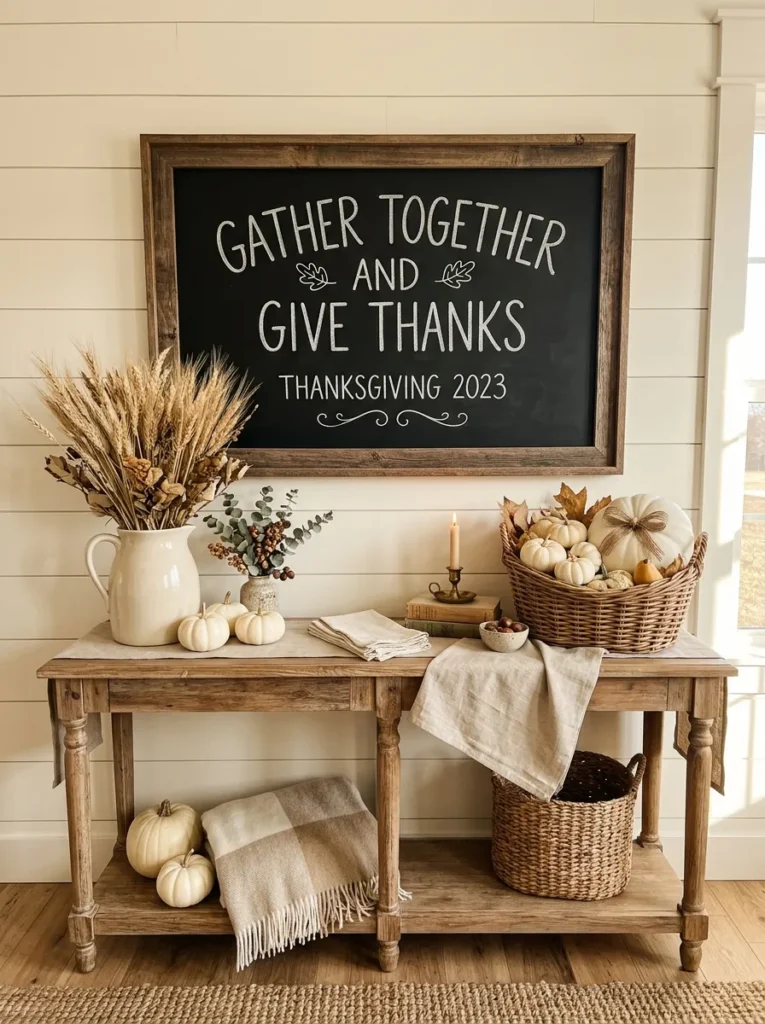
- Brings a personal family touch to seasonal decorating.
- Distressed wood complements farmhouse and cottage interiors.
- Neutral accessories keep the display versatile.
- A meaningful phrase can make the board feel more personal.
A family-focused chalkboard can make seasonal decorating feel more personal without becoming overly formal. Choose a short phrase about family, gathering, or home, and write it in relaxed chalk lettering across a distressed black surface. A reclaimed wood frame adds warmth and pairs naturally with farmhouse furniture, woven baskets, ceramic pitchers, and linen fabrics. This type of display works beautifully above a console table or beside a dining room buffet. The dark board gives neutral interiors a stronger focal point while the natural materials keep the overall arrangement soft, comfortable, and welcoming.
The surrounding decor should support the message rather than compete with it. Place a small ceramic pitcher filled with wheat on one side and a few ivory pumpkins on the other to create an easy asymmetrical arrangement. In my experience, neutral farmhouse displays feel more timeless when seasonal colors are introduced through small accents instead of large decorative pieces. If your walls are already busy, lean the board against furniture rather than hanging it. That approach also makes it easy to move the sign between rooms when you want to refresh the holiday setup.
Cornucopia Sketch
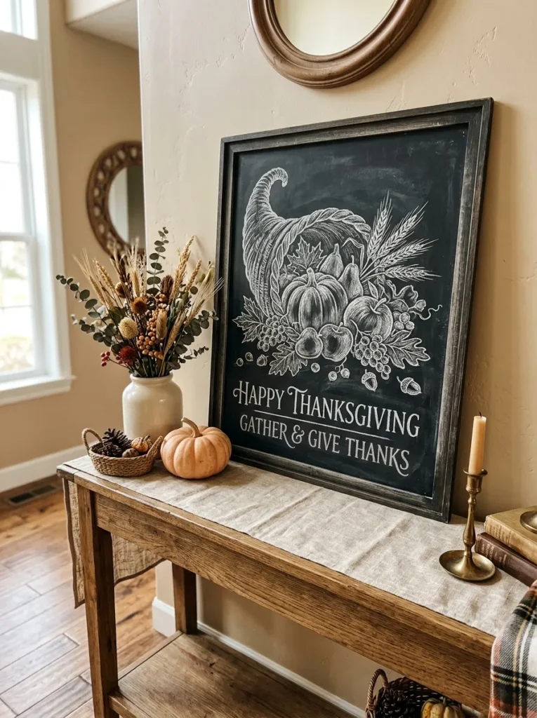
- Brings classic harvest imagery into the seasonal display.
- Creates a strong focal point without physical clutter.
- Small fruit and leaf details add visual richness.
- Pairs naturally with rustic, traditional, and farmhouse interiors.
A hand-drawn cornucopia can turn a simple chalkboard into a classic harvest-inspired focal point. Sketch the curved horn in the center, then fill it with recognizable seasonal elements such as pumpkins, apples, pears, wheat, and curling leaves. White chalk keeps the illustration crisp, while small touches of muted orange or mustard can highlight selected details. This design works especially well on a dining room wall, buffet, or entryway console because the illustration communicates abundance without requiring a large collection of physical decorations. The result feels traditional while still being easy to personalize.
Keep the drawing detailed enough to feel interesting but simple enough to remain readable from several feet away. Start with the outline, then add larger produce shapes before filling smaller gaps with leaves and wheat. I’ve noticed that repeating a few of the same shapes around the room can make a chalkboard feel naturally connected to the rest of the decor. Place a small basket, ceramic vase, or wooden bowl beneath the board for added texture. Warm wood, neutral linens, and soft lighting will help the harvest illustration feel integrated rather than isolated.
Thankful Word Art
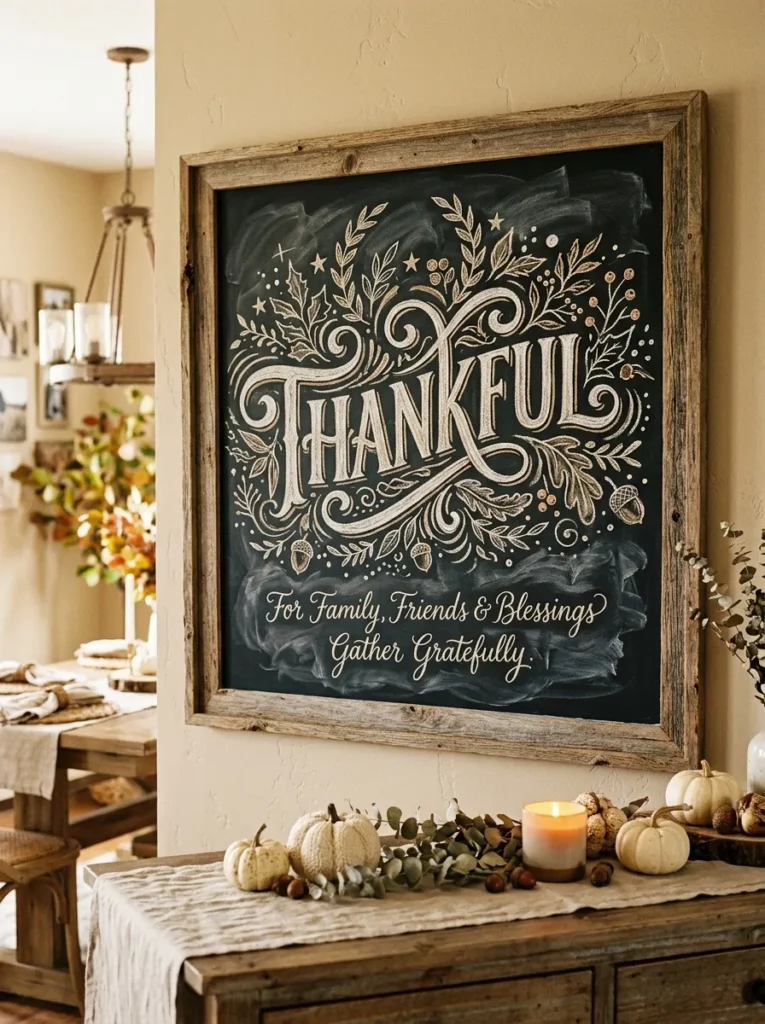
- Makes one meaningful word the visual centerpiece.
- Layered lettering adds interest without complicated illustrations.
- Small botanical accents soften the bold black background.
- Easy to customize with different handwriting styles.
One strong word can sometimes create more visual impact than an entire collection of decorations. Center the word “Thankful” on a black chalkboard using large flowing lettering, then surround it with smaller words, leaves, or simple decorative marks. Mix thick and thin lettering styles to create a layered word-art effect without overcrowding the surface. This approach works particularly well for dining rooms and entryways because the message remains readable from a distance. It also gives you a flexible foundation that can be styled with rustic, modern farmhouse, cottage, or traditional Thanksgiving accessories.
To make the lettering look polished, lightly sketch the placement before going over the lines with brighter chalk. Leave enough empty space around the main word so it remains the obvious focal point. A few small leaves can guide the eye toward the center without distracting from the message. I’ve seen simple typography look especially effective when the surrounding decor stays restrained. Pair the board with ivory pumpkins, a woven basket, or a linen runner, and repeat one or two of those textures elsewhere in the room for a cohesive seasonal arrangement.
Buffet Direction Sign
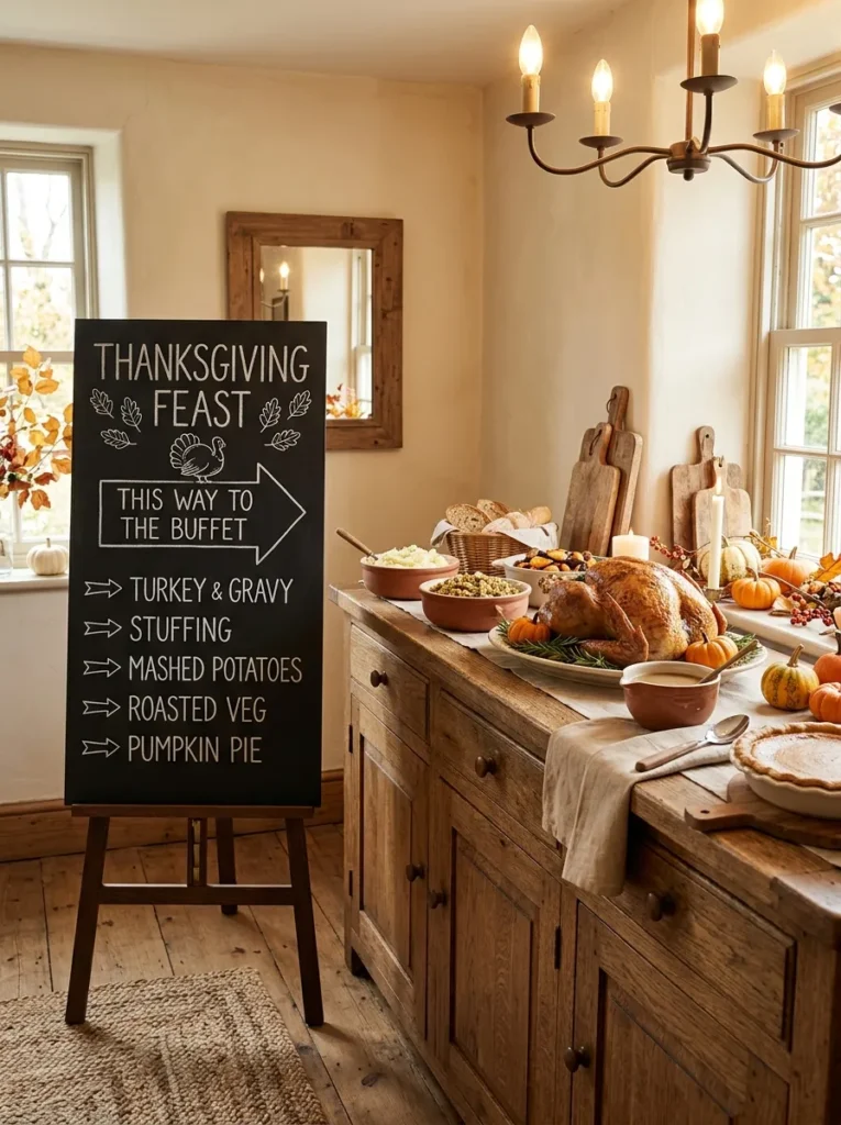
- Helps guests navigate a buffet more easily.
- Adds decoration while serving a practical purpose.
- Simple arrows make the board readable at a glance.
- Works well for larger family gatherings and entertaining spaces.
A chalkboard can do more than decorate the room when it also helps guests find their way around the meal. Create a simple buffet direction sign using clear arrows and short labels such as “Turkey,” “Sides,” “Dessert,” or “Drinks.” Position the board beside the serving area where guests can see it before reaching for plates. This practical approach adds a festive touch while reducing confusion when several dishes are spread across a long sideboard or kitchen counter. It is especially useful when entertaining a larger group and helps the serving area feel intentionally organized.
Keep the lettering bold and the information limited to what guests actually need. A few simple arrows are usually enough, so avoid filling the board with decorative drawings that could make the directions difficult to read. Place the sign on a small easel or lean it securely against the wall behind the buffet. In my experience, functional signs work best when they blend with the surrounding decor rather than looking like temporary labels. A wooden frame, neutral linen, ceramic serving pieces, and a few small pumpkins can make the practical display feel completely intentional.
Acorn Accent Board

- Adds a subtle woodland touch to seasonal decorating.
- Small acorns create detail without overwhelming the board.
- Natural wood framing reinforces the autumn theme.
- Works well in smaller decorating spaces.
Tiny acorns can add a charming woodland detail without making the display feel overly themed. Draw several simple acorns around the edges of a black chalkboard, leaving the center open for a short seasonal phrase. Use white or cream chalk for a soft, natural appearance, then add a few muted brown or mustard accents if you want more definition. This smaller design works especially well on shelves, kitchen counters, console tables, or narrow entryway surfaces where a large decorative sign would feel too bulky. It brings autumn character while keeping the overall arrangement understated.
For a balanced composition, vary the size and direction of the acorns instead of placing identical shapes in a rigid row. A few scattered leaves can connect the drawings and create a gentle border around the message. I’ve noticed that small chalkboards often look best when paired with one taller object, such as a ceramic vase filled with dried stems. Add an ivory pumpkin or woven basket nearby for texture, but avoid crowding the surface. The combination of black chalk, natural wood, dried botanicals, and neutral accessories creates a relaxed display that feels easy to recreate.
Layered Harvest Words
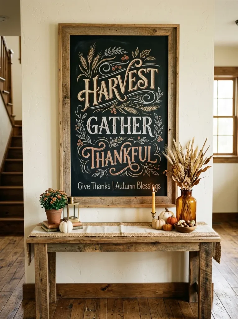
- Creates visual depth through varied lettering sizes.
- Multiple short words add interest without lengthy text.
- Warm chalk tones complement natural autumn materials.
- Works beautifully as a tall entryway or dining accent.
Layering several short harvest words can give a chalkboard a fuller appearance without relying on complicated illustrations. Arrange words such as “Gather,” “Harvest,” and “Thankful” at different sizes, using white, cream, and muted orange chalk to create subtle contrast. Keep the largest word near the center and allow smaller phrases to frame it naturally. This typography-focused approach makes the board feel artistic while still remaining easy to read. It can become a strong focal point in an entryway, dining room, kitchen, or living area where guests naturally spend time.
The secret to keeping layered lettering attractive is giving every word enough breathing room. Lightly mark the approximate positions first, then adjust the spacing before making the final chalk lines. I’ve noticed that combining one flowing script style with simple block lettering creates more dimension than using several complicated fonts. Place the finished board beside a vase of wheat, dried grasses, or eucalyptus to reinforce the harvest theme. A neutral linen runner underneath can soften the dark surface, while warm wood and amber accessories bring the entire arrangement together without making it feel overly busy.
Pie Dessert Sign
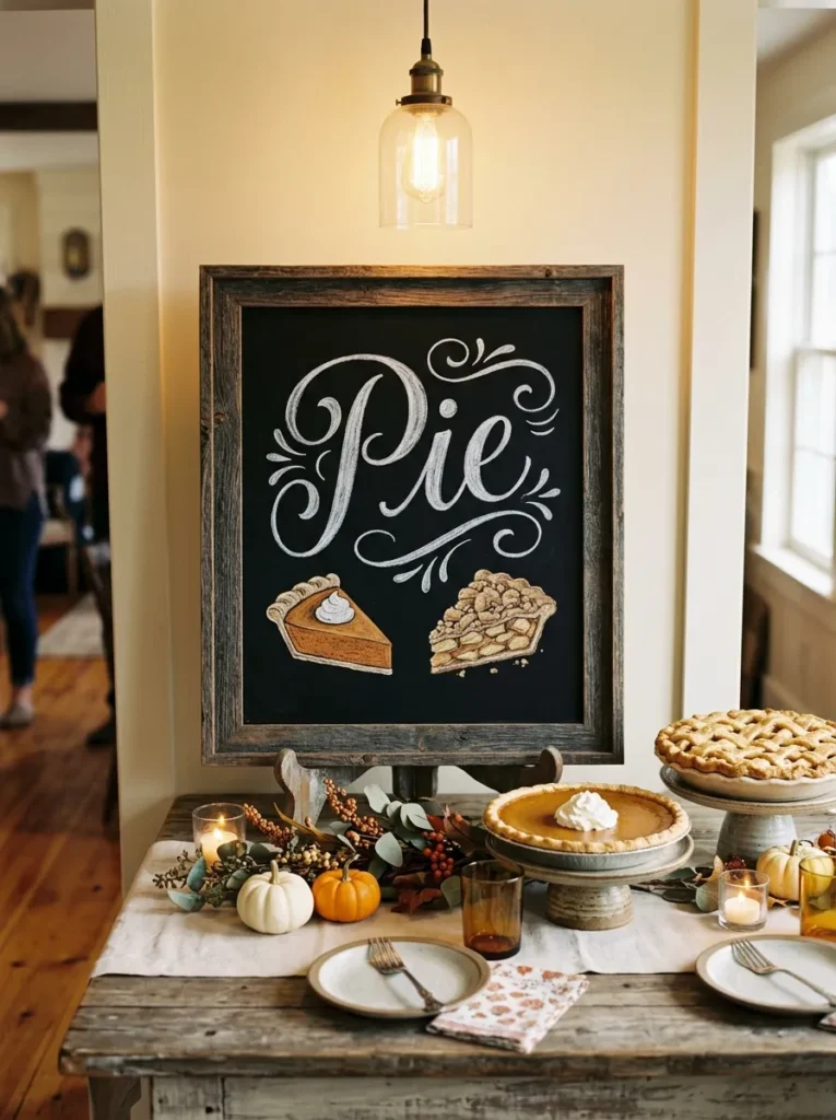
- Makes the dessert station easier for guests to notice.
- Adds playful detail with simple pie illustrations.
- Helps separate sweets from the main serving area.
- Fits naturally into rustic and farmhouse celebrations.
A dessert sign can turn a simple pie table into a memorable holiday feature. Write a bold heading such as “Pie” or “Dessert,” then add small chalk illustrations of pumpkin pie, apple pie, or a slice topped with whipped cream. Position the board behind or beside the serving table so guests can immediately recognize the area. The dark background creates a strong contrast against cream plates, wooden serving boards, linen fabrics, and warm pastries. This idea combines decoration with useful visual organization, making it especially helpful when several food stations are spread around the room.
Keep the illustrations recognizable rather than overly detailed, especially if you are drawing directly with chalk. A few clean outlines and simple filling details can communicate the idea beautifully. I’ve seen dessert displays look more polished when the sign is slightly elevated behind the treats instead of lying flat on the table. Add small pumpkins or dried leaves around the base, but leave enough room for serving utensils and plates. Warm pendant or string lighting can further highlight the display, creating an inviting dessert corner without requiring expensive decorative pieces.
Wheat Bundle Sketch
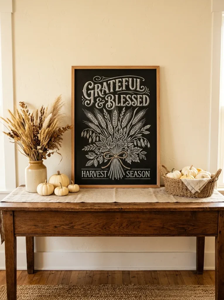
- Brings natural harvest texture into the display.
- Wheat drawings create an elegant seasonal border.
- Neutral colors make the design easy to coordinate.
- Works especially well with farmhouse and rustic interiors.
Wheat is one of the simplest ways to bring a harvest-inspired feeling to a chalkboard without making the design complicated. Draw several tall wheat stems along one side or across the bottom edge, then leave the center open for a short message. White chalk gives the stems a delicate appearance against the dark background, while small touches of tan or muted gold can add subtle warmth. This design works beautifully in dining rooms, kitchens, entryways, and buffets where natural materials already play a major role. The result feels seasonal without becoming overly decorative.
For a more polished composition, draw the wheat stems with slightly different heights and gentle curves rather than making every line identical. Place a real bundle of dried wheat beside the board to repeat the visual theme in three-dimensional form. In my experience, combining drawn and natural botanical elements makes a display feel more layered and intentional. Keep the remaining accessories simple, such as an ivory pumpkin, woven basket, or ceramic vase. A wooden frame and warm afternoon lighting will further soften the contrast of the black board and create an inviting farmhouse-inspired arrangement.
Family Recipe Board
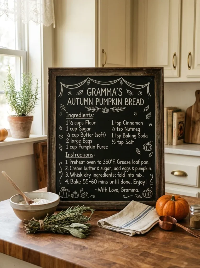
- Gives the display a meaningful personal connection.
- Adds nostalgic character to a kitchen or dining space.
- Handwritten details make the board feel authentic.
- A short recipe keeps the layout readable and attractive.
A handwritten family recipe can turn a seasonal chalkboard into something far more personal than ordinary decoration. Choose a beloved Thanksgiving dish, then write its name prominently with a shortened ingredient list or a memorable preparation note underneath. You might feature a pie, stuffing, cranberry sauce, or another family favorite. Place the board on a kitchen counter, open shelf, or dining room sideboard where guests can naturally see it. The combination of handwritten details and familiar food references creates a warm display that feels connected to the people gathering around the table.
You do not need to copy an entire recipe to make the idea work. Select a few meaningful ingredients or one short family tip, leaving enough empty space for the lettering to breathe. I’ve noticed that vintage-style handwriting pairs particularly well with distressed wood frames and traditional kitchen accessories. Add a small ceramic bowl, wooden spoon, dried herbs, or miniature pumpkin beside the board for extra texture. If the recipe has been passed through several generations, consider adding the family name or year in smaller lettering to make the display feel like a keepsake.
Plaid Frame Display
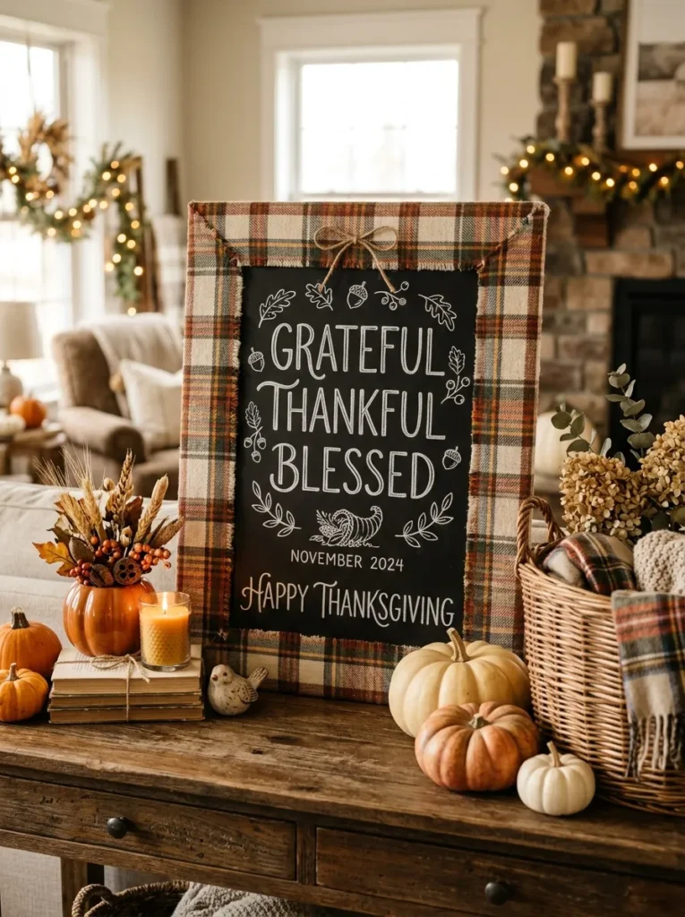
- Introduces classic Thanksgiving pattern without overwhelming the board.
- Softens the strong contrast of black chalk surfaces.
- Plaid coordinates easily with blankets and table linens.
- Works well for rustic, farmhouse, and cabin-inspired rooms.
Plaid can instantly make a chalkboard feel warmer and more connected to classic autumn decorating. Instead of covering the board itself, use plaid fabric around the frame or underneath it as a narrow decorative layer. Choose a pattern featuring cream, rust, brown, mustard, or muted orange so it complements the existing room palette. The chalkboard can then carry a simple phrase in white lettering while the fabric provides color and texture around the edges. This combination works especially well on consoles, buffets, entryway tables, and other surfaces where layered seasonal accessories are already being used.
Keep the plaid pattern controlled so it supports the chalkboard instead of competing with it. A narrow fabric border, ribbon, or folded runner is usually enough to introduce the pattern without making the display visually heavy. I’ve noticed that repeating the same plaid in one nearby pillow, napkin, or table runner can make the arrangement feel more cohesive. Add natural wood, dried leaves, and a few small pumpkins to balance the fabric’s pattern. Warm lighting will bring out the rust and cream tones, giving the finished display a comfortable farmhouse character.
Turkey Menu Board
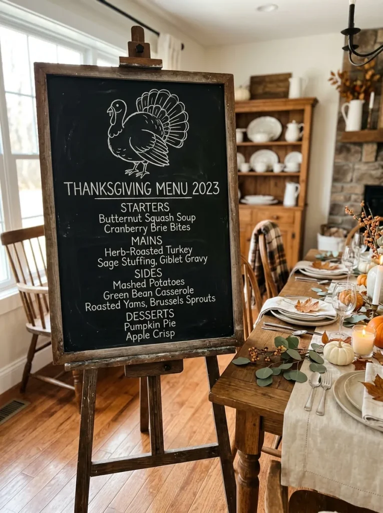
- Combines playful artwork with useful meal information.
- Makes the dining area feel more organized.
- A turkey illustration immediately establishes the holiday theme.
- Large lettering keeps the menu readable from across the room.
Combine a cheerful turkey illustration with a clearly written holiday menu for a display that feels both decorative and useful. Place the turkey near the top of the board, then list the main dishes underneath using simple, evenly spaced lettering. You can include turkey, mashed potatoes, stuffing, vegetables, cranberry sauce, and dessert without filling every inch of the surface. This approach works especially well beside a dining table or buffet because guests can see what is being served before they begin filling their plates. It also creates a natural visual anchor for the surrounding Thanksgiving decor.
For the best result, keep the turkey drawing slightly larger than the individual menu items so the board has an obvious visual hierarchy. Use white chalk for the main information and reserve muted orange or brown for small decorative details. I’ve noticed that menu boards feel more polished when each line has similar spacing and the writing follows a consistent style. Place the board on a sturdy easel and surround the base with a few pumpkins or dried leaves. This creates a finished seasonal display while leaving the serving area practical and uncluttered.
Minimalist Harvest Sign
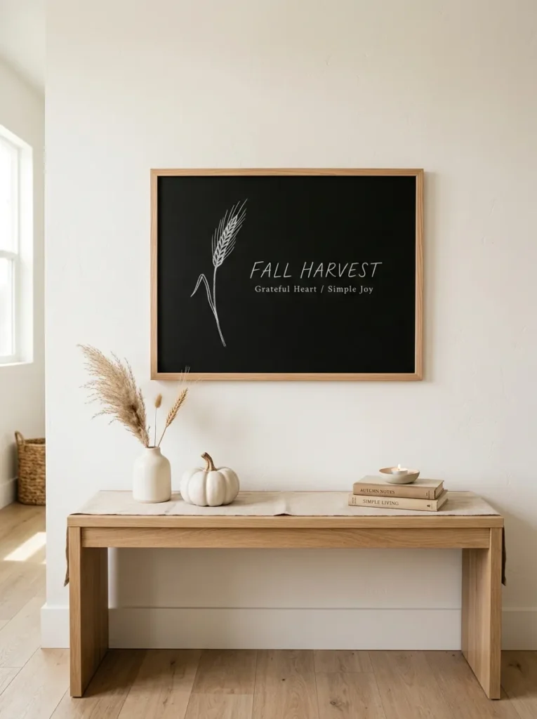
- Keeps seasonal decorating clean and uncluttered.
- Works especially well in modern neutral interiors.
- One botanical detail adds warmth without visual noise.
- Requires very little styling around the board.
Sometimes the strongest seasonal statement is the simplest one. A minimalist harvest sign uses a short phrase, clean lettering, and one or two subtle botanical drawings to create a polished Thanksgiving accent. Choose a slim black board with a natural oak frame, then write a single word such as “Harvest” in spacious lettering. Add one delicate wheat stem or small leaf rather than covering the surface with illustrations. This restrained approach is especially effective in modern farmhouse, Scandinavian-inspired, transitional, or neutral homes where too many autumn accessories can quickly make the room feel crowded.
Keep the supporting decor equally simple to preserve the clean aesthetic. Place the board on a light wood console beside one ceramic vase, an ivory pumpkin, or a small bundle of dried grass. In my experience, minimalist displays look more intentional when every object has enough space around it. Avoid mixing too many colors; cream, beige, natural wood, black, and one muted autumn shade are enough. Soft daylight will emphasize the contrast between the board and wall, while subtle evening lighting can make the arrangement feel warmer during nighttime gatherings.
Grateful Guest Board

- Gives every guest an easy way to participate.
- Adds an interactive element to the holiday setup.
- Blank writing space keeps the design flexible.
- Creates a meaningful display throughout the gathering.
Give guests a small opportunity to contribute to the holiday decor with a grateful guest board. Write a clear heading at the top, then leave most of the surface open for visitors to add a word, sentence, or short note about what they appreciate. Place a small container of chalk beside the board so participation feels simple and natural. This idea works particularly well near a dining room entrance, buffet, or living area where guests have time to pause. As messages accumulate, the once-empty board becomes a personal part of the gathering itself.
The display should be positioned where people can comfortably write without blocking a walkway or serving area. Use larger lettering for the heading and smaller decorative leaves around the edges, leaving plenty of blank space in the middle. I’ve seen interactive boards become more inviting when there is a simple instruction, such as “Leave a note of gratitude.” Add a wooden easel, woven basket, or small pumpkin arrangement nearby to connect the board with the rest of the room. Photograph the completed board afterward so the handwritten messages can become a lasting holiday memory.
Floral Chalk Border
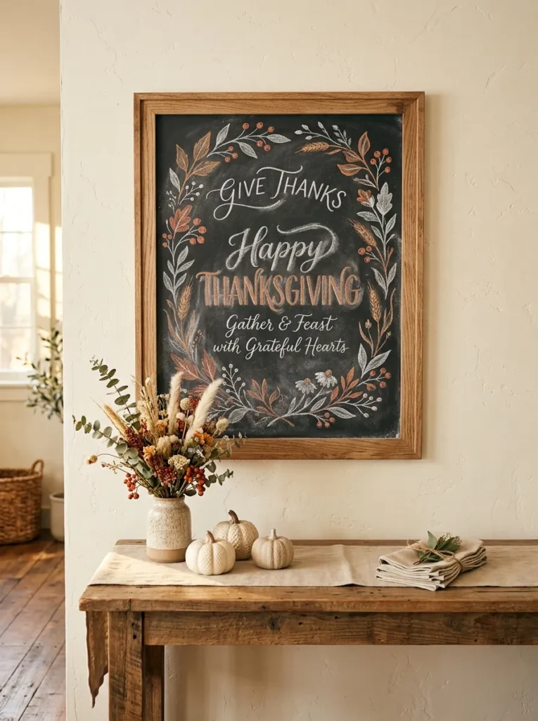
- Adds a softer botanical touch to the seasonal display.
- Floral details make simple lettering feel more decorative.
- Muted colors keep the design natural and sophisticated.
- Works beautifully with cottage and farmhouse interiors.
A floral chalk border can soften the strong contrast of a black board while adding delicate seasonal detail. Draw small flowers, leaves, berries, and curling stems around the outer edges, keeping the center clear for a short Thanksgiving message. White chalk works beautifully as the foundation, while tiny touches of muted orange, rust, or mustard can highlight selected petals and leaves. This approach brings the look of dried florals onto the board without requiring actual arrangements. It works especially well in dining rooms, entryways, kitchens, and living spaces with neutral or natural decor.
For a balanced composition, avoid making every flower identical or evenly spaced. Let some stems curve inward while others remain close to the frame, creating a relaxed hand-drawn appearance. I’ve noticed that botanical chalk designs look especially attractive when paired with real dried flowers nearby. Place the board beside a ceramic vase, woven basket, or small cluster of ivory pumpkins to repeat the natural textures. Keep the accessories low enough that they do not hide the artwork. Soft afternoon light can highlight the chalk details beautifully, while warm evening illumination gives the display a cozy seasonal glow.
Easel Entry Sign
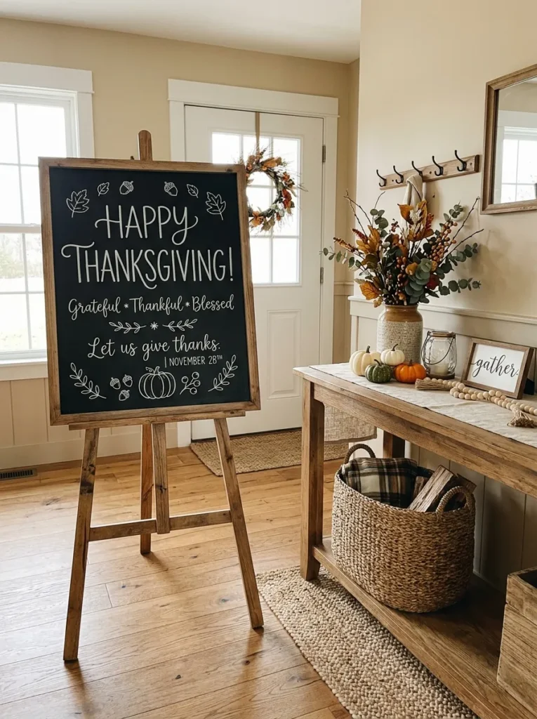
- Creates an immediate focal point near the entrance.
- An easel makes the board easy to reposition.
- Vertical height fills unused wall space effectively.
- Small accessories make the entry feel finished.
An easel-mounted chalkboard can make an entryway feel decorated without requiring permanent wall installation. Choose a tall board with a natural wood frame, then add a short welcome message, seasonal phrase, or simple leaf illustration. Position it beside a console table, near the front door, or at the entrance to the dining room so guests notice it immediately. The vertical shape draws the eye upward and can fill an otherwise empty corner beautifully. This setup is particularly useful for renters or anyone who likes changing seasonal decorations without putting holes in the walls.
Keep the floor area around the easel open so the display does not interfere with movement through the entryway. A small basket, ceramic vase, or collection of miniature pumpkins can sit beside the legs to anchor the arrangement visually. In my experience, natural wood easels blend more easily with seasonal decor than highly polished metal versions. Choose chalk lettering that is large enough to read from several feet away, then add only a few decorative leaves. Warm lighting from a nearby lamp or pendant can make the board especially inviting during evening arrivals.
Layered Pumpkin Art
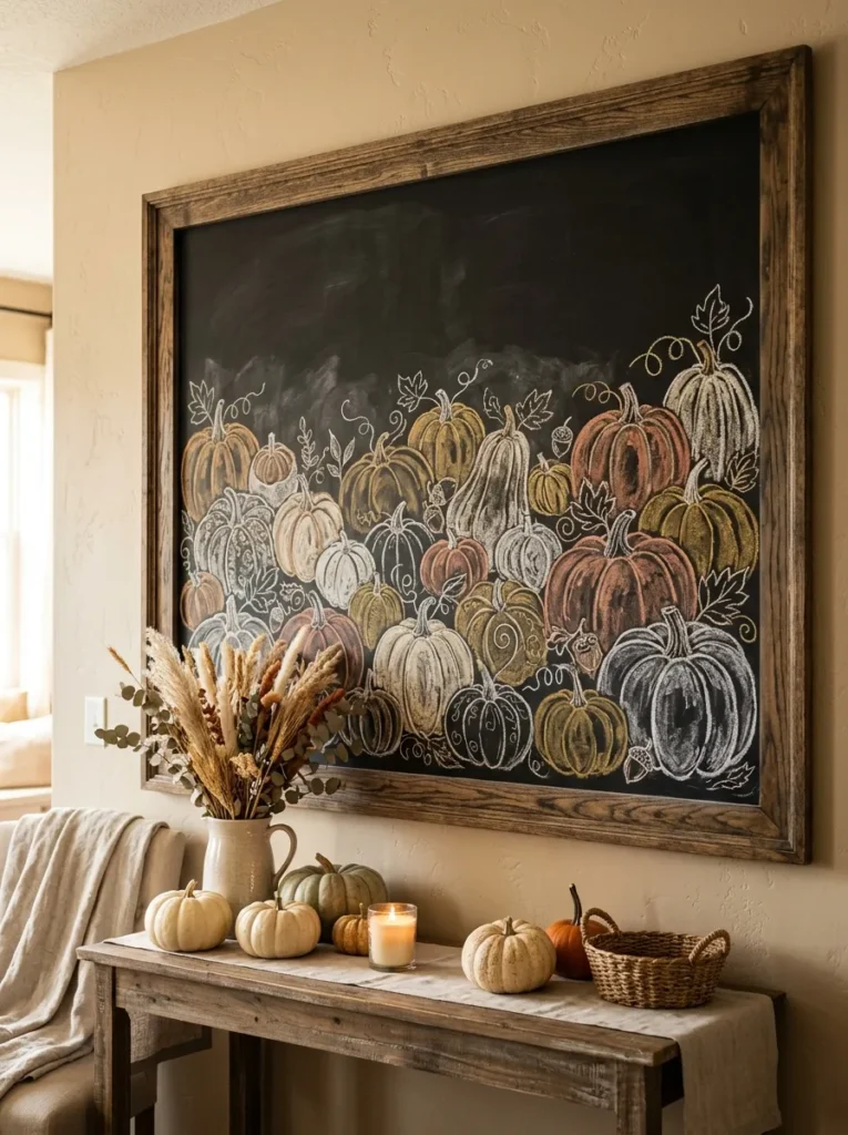
- Creates depth through overlapping seasonal illustrations.
- Different pumpkin sizes make the artwork more dynamic.
- Limited colors keep the composition coordinated.
- Works as a focal point above consoles or buffets.
Layer several chalk-drawn pumpkins across the lower portion of a board to create a dimensional autumn display. Use different sizes and shapes, allowing some pumpkins to overlap while keeping the upper area open for a short message. White chalk can define the main outlines, while muted orange, cream, and mustard add gentle color variation. Small leaves and curling vines can fill the gaps without overwhelming the composition. This arrangement works especially well above a console, behind a buffet, or on an easel where the artwork can become a strong seasonal focal point.
Start with the largest pumpkins first, then add smaller ones around them to create a natural layered effect. Avoid placing every pumpkin in a straight line because varied heights will make the drawing feel more organic. I’ve noticed that using only a few coordinated chalk colors makes illustrated boards look more polished and easier to match with existing decorations. Add real pumpkins, dried grasses, or a woven basket near the bottom of the display to extend the artwork into the room. The combination creates a festive harvest scene while keeping the overall styling warm and approachable.
Conclusion
A beautiful Thanksgiving display does not have to be complicated or expensive. These thanksgiving chalkboard ideas show how simple lettering, seasonal drawings, natural textures, and thoughtful placement can transform everyday spaces into inviting holiday settings. Choose one idea that fits your style, then make it your own with colors, messages, and decorations you already love. I’ve seen how small changes like a handmade sign or simple harvest illustration can completely transform a space. Save this post on Pinterest so you can revisit these ideas when decorating, try your favorite design at home, and share the inspiration with someone planning their own Thanksgiving gathering.