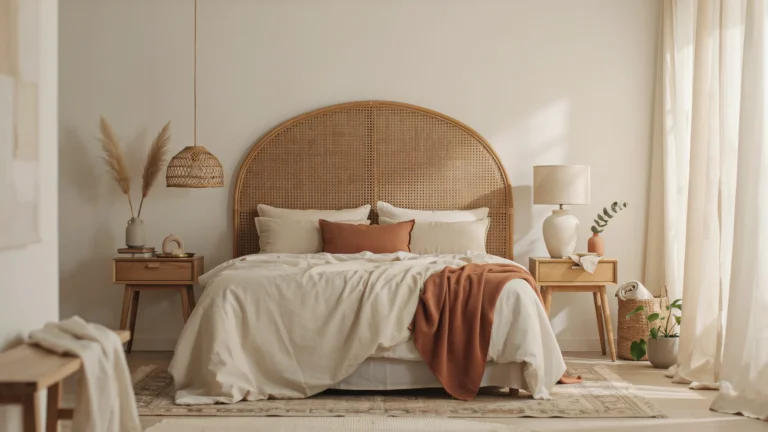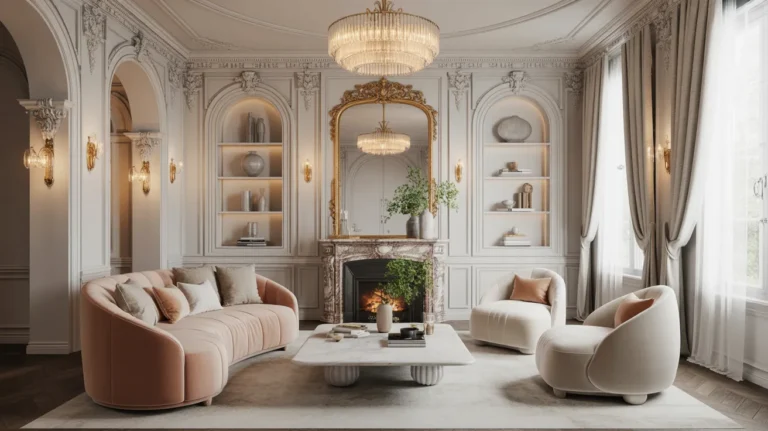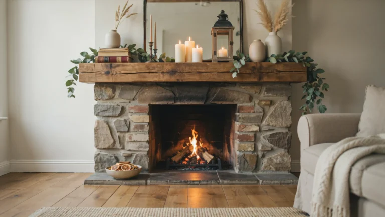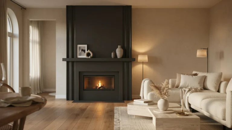
24 Inspiring 2026 Paint Color Trends for Every Room
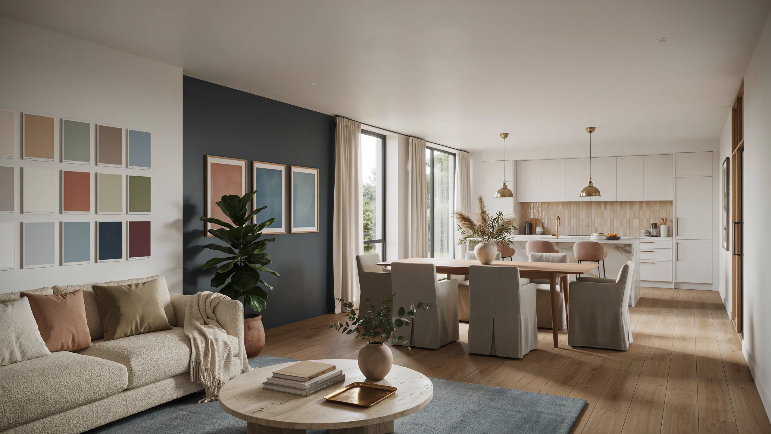
Choosing the right paint color can completely transform the mood, style, and personality of a room. The latest 2026 Paint Color Trends are moving beyond basic neutrals, bringing together warm earthy shades, calming nature-inspired hues, sophisticated dark tones, and soft timeless colors that make every space feel more inviting. Whether you’re refreshing a single accent wall or planning a complete room makeover, the right color can create a noticeable difference without requiring a major renovation.
In this guide, you’ll discover 24 inspiring 2026 Paint Color Trends for bedrooms, living rooms, kitchens, bathrooms, home offices, and more. From warm sandstone and muted sage to stormy blue, rich aubergine, creamy mocha, and cloud white, these shades offer plenty of inspiration for every decorating style. If you’re ready to give your home a fresh new look, these beautiful paint colors can help you create spaces that feel comfortable, stylish, personal, and effortlessly modern.
Warm Sandstone
- Creates a soft and welcoming atmosphere without feeling overly beige.
- Pairs beautifully with wood, stone, and natural fiber textures.
- Helps rooms feel brighter while maintaining warmth.
- Works well in both modern and traditional interiors.
- Makes seasonal decor changes easier throughout the year.
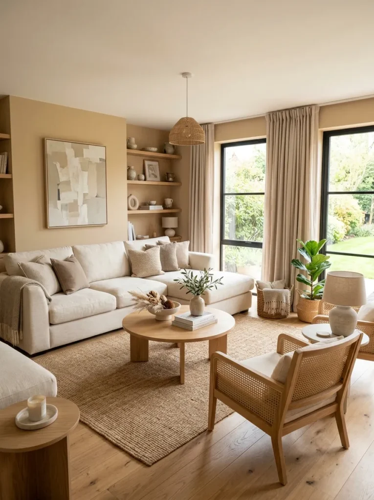
A warm sandstone shade instantly makes a room feel calm, balanced, and inviting. Unlike cooler neutrals that can sometimes feel stark, this earthy tone adds gentle warmth while still keeping the space light and open. It works especially well in living rooms, entryways, and family spaces where comfort matters most. The subtle depth of the color helps furniture and decorative accents stand out naturally. When paired with natural wood finishes and textured fabrics, the overall look feels effortless, timeless, and perfectly suited to evolving interior design preferences.
One reason this color continues gaining attention is its flexibility across different decorating styles. Whether your home leans modern, farmhouse, coastal, or transitional, sandstone tones blend smoothly with existing furnishings. I’ve noticed this works especially well in homes that receive varying amounts of daylight throughout the day. The color shifts beautifully under changing light conditions without looking dull. As homeowners explore fresh interior palettes inspired by 2026 Paint Color Trends, warm sandstone offers a practical solution that feels current while remaining classic enough to enjoy for many years.
Muted Sage
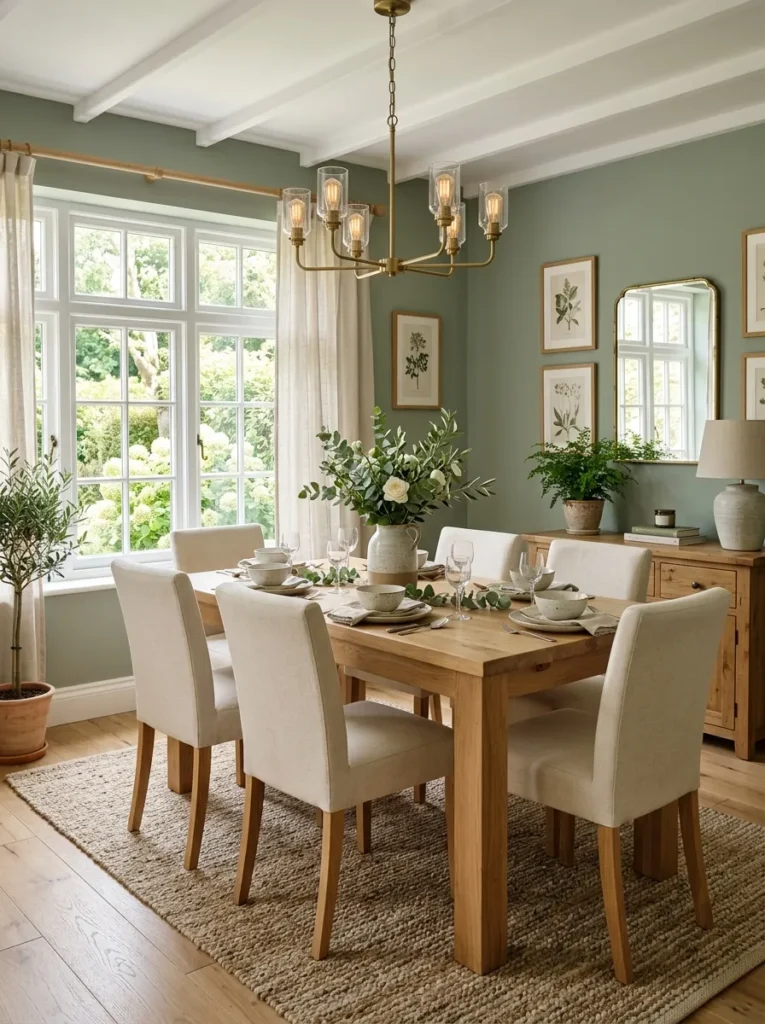
- Introduces color without overwhelming the room.
- Brings a natural and relaxing feeling indoors.
- Complements warm metals and wood finishes beautifully.
- Helps dining and gathering spaces feel more comfortable.
- Adds visual interest while remaining easy to decorate around.
Muted sage remains one of the easiest ways to bring nature-inspired color into a home. The gentle green tone feels soothing, fresh, and highly adaptable, making it suitable for dining rooms, bedrooms, and home offices alike. Instead of dominating a room, it quietly enhances surrounding materials and textures. Natural wood furniture appears richer against sage walls, while soft textiles create an inviting layered effect. The result is a balanced environment that feels both stylish and livable, making everyday spaces more enjoyable without requiring dramatic design changes.
What makes muted sage especially appealing is its ability to stay relevant through changing trends. That’s why many designers recommend it for homeowners seeking long-term value from a paint update. In my experience, this shade works particularly well when combined with warm whites and subtle botanical decor. It creates visual calm while still offering enough personality to prevent a room from feeling plain. The color supports a connection to nature that many people now seek inside their homes, helping create peaceful spaces that encourage relaxation and comfort.
Dusty Clay
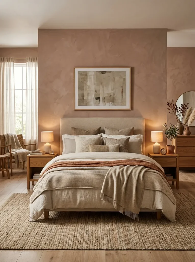
- Adds warmth and depth without using dark colors.
- Creates a cozy atmosphere ideal for bedrooms.
- Pairs naturally with earthy and neutral palettes.
- Gives plain spaces more character and dimension.
- Works beautifully with layered textures and soft lighting.
Dusty clay introduces an earthy richness that instantly makes a room feel more grounded. This warm, muted tone sits between terracotta and neutral beige, creating a sophisticated balance that feels modern yet approachable. Bedrooms benefit especially from its cozy character because the color encourages relaxation without making the space feel heavy. Soft textiles, wood furnishings, and layered lighting all become more noticeable against this backdrop. The result is a room that feels thoughtfully designed while maintaining a comfortable and welcoming atmosphere for everyday living.
Many homeowners are moving toward colors that feel connected to nature, and dusty clay fits that direction perfectly. I’ve seen this work well in both compact bedrooms and larger primary suites because it adds depth without visually shrinking the space. The shade creates subtle contrast with lighter furnishings while supporting a warm overall palette. As color forecasting continues to highlight earthy influences within 2026 Paint Color Trends, dusty clay stands out as a practical option that delivers personality, comfort, and lasting visual appeal without feeling overly bold.
Misty Blue
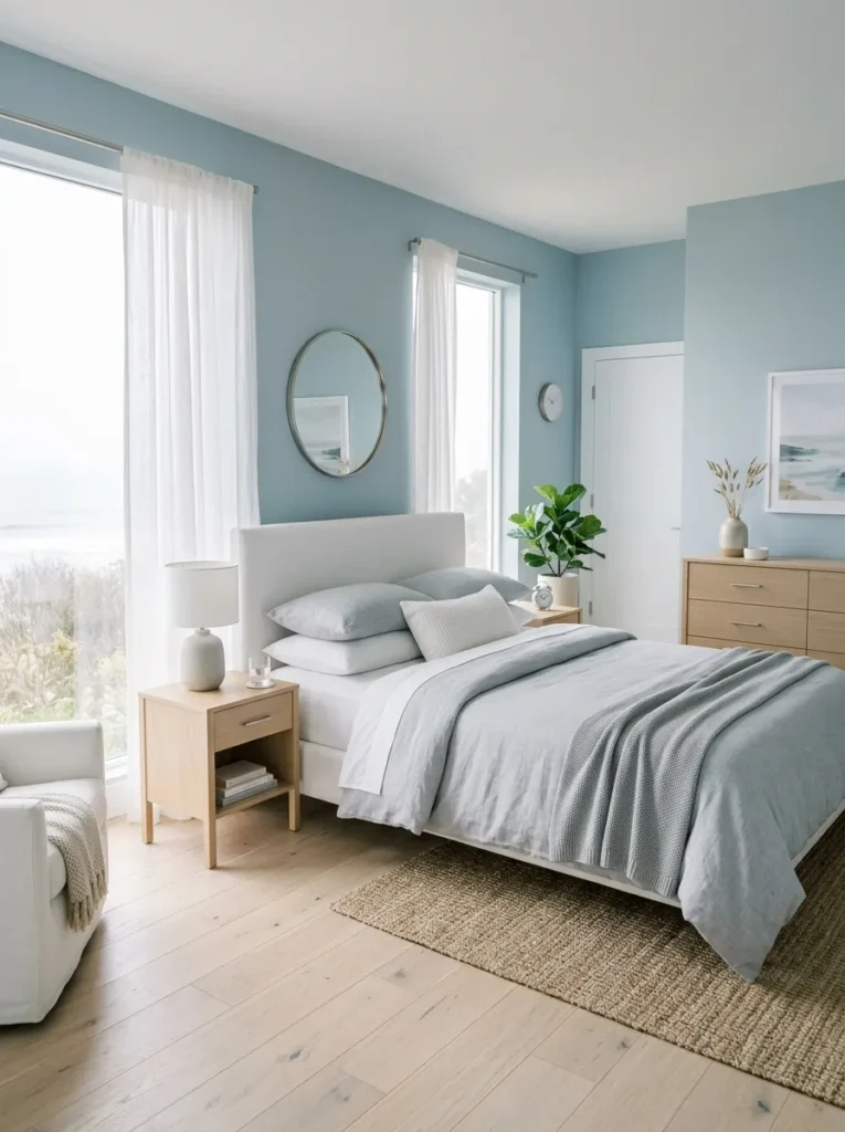
- Creates a peaceful atmosphere for rest and relaxation.
- Makes smaller rooms feel more open and airy.
- Pairs effortlessly with white, gray, and natural wood tones.
- Adds subtle color without overwhelming the space.
- Works well in bedrooms, bathrooms, and reading corners.
Misty blue offers the perfect balance between color and neutrality, making it an easy choice for homeowners who want something fresh without going too bold. The soft tone reflects light beautifully and helps create a calm visual flow throughout the room. Bedrooms especially benefit from its soothing character because the color encourages a sense of quiet and comfort. Combined with crisp white trim and natural textures, the overall effect feels clean, modern, and timeless. This versatile shade can easily adapt to changing decor styles without requiring a complete room makeover.
One of the reasons misty blue remains popular is its ability to create a relaxing environment while still feeling sophisticated. I’ve noticed that rooms painted in soft blue tones often feel brighter and more spacious, particularly when paired with simple furnishings. The shade also works across multiple design styles, from coastal-inspired interiors to contemporary spaces. Homeowners looking beyond basic neutrals often appreciate how approachable this color feels. It delivers enough personality to feel intentional while maintaining the calm atmosphere many people want in their most-used living spaces.
Soft Olive
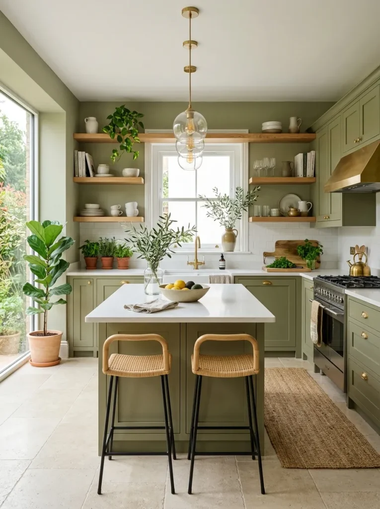
- Brings an organic and sophisticated feel to interiors.
- Complements stone, wood, and brass finishes naturally.
- Adds depth without appearing too dark.
- Creates a welcoming and grounded atmosphere.
- Blends beautifully with both modern and rustic decor.
Soft olive introduces a deeper nature-inspired look while remaining surprisingly versatile. The muted green undertone adds richness to kitchens, dining areas, and living rooms without becoming visually overpowering. This color works particularly well alongside natural materials, allowing wood grains, stone surfaces, and metallic accents to stand out beautifully. The overall result feels curated yet approachable. Homeowners often appreciate how soft olive provides more personality than traditional neutrals while still maintaining the flexibility needed for seasonal decorating and evolving interior preferences.
A major advantage of soft olive is its ability to feel both current and enduring. That’s why many designers recommend it as an alternative to gray-based palettes that have dominated interiors for years. In my experience, olive shades perform especially well in rooms with abundant natural light because the color reveals subtle depth throughout the day. It creates a comfortable backdrop that feels connected to nature while remaining elegant. This balance of warmth, sophistication, and practicality continues to make olive-inspired hues increasingly attractive for modern homes.
Creamy Mocha
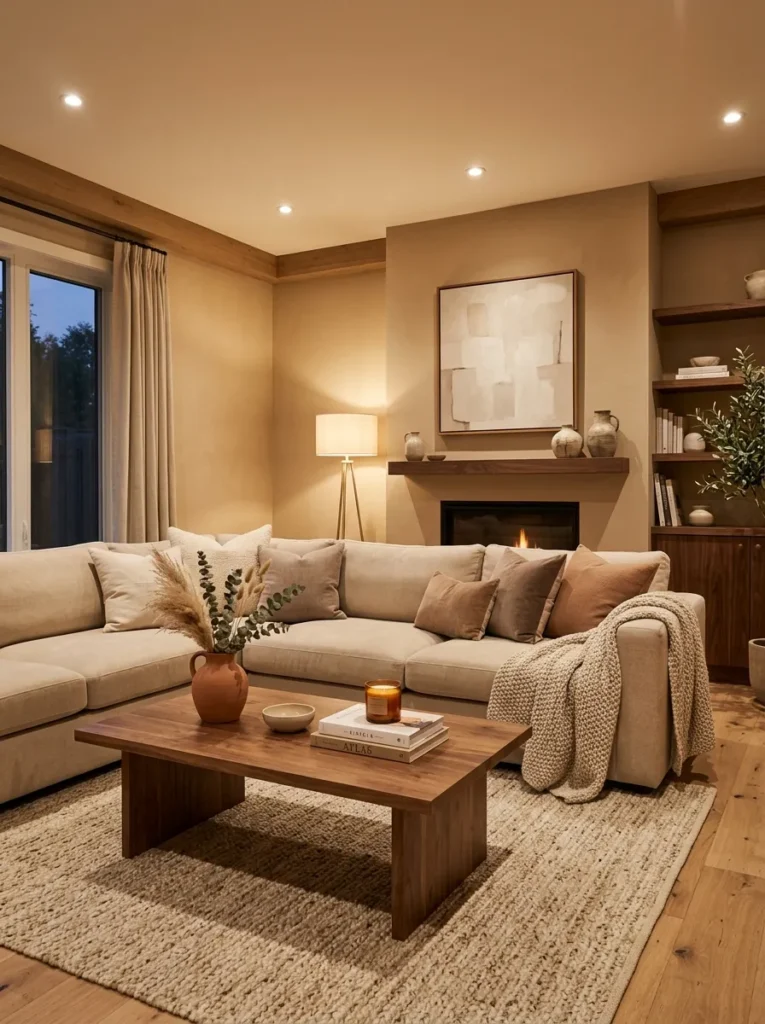
- Adds warmth without making a room feel dark.
- Creates a cozy and upscale appearance.
- Works beautifully with layered neutral decor.
- Enhances wood furniture and textured materials.
- Helps large spaces feel more comfortable and inviting.
Creamy mocha delivers a rich neutral look that feels welcoming from the moment you enter the room. The soft brown undertones provide warmth and depth while maintaining enough brightness to keep spaces feeling open. Living rooms, family rooms, and home offices benefit particularly well from this color because it creates a sense of comfort without sacrificing elegance. Paired with natural woods, woven textures, and soft fabrics, creamy mocha produces a layered aesthetic that feels thoughtfully designed yet easy to live with every day.
As homeowners continue exploring warmer interior palettes, creamy mocha has emerged as a favorite among the evolving 2026 Paint Color Trends. Its versatility allows it to work equally well with contemporary furniture and more traditional pieces. I’ve seen this work well in homes where homeowners wanted a richer alternative to plain white walls but still needed a neutral foundation. The color adds visual depth while helping furnishings feel more connected. This creates a polished appearance that remains comfortable, practical, and highly adaptable for future decorating changes.
Smoky Lavender
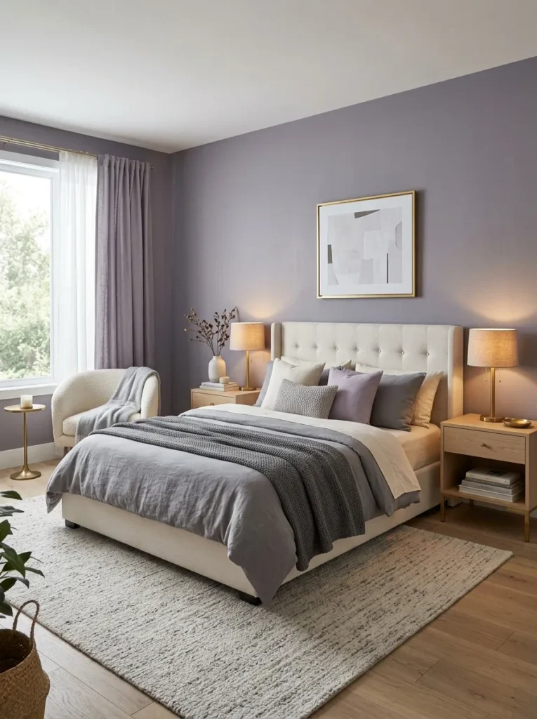
- Introduces subtle color while maintaining a refined look.
- Creates a relaxing environment without feeling overly feminine.
- Pairs beautifully with warm metals and soft neutrals.
- Adds personality to bedrooms and reading spaces.
- Enhances layered textures and soft lighting.
Smoky lavender offers a fresh alternative to traditional neutrals while maintaining a sophisticated and calming presence. The muted purple-gray blend feels soft rather than dramatic, making it suitable for bedrooms, guest rooms, and quiet retreats. Its understated character allows furniture, textiles, and decorative accents to shine without competing for attention. When paired with warm metallic finishes and natural textures, the color creates an elevated look that feels both modern and welcoming. The result is a space that feels thoughtfully curated while remaining comfortable for everyday living.
What makes smoky lavender especially appealing is its ability to add uniqueness without overwhelming a room. I’ve noticed many homeowners hesitate to use purple tones because they fear the result will feel dated or overly decorative. This softer version avoids that issue entirely. Instead, it introduces subtle depth and visual interest while maintaining balance. As color palettes continue shifting toward nuanced and layered shades, smoky lavender provides an approachable way to experiment with color while preserving the calm and flexibility most people want throughout their homes.
Deep Charcoal
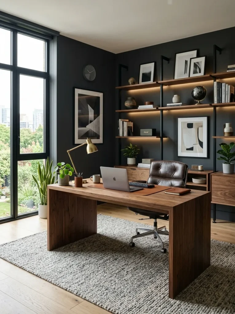
- Creates strong contrast and visual depth.
- Makes artwork and decor stand out dramatically.
- Adds sophistication to modern interiors.
- Works well as an accent wall or full-room color.
- Balances lighter furnishings beautifully.
Deep charcoal continues to attract attention because it brings instant sophistication and structure to a space. Unlike pure black, charcoal offers richness and depth while remaining easier to decorate around. It works exceptionally well in home offices, dining rooms, and living spaces where a more dramatic atmosphere is desired. Light-colored furniture and natural wood finishes become more prominent against darker walls, creating striking visual balance. The color also helps define architectural features, giving rooms a polished appearance that feels intentional and professionally designed.
A common misconception is that dark paint automatically makes a room feel smaller. In my experience, that depends more on lighting and overall design choices than the color itself. Deep charcoal often creates a sense of depth that can actually make walls feel less defined. That’s why many designers recommend it for creating cozy yet elegant spaces. When paired with layered lighting, reflective surfaces, and contrasting furnishings, the result feels luxurious rather than heavy. This versatility keeps charcoal-inspired shades relevant across a wide range of interior styles.
Pale Peach
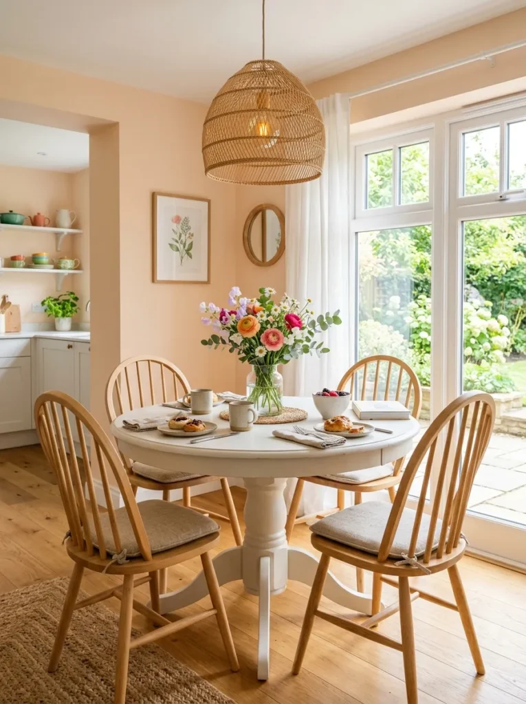
- Adds warmth while keeping spaces bright and fresh.
- Creates a welcoming atmosphere for gathering areas.
- Softens rooms that feel cold or overly neutral.
- Works beautifully with white and light wood finishes.
- Brings a gentle touch of color without overpowering decor.
Pale peach is making a quiet comeback thanks to its ability to create warmth without becoming overly vibrant. This soft shade brings a gentle glow to kitchens, breakfast nooks, and casual living spaces where comfort and brightness are priorities. The color reflects natural light beautifully, helping rooms feel cheerful throughout the day. Unlike stronger orange tones, pale peach remains subtle and easy to pair with existing decor. Combined with white accents and natural materials, it creates an inviting atmosphere that feels fresh, relaxed, and effortlessly stylish.
One reason homeowners are embracing pale peach again is its ability to soften modern interiors. Many contemporary spaces feature clean lines and neutral finishes that can occasionally feel cold. A delicate peach tone introduces warmth while preserving the simplicity people love. I’ve seen this work especially well in homes with abundant natural light because the color develops a soft glow that changes throughout the day. The effect feels uplifting and comfortable without appearing trendy, making it a practical choice for long-term decorating success.
Ocean Teal
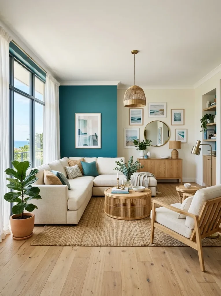
- Adds bold character without feeling overwhelming.
- Creates a refreshing focal point in living spaces.
- Pairs beautifully with warm woods and neutral furniture.
- Brings a subtle coastal influence indoors.
- Helps plain rooms feel more dynamic and intentional.
Ocean teal introduces rich color while maintaining a sense of calm and sophistication. The blend of blue and green undertones creates visual depth that instantly draws attention without dominating the entire room. Living rooms, home offices, and accent walls benefit especially from this shade because it creates a strong focal point while remaining highly versatile. Natural materials such as wood, stone, and woven textures work exceptionally well alongside teal tones. The overall effect feels fresh, balanced, and modern while still offering enough warmth to remain welcoming and comfortable.
As homeowners seek more expressive color choices, ocean teal continues gaining popularity for its ability to feel bold yet approachable. I’ve noticed it performs especially well in rooms that need additional personality but cannot support extremely bright colors. The shade changes subtly throughout the day depending on available light, creating visual interest without requiring extra decorative elements. That flexibility makes it useful across many design styles, from contemporary interiors to relaxed coastal-inspired spaces. The result is a home that feels stylish, distinctive, and thoughtfully designed.
Mushroom Taupe
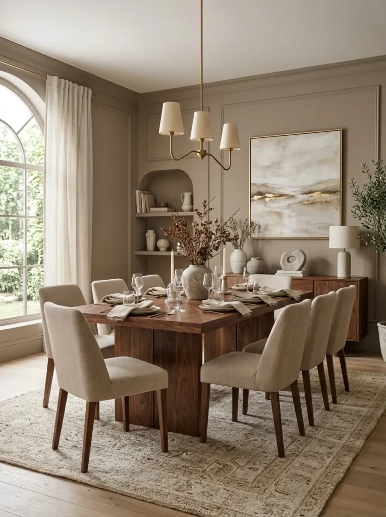
- Offers more depth than standard beige tones.
- Creates a refined and timeless backdrop.
- Works with both warm and cool decorative accents.
- Enhances layered textures throughout the room.
- Makes furniture and artwork stand out naturally.
Mushroom taupe strikes an ideal balance between warm and cool undertones, making it one of the most adaptable paint choices for modern homes. The subtle blend creates depth without becoming too dark or visually heavy. Dining rooms, hallways, and open-concept living areas particularly benefit from its versatility because it complements a wide range of furniture styles and finishes. The color provides a sophisticated foundation that allows decorative elements to stand out naturally. Its understated elegance creates a polished appearance that feels current while remaining comfortably timeless.
Many homeowners struggle to find a neutral shade that works consistently throughout multiple rooms. That is where mushroom taupe often excels. In my experience, it adapts beautifully to changing lighting conditions and different design styles. Whether paired with black accents, warm woods, or soft textiles, the color remains balanced and inviting. That’s why many designers recommend taupe-inspired palettes for large spaces where consistency matters. The shade offers enough character to avoid feeling plain while maintaining the flexibility needed for future decorating updates and seasonal changes.
Buttercream Yellow
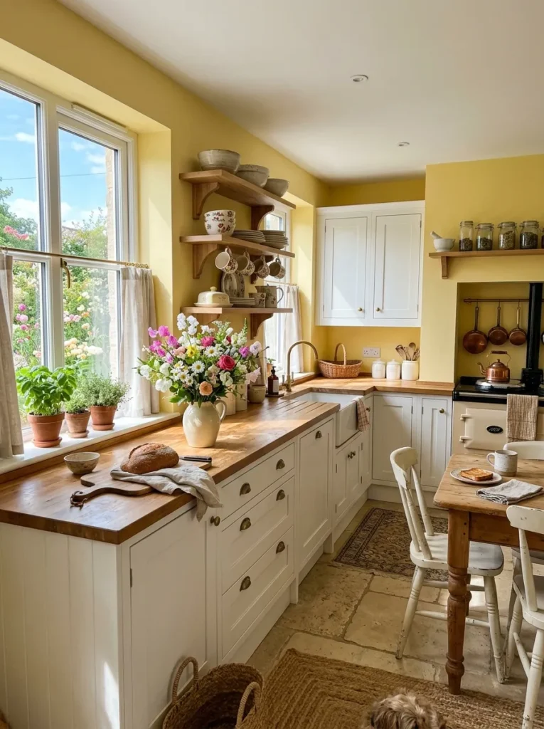
- Brightens rooms without using stark white paint.
- Creates a cheerful and welcoming environment.
- Works beautifully in kitchens and breakfast areas.
- Reflects natural light for an airy appearance.
- Adds warmth while maintaining a soft neutral feel.
Buttercream yellow brings gentle optimism into a home without the intensity often associated with traditional yellow shades. The creamy undertones create warmth while keeping the overall look soft and sophisticated. Kitchens, breakfast nooks, and family gathering spaces benefit particularly well because the color encourages a welcoming atmosphere. Natural light enhances its subtle glow, helping rooms feel brighter and more open throughout the day. Combined with white cabinetry and wood accents, buttercream yellow creates a comfortable setting that feels cheerful without becoming visually overwhelming.
One reason this color is receiving renewed attention is its ability to make everyday spaces feel more uplifting. I’ve seen this work well in homes where homeowners wanted extra brightness but found pure white walls too stark. The warmth creates a softer visual experience while still reflecting plenty of light. As more people explore comforting color palettes inspired by modern living, buttercream yellow offers a practical balance between personality and versatility. It feels inviting, approachable, and easy to incorporate into a variety of decorating styles.
Stormy Blue
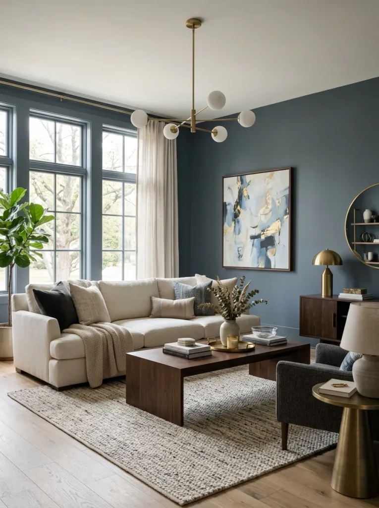
- Creates depth without using extremely dark colors.
- Adds sophistication to modern and traditional interiors.
- Works beautifully with warm metallic finishes.
- Enhances contrast with light furnishings.
- Makes large spaces feel more intimate and polished.
Stormy blue offers a rich, grounded look that instantly elevates a room. The muted blend of gray and blue creates a sophisticated atmosphere while remaining surprisingly versatile. Living rooms, dining areas, and home offices benefit particularly well from this shade because it introduces depth without overwhelming the space. Light-colored furniture appears brighter against the darker backdrop, creating balanced contrast and visual interest. The color also highlights architectural details beautifully, helping rooms feel more refined and thoughtfully designed without requiring extensive decorating changes.
A major reason homeowners continue choosing stormy blue is its ability to feel dramatic while remaining highly livable. I’ve noticed it performs especially well in rooms with generous natural light, where subtle color shifts appear throughout the day. That’s why many designers recommend it as a modern alternative to traditional navy shades. The color creates a strong visual foundation while maintaining enough softness to avoid feeling heavy. This combination of elegance, versatility, and comfort makes stormy blue a dependable choice for long-term interior updates.
Terracotta Blush
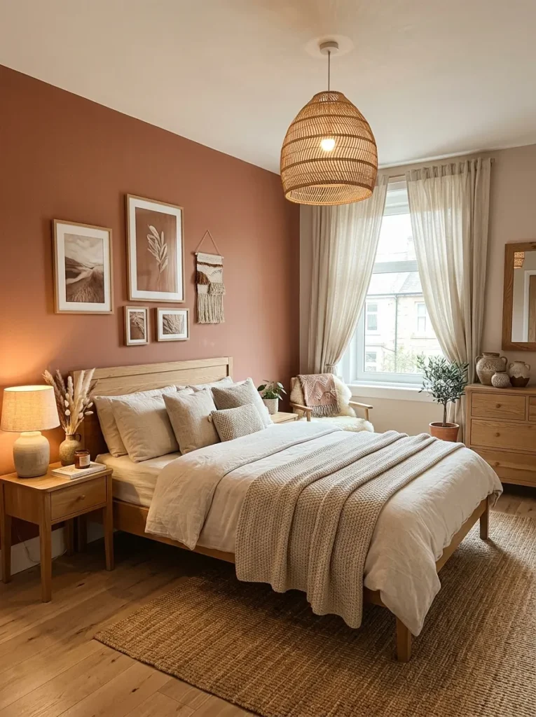
- Adds warmth and personality without overpowering the room.
- Creates a cozy atmosphere with an earthy touch.
- Complements natural materials beautifully.
- Works well with both modern and rustic decor.
- Makes bedrooms feel more inviting and relaxed.
Terracotta blush combines earthy warmth with soft elegance, creating a color that feels both modern and timeless. The subtle clay-inspired undertones bring character to bedrooms, reading nooks, and living spaces while remaining easy to decorate around. Unlike stronger terracotta shades, this softer version introduces warmth without dominating the room. Natural wood furniture, woven textures, and neutral textiles pair especially well with its earthy appearance. The result is a comfortable environment that feels welcoming, layered, and visually balanced throughout every season.
As interior palettes continue shifting toward nature-inspired influences, terracotta blush stands out for its versatility and warmth. I’ve seen this work well in homes where owners wanted more personality than beige but less intensity than traditional orange tones. The color creates depth while maintaining softness, helping spaces feel relaxed rather than overly designed. Its ability to complement a wide range of finishes makes it particularly useful for homeowners who enjoy updating decor over time. The overall effect feels authentic, grounded, and effortlessly stylish.
Silver Mist
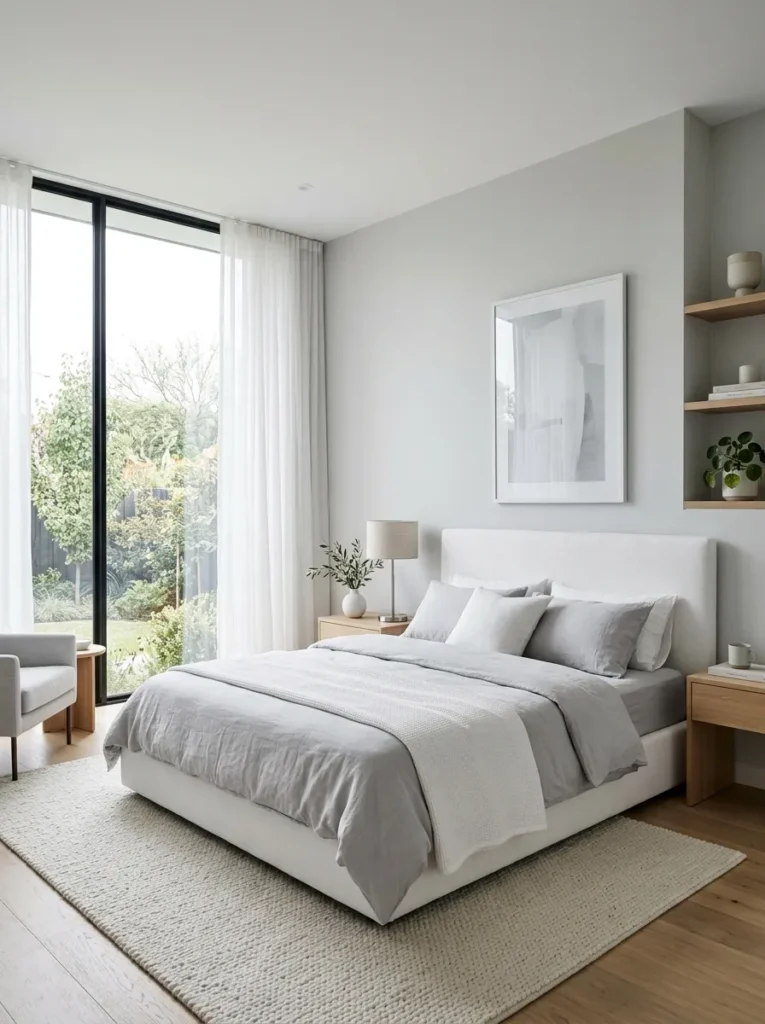
- Creates a clean and modern appearance.
- Helps rooms feel larger and brighter.
- Pairs effortlessly with nearly any accent color.
- Provides a fresh alternative to plain white walls.
- Supports a calm and uncluttered atmosphere.
Silver mist delivers a crisp, airy look that works beautifully in both contemporary and transitional homes. The delicate blend of gray and soft silver undertones creates visual interest while maintaining a light, spacious feel. Bedrooms, hallways, and open living areas often benefit from this shade because it reflects light effectively without appearing stark. Decorative accents become more noticeable against its subtle backdrop, allowing homeowners to introduce seasonal colors and personal style with ease. The overall result feels fresh, clean, and highly adaptable.
One of the strongest advantages of silver mist is its remarkable flexibility. In my experience, it serves as an excellent foundation for homeowners who frequently refresh their decor or furnishings. The color remains neutral enough to support changing design preferences while still offering more personality than standard white paint. As homeowners continue exploring updated interior palettes and evolving 2026 Paint Color Trends, silver mist provides a practical option that feels modern, bright, and timeless. Its understated elegance makes it suitable for nearly every room in the home.
Forest Moss
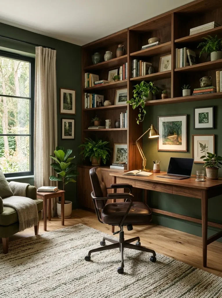
- Creates a rich and grounded atmosphere.
- Brings a strong connection to nature indoors.
- Works beautifully with wood and leather furnishings.
- Adds depth without feeling overly dark.
- Makes workspaces feel more focused and inviting.
Forest moss brings an earthy richness that instantly adds character to a room. The deep green tone feels connected to nature while maintaining a refined and sophisticated appearance. Home offices, libraries, and living rooms benefit especially from this color because it creates a sense of comfort and focus. Natural wood furniture appears warmer against the green backdrop, while layered textures add visual depth. The result is a balanced environment that feels cozy, welcoming, and thoughtfully designed without relying on bold decorative elements.
One reason forest moss continues attracting attention is its ability to make spaces feel grounded and timeless. I’ve noticed that darker green shades often create a calming effect that encourages relaxation and concentration. That’s why many designers recommend them for rooms where people spend extended periods working or unwinding. The color changes subtly throughout the day as lighting conditions shift, adding natural visual interest. This combination of warmth, sophistication, and practicality helps forest moss remain a favorite among homeowners seeking lasting design appeal.
Champagne Beige
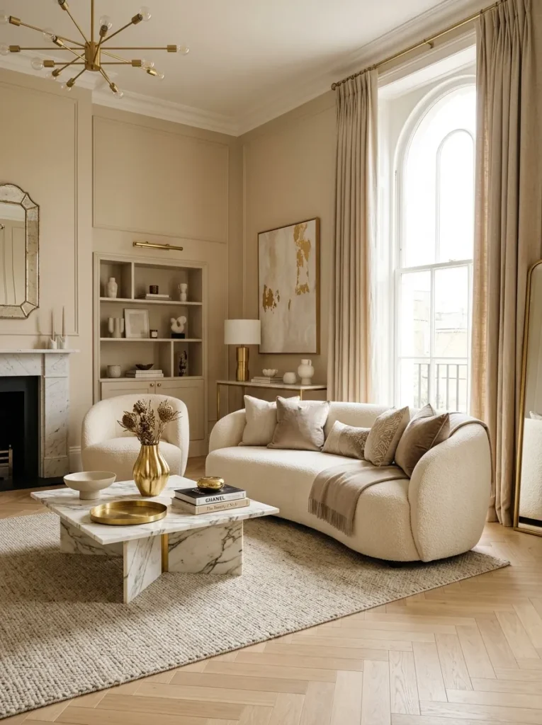
- Creates a luxurious look without feeling formal.
- Adds warmth while maintaining brightness.
- Works seamlessly with modern and classic decor.
- Enhances metallic finishes and natural textures.
- Provides a timeless neutral foundation.
Champagne beige offers a sophisticated alternative to standard neutral paint colors. Its subtle warm undertones create a soft glow that makes interiors feel elegant yet approachable. Living rooms, entryways, and primary bedrooms benefit especially from this shade because it balances brightness with warmth. Decorative elements such as brass accents, marble surfaces, and textured fabrics stand out beautifully against the refined backdrop. The overall effect feels polished and inviting, helping homeowners achieve a high-end appearance without requiring major design changes or expensive renovations.
Many people choose champagne beige because it delivers versatility without looking plain. In my experience, this shade adapts effortlessly to changing furniture styles and decorative trends. It creates enough warmth to avoid the cold feeling some neutrals can produce while remaining light enough to keep rooms open and airy. The color also performs exceptionally well under both natural and artificial lighting. This flexibility makes champagne beige a dependable choice for homeowners seeking a long-lasting paint color that feels stylish, practical, and universally appealing.
Midnight Plum
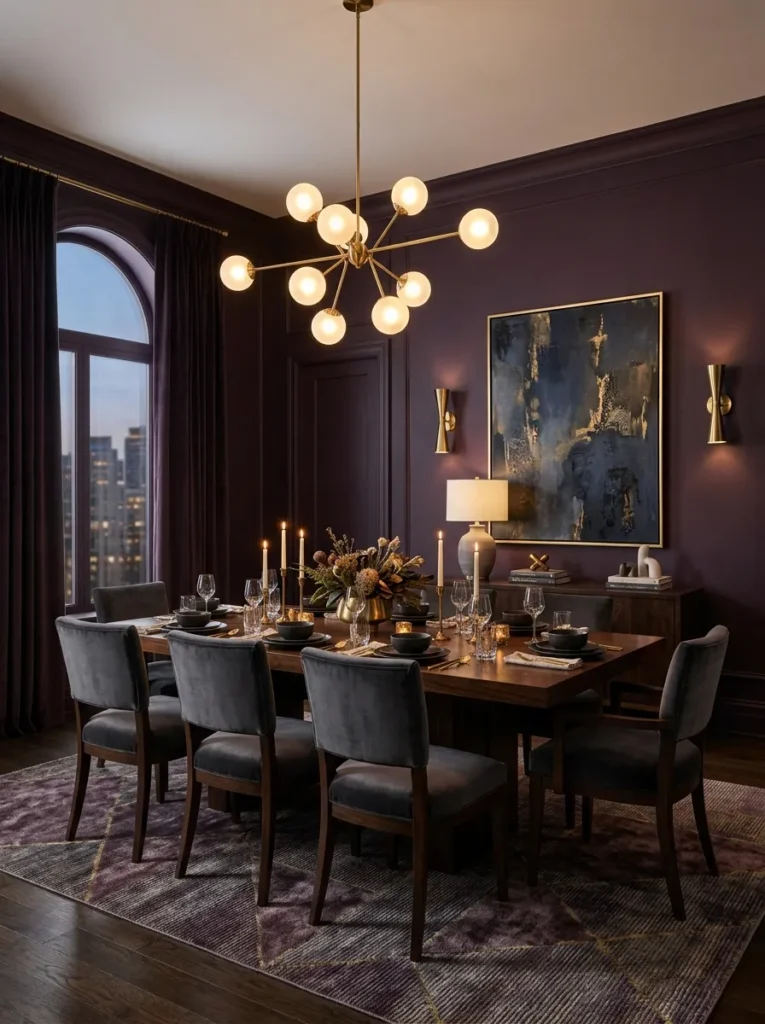
- Introduces dramatic color with a refined feel.
- Creates an elegant focal point in entertaining spaces.
- Pairs beautifully with gold and wood finishes.
- Adds richness and visual depth.
- Makes rooms feel distinctive and memorable.
Midnight plum is a bold yet sophisticated color that instantly transforms a room. The rich blend of deep purple and subtle gray undertones creates dramatic depth while maintaining elegance. Dining rooms, accent walls, and formal living spaces often benefit most because the color establishes a strong visual presence without appearing overwhelming. Warm lighting enhances its richness, while metallic accents add extra dimension. The result is a space that feels luxurious, inviting, and intentionally designed to leave a lasting impression on guests and family members alike.
Homeowners looking for something beyond traditional dark neutrals often find midnight plum surprisingly versatile. I’ve seen this work well in homes where people wanted dramatic color but still needed a sophisticated overall appearance. The shade pairs effortlessly with natural woods, soft neutrals, and warm metallic finishes. That’s why many designers recommend it for creating statement spaces that feel current yet timeless. Its ability to add personality, depth, and elegance makes midnight plum a standout choice for homeowners seeking a distinctive interior update.
Cloud White
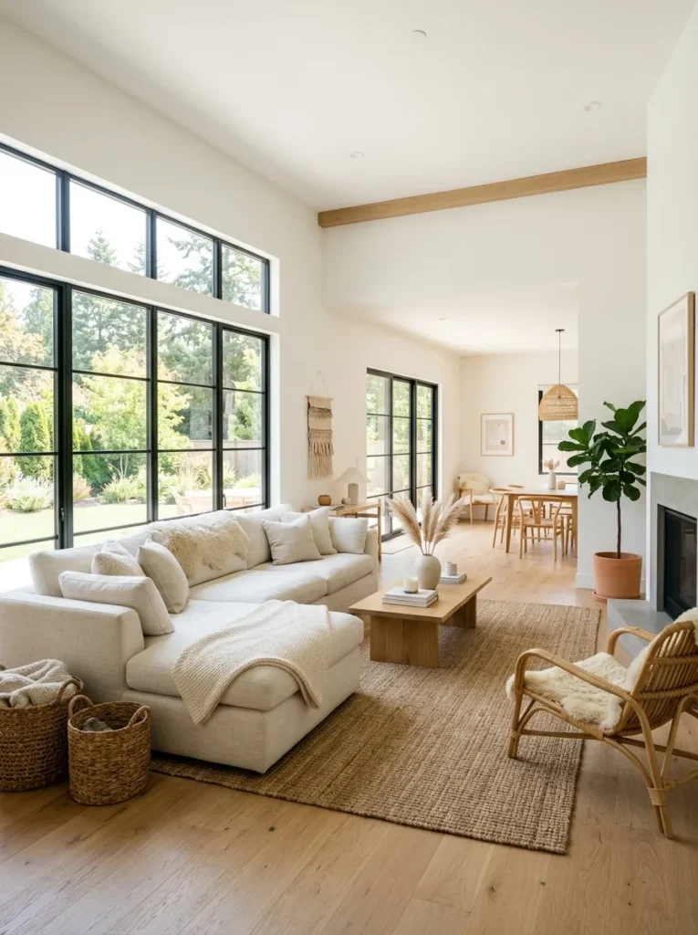
- Creates a clean and timeless foundation.
- Makes rooms feel larger and brighter.
- Works with virtually every decorating style.
- Allows furniture and decor to stand out naturally.
- Reflects light beautifully throughout the day.
Cloud white remains a favorite because it delivers a fresh, open feeling without appearing harsh or sterile. Unlike cooler whites that can sometimes feel clinical, this softer shade introduces warmth while maintaining a bright appearance. Living rooms, kitchens, and open-concept spaces benefit especially from its ability to maximize natural light. Decorative accents, artwork, and furniture become more noticeable against the simple backdrop. The overall result feels airy, welcoming, and adaptable, making it easier for homeowners to update their style without needing to repaint frequently.
One of the greatest strengths of cloud white is its flexibility. I’ve noticed that homeowners often return to this shade because it works equally well in modern, traditional, farmhouse, and minimalist interiors. The color provides a sense of visual clarity while helping smaller rooms appear more spacious. That’s why many designers recommend soft white tones as a reliable long-term choice. Whether paired with bold accents or neutral decor, cloud white creates a balanced environment that feels bright, comfortable, and effortlessly sophisticated throughout every season.
Cinnamon Clay
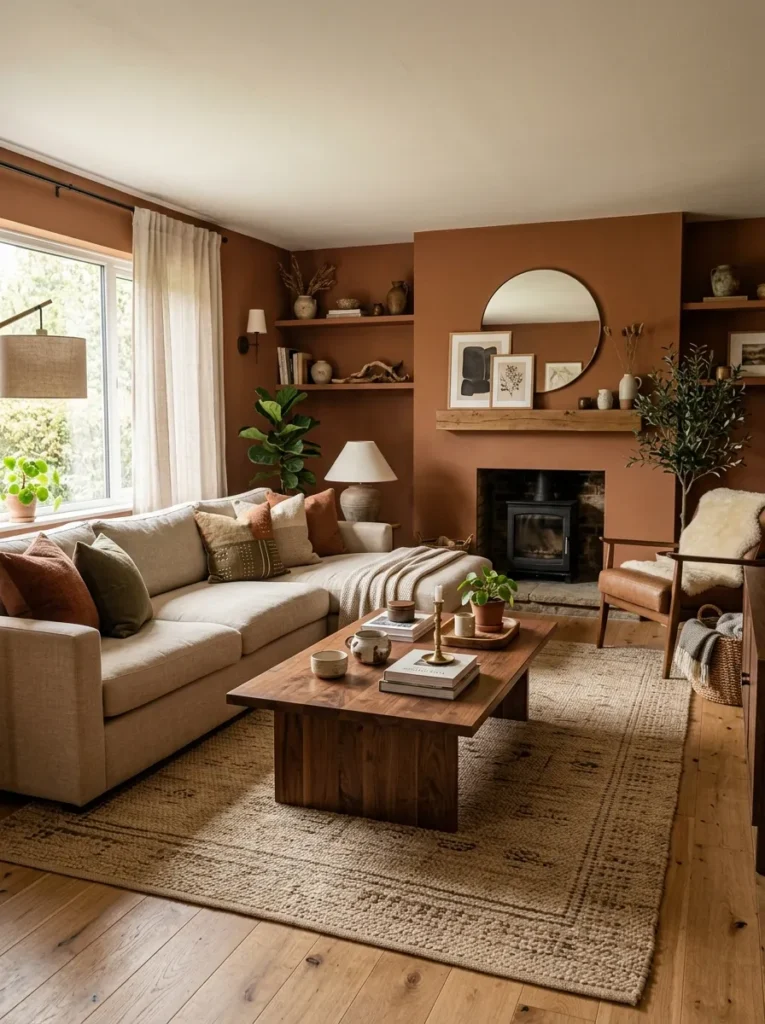
- Adds warmth and richness to everyday spaces.
- Creates a cozy atmosphere without darkening the room.
- Works beautifully with earthy materials and textures.
- Introduces character while remaining easy to decorate around.
- Helps large rooms feel more inviting.
Cinnamon clay delivers a warm and welcoming appearance that instantly makes interiors feel more comfortable. The earthy blend of brown and soft terracotta undertones creates visual depth while maintaining a balanced, approachable look. Family rooms, dining spaces, and bedrooms benefit particularly well because the color encourages relaxation and connection. Wood furniture, woven textures, and natural fabrics all appear richer against this backdrop. The overall effect feels grounded and authentic, helping create a home environment that is both stylish and comfortable for daily living.
As more homeowners embrace nature-inspired palettes, cinnamon clay continues gaining attention for its versatility and warmth. In my experience, this shade works especially well in spaces that previously felt plain or lacking personality. It introduces subtle richness without overwhelming the room or limiting future decorating choices. The color adapts beautifully to different lighting conditions, creating depth throughout the day. This balance between comfort, character, and practicality makes cinnamon clay a valuable option for homeowners seeking a meaningful yet timeless interior update.
Dusty Aqua
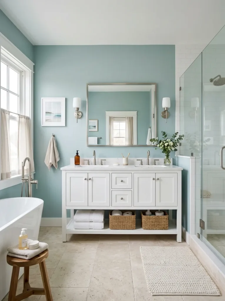
- Brings a refreshing and calming energy.
- Adds subtle color without feeling overwhelming.
- Works beautifully in bathrooms and bedrooms.
- Pairs well with white, stone, and wood finishes.
- Creates a light and airy atmosphere.
Dusty aqua combines the calming qualities of blue with the freshness of green, resulting in a color that feels peaceful and revitalizing. Bathrooms, guest rooms, and quiet retreat spaces particularly benefit from this gentle shade because it promotes a relaxed atmosphere. The muted tone remains soft enough to function almost like a neutral while still providing noticeable personality. White fixtures, natural wood accents, and textured materials pair beautifully with dusty aqua, creating a balanced environment that feels bright, welcoming, and visually refreshing.
Many homeowners appreciate dusty aqua because it introduces color in a way that feels approachable and timeless. I’ve seen this work well in spaces where people wanted a subtle update without committing to stronger shades. The color reflects natural light effectively and helps create a sense of openness, particularly in smaller rooms. That’s why many designers recommend muted blue-green palettes for creating calm, restorative environments. Dusty aqua delivers that effect while remaining flexible enough to support a wide range of decorating styles and preferences.
Espresso Brown
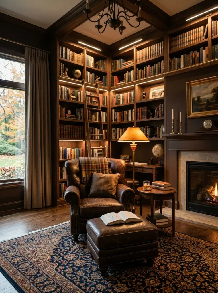
- Creates a rich and sophisticated atmosphere.
- Adds warmth and depth to larger spaces.
- Enhances natural wood and leather furnishings.
- Makes rooms feel cozy and refined.
- Provides a dramatic alternative to dark gray tones.
Espresso brown introduces a sense of richness that instantly elevates a room. The deep tone creates visual depth while maintaining warmth, making it especially effective in libraries, home offices, and cozy living spaces. Unlike some darker colors that can feel cold, espresso brown adds comfort and character through its earthy undertones. Wood furniture appears even more luxurious against the darker backdrop, while layered lighting helps create an inviting atmosphere. The result is a room that feels elegant, grounded, and thoughtfully designed for everyday enjoyment.
One reason espresso brown continues appearing in modern interiors is its ability to create drama without sacrificing warmth. I’ve noticed it works particularly well in rooms with large windows or generous lighting, where the color develops beautiful depth throughout the day. That’s why many designers recommend rich brown tones for homeowners seeking a sophisticated alternative to charcoal or black. The shade delivers timeless appeal while helping create spaces that feel welcoming, personal, and visually memorable for years to come.
Seafoam Gray
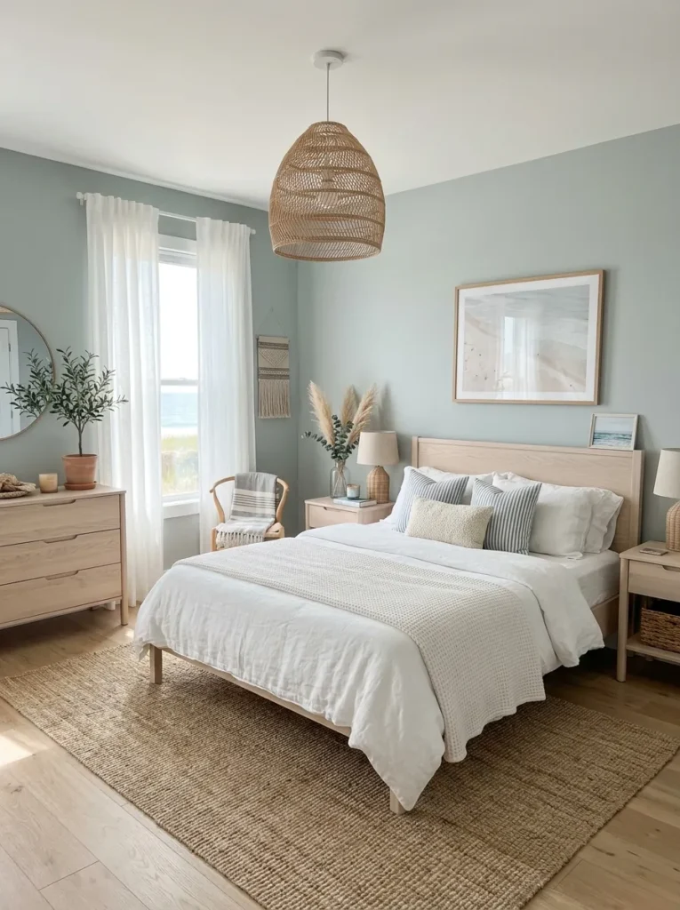
- Combines softness, freshness, and versatility.
- Creates a calm atmosphere without feeling plain.
- Works beautifully with natural textures and whites.
- Helps smaller spaces feel brighter and more open.
- Offers subtle color with long-term appeal.
Seafoam gray blends soft green and gray undertones to create a color that feels fresh, calming, and highly adaptable. The gentle shade works particularly well in bedrooms, guest rooms, and casual living spaces where comfort is a priority. Its muted appearance allows it to function almost like a neutral while still adding visual interest. Natural fibers, light woods, and crisp white accents pair effortlessly with the color, creating a balanced design that feels airy and relaxed. The overall effect is peaceful, inviting, and easy to live with.
In my experience, seafoam gray is especially useful for homeowners who want a hint of color without committing to a stronger palette. The shade adapts beautifully to changing decor and lighting conditions, making it a practical long-term choice. It offers enough personality to avoid feeling generic while maintaining the flexibility people expect from a neutral-inspired color. This balance helps create interiors that feel fresh and current without relying on short-lived trends, making seafoam gray an appealing option for many different home styles.
Rich Aubergine
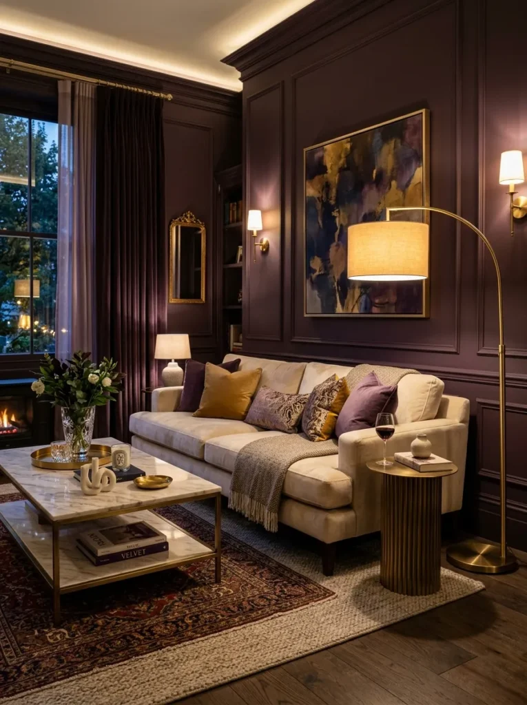
- Creates a bold and luxurious focal point.
- Adds depth and personality to entertaining spaces.
- Pairs beautifully with warm metallic finishes.
- Elevates neutral furnishings instantly.
- Makes interiors feel unique and high-end.
Rich aubergine delivers dramatic elegance for homeowners ready to embrace deeper color. The luxurious blend of purple and brown undertones creates remarkable depth while maintaining a refined appearance. Living rooms, dining rooms, and statement walls benefit especially from this shade because it establishes a strong visual identity. Light-colored furniture and metallic accents stand out beautifully against the darker backdrop, creating striking contrast. The result is a space that feels sophisticated, memorable, and intentionally designed without becoming overly formal or difficult to decorate.
As homeowners look for distinctive alternatives to standard dark neutrals, rich aubergine continues gaining attention within emerging color forecasts. I’ve seen this work well in homes where people wanted a bold transformation without sacrificing elegance. The color creates warmth, visual depth, and a sense of luxury that instantly elevates surrounding furnishings. As interest in expressive interiors grows alongside evolving 2026 Paint Color Trends, rich aubergine offers a confident choice that feels both contemporary and timeless, making rooms stand out in a beautiful and lasting way.
Conclusion
The right paint color does more than change a wall, it changes how a room feels every day. These inspiring 2026 Paint Color Trends show how thoughtful color choices can add warmth, personality, comfort, and style to every corner of your home. Whether you prefer soft neutrals, earthy tones, or bold statement shades, there is an idea here to match your vision.
I’ve seen how small changes like these can completely transform a space without requiring a major renovation. Save this post on Pinterest for future inspiration, try your favorite ideas at home, and share this guide with friends and family who are planning their next room makeover.