25 Dark Green Kitchen Ideas for Bold Home Style
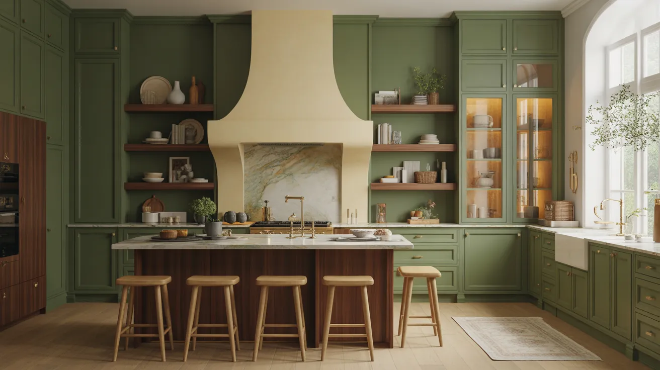
Ready to give your kitchen a bold new personality? A dark green kitchen can turn an ordinary space into a rich, inviting focal point.
From deep forest cabinets and warm wood accents to elegant marble, brass hardware, and clever storage, this collection brings together 25 inspiring ways to use green beautifully. If your kitchen feels flat, dated, too plain, or simply lacks character, these ideas can help you create a space that feels intentional without becoming overwhelming. You’ll discover practical combinations for different layouts, lighting conditions, and decorating styles. In my experience, even one thoughtful change, such as repainting lower cabinets or adding warmer hardware, can make the entire room feel refreshed. Explore the ideas, find your favorite look, and save the ones you want to try.
Deep Green Shaker Cabinets
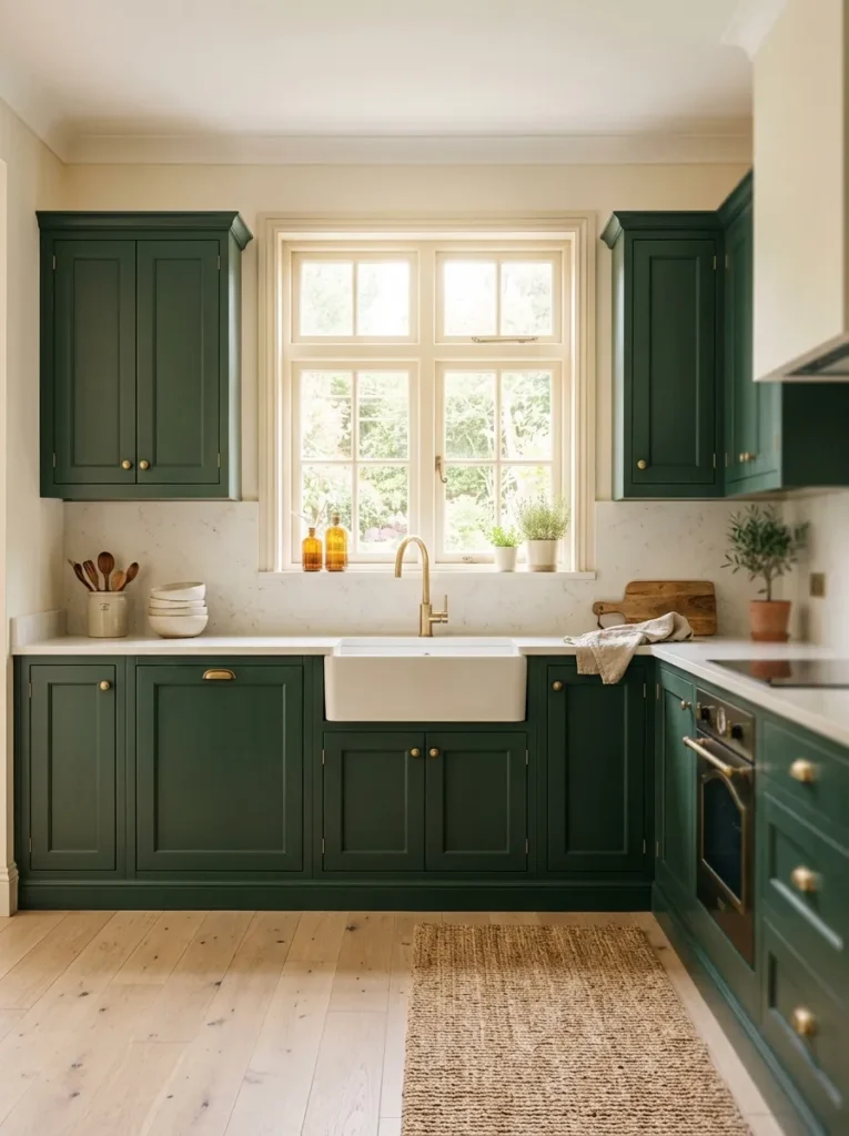
- Shaker doors give the color a timeless, tailored look.
- Warm brass pulls add a subtle contrast without overpowering the cabinets.
- Light countertops keep the darker cabinetry from making the room feel closed in.
- Pale flooring creates visual balance and makes the kitchen feel more spacious.
A deep green cabinet finish can instantly give an ordinary kitchen a stronger sense of character. The beauty of shaker cabinetry is that its simple lines keep the rich color from feeling overly dramatic. In real homes, this combination works especially well when paired with light countertops and warm wood flooring. The contrast creates definition without making the room visually heavy. I’ve noticed that choosing a muted, slightly earthy green rather than an extremely bright shade also makes the cabinets easier to live with long term, especially when natural daylight changes throughout the day.
The best part is how easily this setup adapts to different decorating styles. Add brass handles and cream ceramics for a classic appearance, or introduce black fixtures and simple lighting for a more contemporary finish. If the kitchen has limited natural light, keep the walls and countertop noticeably lighter than the cabinetry. This helps reflect available daylight and prevents the space from looking cramped. A simple backsplash in warm white, ivory, or lightly veined stone can complete the look while keeping attention on the beautiful cabinet color rather than creating too many competing details.
Forest Green Island
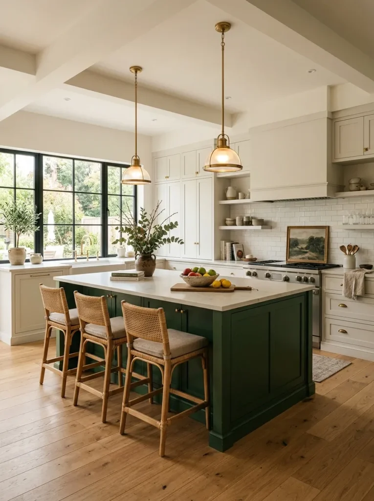
- A green island creates a strong focal point without requiring every cabinet to be dark.
- White perimeter cabinets make the room feel brighter and more open.
- Pendant lights visually anchor the island and add warmth above the workspace.
- Wood stools soften the contrast and introduce a natural texture.
Make the island the star, and the entire kitchen can feel more intentional. A forest-green island works beautifully when surrounding cabinets remain soft white, cream, or light wood. This approach gives you the richness of a bold color without covering every surface in it. The island naturally becomes a visual anchor while still providing useful preparation and gathering space. For busy households, that central location can also make the room feel more connected. I’ve seen this work particularly well in open-plan homes where the island needs to define the kitchen without creating a heavy visual barrier.
Proportion matters when designing this setup. Choose an island size that leaves comfortable walking space around all sides, then use pendant lighting to emphasize its central position. Warm brass, aged bronze, or simple matte fixtures can complement the green beautifully. Counter stools in oak, woven material, or natural wood add softness and keep the composition approachable. For the countertop, consider a pale stone surface with subtle veining rather than a highly patterned option. The simpler background allows the island color to remain the main feature while keeping the overall kitchen polished and easy to maintain.
Green Cabinets With Wood
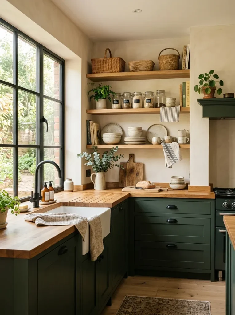
- Natural wood instantly warms a deep green color palette.
- Open shelving provides a lighter visual break between closed cabinets.
- Wood textures make the kitchen feel relaxed rather than overly formal.
- Simple ceramic pieces and greenery add small, low-cost finishing touches.
Pairing rich green cabinetry with natural wood creates a kitchen that feels grounded, warm, and welcoming. The two materials balance each other naturally because the green provides depth while wood introduces softness and visible texture. This combination is especially useful in kitchens that feel too cool or overly polished. Instead of adding lots of decoration, you can let the cabinet finish, timber grain, and simple accessories create the visual interest. In my experience, even a small amount of warm wood can make a darker color feel considerably more inviting, particularly in kitchens with neutral walls and stone surfaces.
You can bring this balance into the room through open shelves, an island base, stools, or a wood countertop. Oak is especially versatile because its pale, natural tone creates a gentle contrast without fighting the green. Keep the rest of the palette restrained with cream walls, neutral stone, and simple hardware. A few wooden boards, woven baskets, or handmade ceramic pieces can reinforce the organic feeling without creating clutter. If your kitchen already has wood flooring, repeat that tone in one or two smaller elements so the materials feel connected rather than randomly placed throughout the room.
Brass Hardware Accents
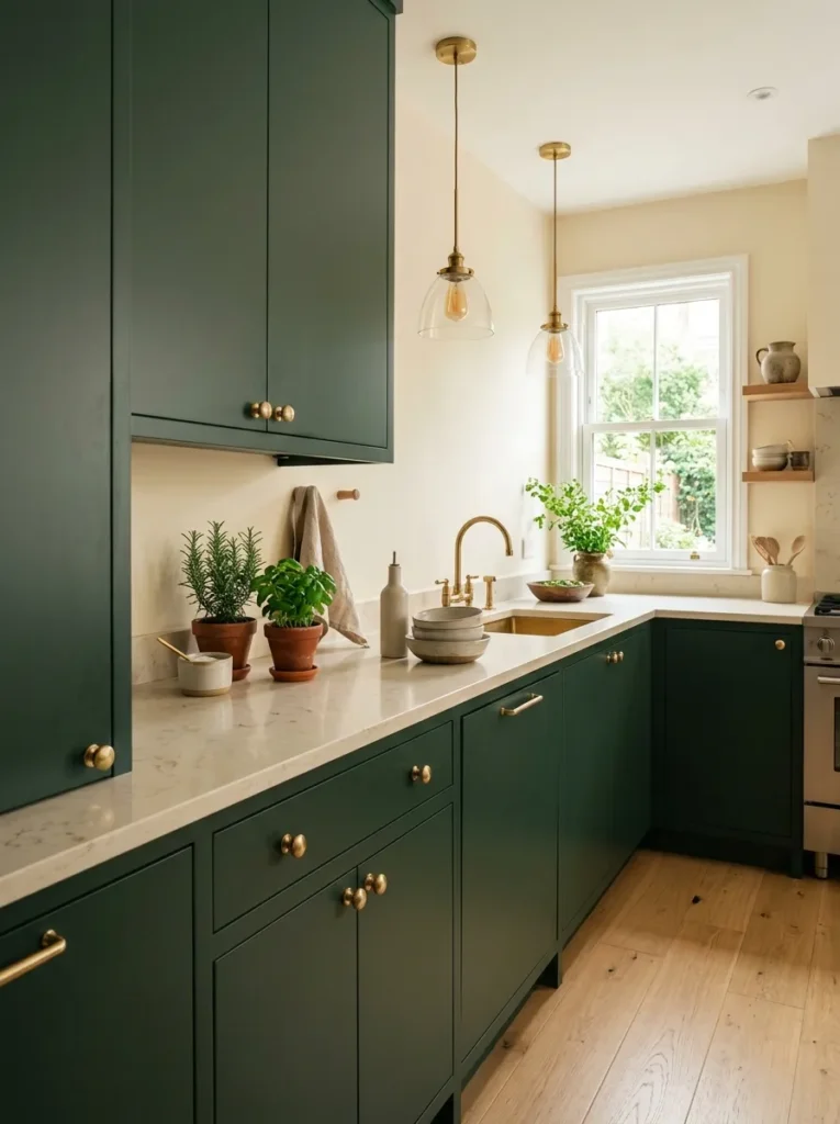
- Brushed brass instantly warms up a deep cabinet color.
- Simple hardware adds polish without requiring expensive remodeling.
- Matching metallic details can visually connect cabinets, lighting, and faucets.
- Choose satin finishes if you want a softer, less reflective appearance.
Small hardware changes can make dark cabinetry look surprisingly sophisticated. Brushed brass handles bring warmth to deep green surfaces while adding just enough contrast to make each cabinet door stand out. This is especially useful when the kitchen already has a strong color but needs a more finished appearance. Instead of replacing cabinets, updating the knobs and pulls can create a noticeable visual improvement with relatively little work. I’ve noticed that longer pulls often look especially polished on wide drawers, while smaller round knobs can keep upper cabinets feeling simple and classic.
For the most cohesive result, repeat the brass finish in one or two other areas rather than covering every fixture in metallic accents. A brass faucet, pendant light, or small decorative frame can create continuity without making the room feel overly coordinated. Satin or brushed finishes are generally easier to blend with different materials than highly polished brass. Pair the hardware with cream stone, warm wood, or soft neutral walls to keep the palette balanced. The result is a kitchen that feels richer and more considered while allowing the green cabinetry to remain the main visual feature.
Dark Green Lower Cabinets
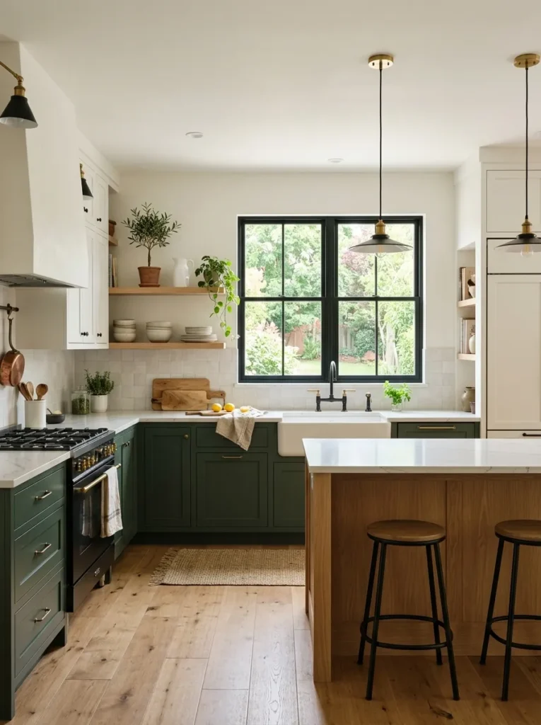
- Lower cabinets create a bold color foundation without darkening the whole room.
- White upper cabinetry keeps the upper half visually light.
- This layout works well when you want contrast without committing to full-height green cabinetry.
- A pale backsplash helps connect both cabinet colors smoothly.
If you love rich cabinetry but worry about making the kitchen feel too dark, start from the floor upward. Deep green lower cabinets create a grounded foundation while white or cream upper cabinets keep the eye moving toward the brighter upper half of the room. This two-tone approach works particularly well in smaller kitchens because the darker color stays concentrated below eye level. The countertop then becomes a visual bridge between the two finishes. A pale surface with subtle movement can connect everything while providing a practical workspace that remains easy to coordinate with everyday accessories.
The lower-cabinet approach also gives you more freedom with decorative details. Natural wood shelves, woven baskets, and light ceramic pieces can soften the contrast without competing with the cabinetry. For a contemporary kitchen, combine the green base with slim hardware, simple lighting, and clean-lined counters. For a more traditional room, consider framed doors and warm brass handles. I’ve seen designers use this technique when homeowners want a dramatic update but still want the room to feel bright. Keeping the upper cabinets and backsplash light is one of the easiest ways to achieve that balance.
Moody Green Pantry Wall
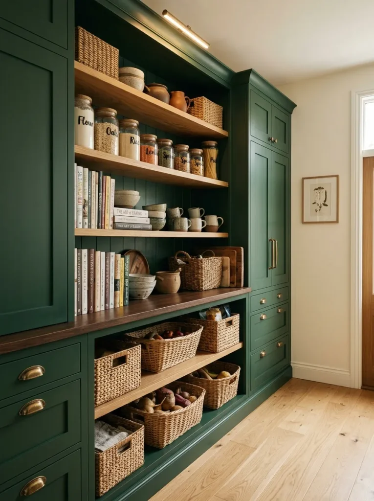
- A pantry wall turns practical storage into a strong design feature.
- Floor-to-ceiling cabinets make use of otherwise overlooked vertical space.
- Matching cabinet fronts create a calm, uncluttered appearance.
- Interior lighting can make deep cabinetry easier to use at night.
Turn an ordinary storage wall into one of the most memorable features in the kitchen. A moody green pantry wall gives tall cabinetry a sense of purpose while hiding everyday clutter behind consistent doors. This works especially well when counters are already busy because appliances, dry goods, and less attractive kitchen essentials can disappear from view. The vertical arrangement also draws attention upward, making the room feel more substantial. Using the same rich finish across several cabinet heights creates a continuous backdrop rather than a collection of disconnected storage pieces.
Function should guide the layout before decoration. Place frequently used items at comfortable heights, reserve higher shelves for occasional storage, and consider drawers for heavier pantry goods. If the wall receives little daylight, add warm interior cabinet lighting or discreet ceiling fixtures to make the darker finish practical after sunset. Pale flooring and light countertops can prevent the storage wall from becoming visually overwhelming. In my experience, a pantry becomes much easier to keep organized when every item has a designated location, so attractive doors should be paired with thoughtful internal storage rather than used only for appearance.
Green Marble Backsplash
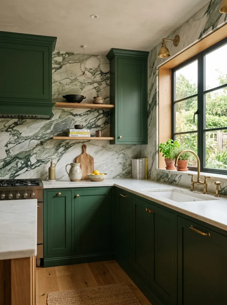
- A marble backsplash adds movement to otherwise solid-colored cabinetry.
- Matching green tones create a layered, intentional appearance.
- Extending the stone upward can make the kitchen feel taller and more finished.
- Keep accessories simple so the natural veining remains the visual highlight.
Bring extra depth to rich cabinetry by introducing natural stone with subtle green movement. A marble backsplash can echo the cabinet color while adding delicate veining that prevents the walls from looking flat. This approach works particularly well when the cabinetry has a matte or satin finish because the polished stone creates a controlled contrast in texture. Rather than introducing another strong color, the backsplash keeps the palette connected. In my experience, choosing stone with restrained veining makes a dramatic kitchen easier to style because everyday appliances and accessories can remain neutral.
For a cohesive installation, consider carrying the backsplash from the counter toward the underside of upper cabinets or even extending it higher where the layout allows. This can visually lengthen the wall and create a more custom appearance. If the stone has prominent veining, simplify nearby details with understated hardware, warm wood accents, and minimal countertop decoration. A pale marble with soft green or gray movement can also brighten a darker room by reflecting available light. The finished space feels layered and sophisticated without relying on excessive decoration or multiple competing materials.
Open Shelving Contrast
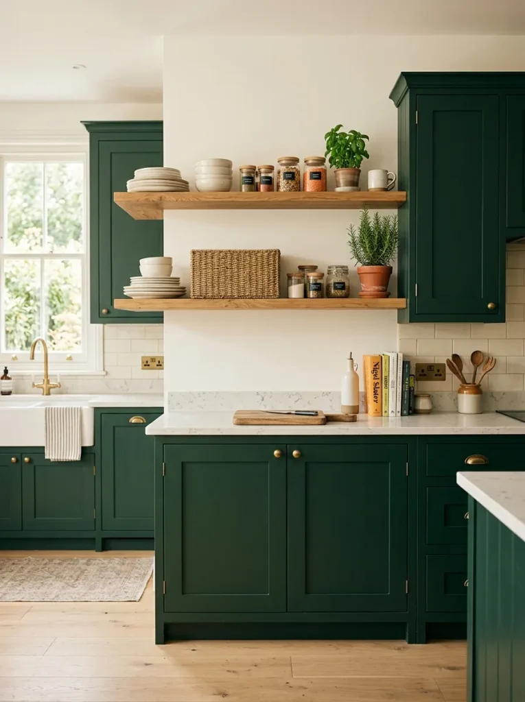
- Open shelves break up long stretches of closed cabinetry.
- Natural wood introduces warmth against the saturated green finish.
- Everyday dishes can become useful decorative elements.
- Keep shelf styling restrained to preserve a clean, spacious appearance.
Open shelving can make a bold cabinet color feel lighter without removing its visual impact. Natural wood shelves create a warm horizontal break across the darker cabinetry, giving the eye a place to rest. They are also practical because frequently used plates, glasses, jars, and cooking essentials can stay within easy reach. The key is to avoid filling every inch. A few carefully chosen pieces usually look more intentional than a crowded display. I’ve noticed that repeating similar neutral colors on the shelves helps the arrangement feel organized even when the kitchen contains many everyday items.
Choose shelf material that complements existing wood tones rather than introducing an unrelated finish. Pale oak, walnut, or reclaimed timber can each work, depending on the overall palette. Keep the wall behind the shelves relatively quiet with cream, white, or soft stone tones so the contrast remains clear. For styling, combine useful objects with small touches such as herbs, a wooden board, or handmade pottery. If dust or maintenance is a concern, use open shelves selectively and reserve less frequently cleaned areas for decorative pieces rather than daily-use items.
Green Cabinets With Black
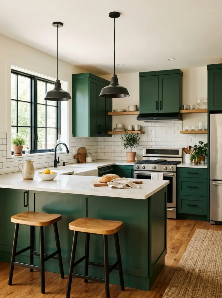
- Matte black details give deep green cabinetry a sharper contemporary edge.
- Repeating black through lighting and window frames creates visual consistency.
- Pale counters keep the darker palette from becoming too heavy.
- Warm wood accents soften the stronger contrast between green and black.
For a more contemporary direction, combine rich green cabinetry with carefully placed black accents. Matte black hardware, window frames, lighting, or faucets can give the room stronger definition while keeping the cabinet color sophisticated. The trick is repetition rather than quantity. A few black elements distributed around the room can create a cohesive visual rhythm without making the space feel severe. This combination works especially well with clean cabinet profiles and simple countertops. When the architecture already has strong lines, black details can emphasize those features and make the entire kitchen appear more structured.
Balance is essential when using two darker tones together. Keep at least one major surface light, such as the countertop, backsplash, ceiling, or walls, to prevent the room from becoming visually dense. Warm oak flooring or wooden stools can add another layer of softness and make the palette feel more welcoming. I’ve seen this combination work beautifully in modern kitchens where homeowners want drama without excessive decoration. Use lighting thoughtfully too, because black and green can look very different under cool versus warm bulbs, especially after natural daylight fades.
Green Tile Backsplash
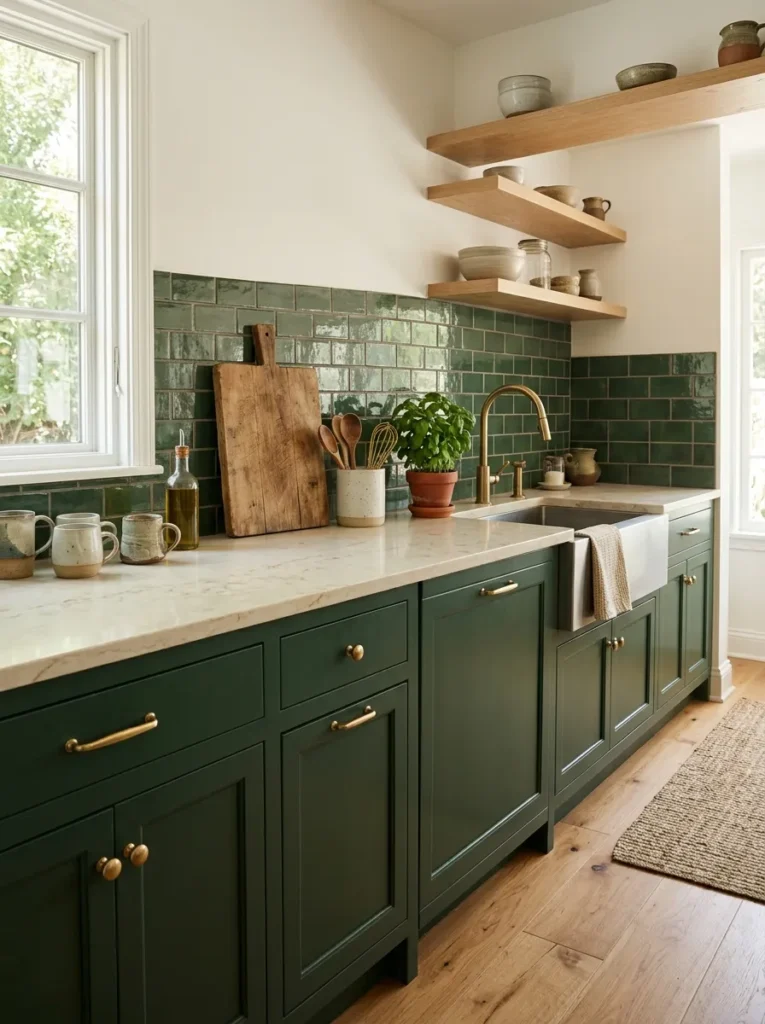
- Glossy tiles reflect light and keep darker walls from feeling flat.
- A simple subway pattern adds texture without overwhelming the cabinetry.
- Warm grout can soften the contrast between green tiles and surrounding materials.
- Small-format tiles work well when you want more visible surface texture.
A green tile backsplash is an easy way to introduce another layer of color without changing the entire kitchen. When the tiles sit close to the cabinet shade, they create a coordinated backdrop while their grout lines and surface texture add dimension. Glossy finishes can be especially useful in kitchens with limited daylight because they reflect small amounts of available light across the wall. A simple subway shape keeps the pattern approachable, while handmade or slightly irregular tiles can create a softer appearance. The result feels intentional without requiring a complicated decorative treatment.
The grout choice can change the final effect more than expected. A matching grout creates a seamless appearance, while warm white or pale gray grout emphasizes the individual tiles and makes the pattern more noticeable. Consider the countertop when choosing the finish. Light quartz or natural stone can provide enough contrast to keep the backsplash visible without competing with it. In my experience, keeping the remaining surfaces relatively quiet helps a textured backsplash look expensive rather than busy. Add only a few countertop accessories so the tile remains easy to see and clean between everyday cooking tasks.
Warm Wood Island
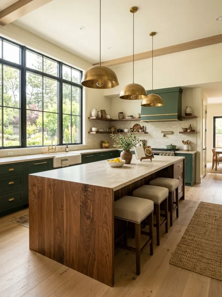
- A wood island adds warmth to a predominantly green kitchen.
- Visible grain creates natural texture and visual interest.
- A lighter surrounding palette prevents the room from feeling overly dark.
- Matching wood tones can connect the island with flooring or open shelving.
A warm wood island can completely change the character of a green kitchen. Instead of adding another painted surface, natural timber introduces visible grain, warmth, and a more relaxed feeling at the center of the room. Walnut creates a richer contrast, while oak keeps the composition lighter and airier. This approach works especially well when the surrounding cabinetry is saturated because the island gives the eye a natural material to focus on. It also makes a practical gathering area feel more welcoming, especially when the kitchen doubles as a breakfast spot, homework station, or casual entertaining space.
Choose the island wood according to the existing finishes rather than treating it as an isolated feature. If the room already has oak flooring, a related wood tone can make the design feel connected. For darker flooring, a lighter island may provide useful contrast. Keep countertops simple if the wood grain is prominent, and use warm pendant lighting to emphasize its texture after sunset. I’ve noticed that natural wood also makes bold cabinet colors easier to live with because it removes some of the formality and gives the kitchen a comfortable, everyday quality.
Sage And Deep Green
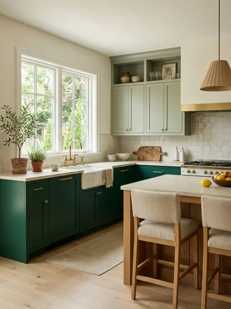
- Layered green shades create depth without introducing unrelated colors.
- Sage cabinetry keeps the upper portion of the room visually soft.
- Deep lower cabinets provide grounding and definition.
- Warm neutrals help different green tones transition smoothly.
Using two related shades of green can create a layered kitchen that feels much more sophisticated than a single-color scheme. A deep tone on lower cabinets provides grounding, while softer sage cabinetry above keeps the upper part of the room bright and relaxed. The relationship between the colors is what makes this combination work. Rather than competing, the shades create subtle depth while staying within the same natural palette. This is particularly helpful when you want a colorful kitchen but prefer a restrained look that will not feel overwhelming after the initial excitement wears off.
To keep multiple greens from looking mismatched, choose shades that share a similar undertone. Warm greens pair naturally with cream, oak, brass, and beige, while cooler greens can work with white stone and brushed nickel. Keep countertops and backsplash materials relatively neutral so the cabinetry remains the focus. In my experience, testing paint samples in morning, afternoon, and evening light is worth the effort because green can shift noticeably throughout the day. Once the shades feel harmonious under different lighting conditions, the room becomes much easier to accessorize and maintain visually.
Green Pantry Cabinets
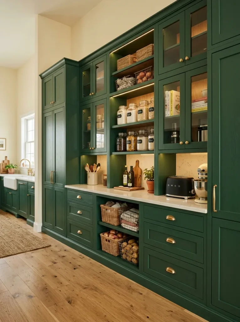
- Tall pantry cabinets turn unused wall space into valuable storage.
- Matching doors create a clean, uninterrupted visual backdrop.
- Built-in shelves keep appliances and pantry items organized.
- Brass hardware adds warmth to the tall cabinet arrangement.
A wall of tall green pantry cabinets can make storage feel like part of the architecture rather than an afterthought. Floor-to-ceiling doors use vertical space efficiently while keeping food, appliances, and household supplies hidden from view. This is especially useful in kitchens where limited counter space quickly becomes cluttered. The continuous cabinet fronts also create a strong visual block, giving the room a more finished appearance. I’ve noticed that tall storage looks particularly elegant when the cabinet color is rich and matte because the uninterrupted finish feels more like custom furniture than standard kitchen cabinetry.
Plan the interior carefully so attractive doors are supported by practical organization. Adjustable shelves work well for changing pantry items, while drawers are useful for heavier cookware and small appliances. If possible, include dedicated spaces for frequently used equipment so counters remain clear throughout the day. Pair the cabinets with lighter flooring and countertops to maintain visual balance. Warm interior lighting can also make deep storage easier to use after sunset. A few glass-front sections may be added if you want to display beautiful dishes, but keeping most storage concealed usually creates the calmest and most organized appearance.
Emerald Cabinetry
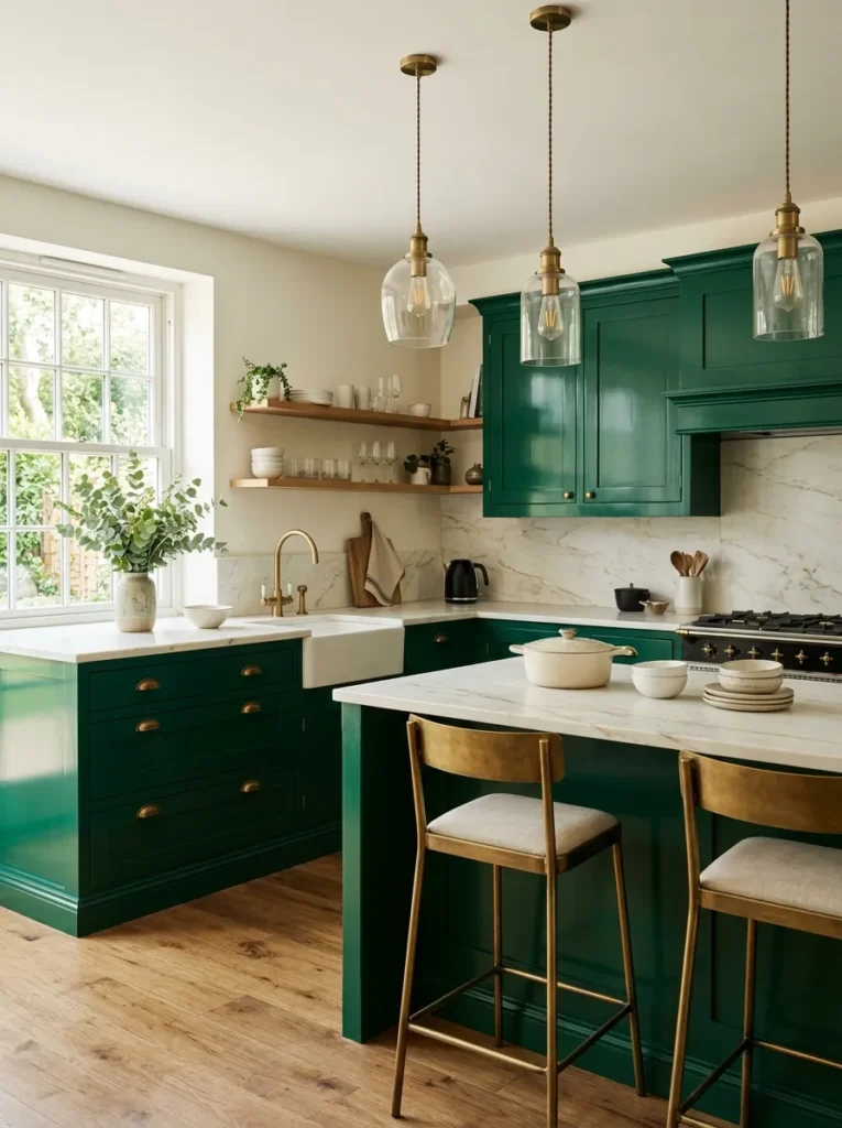
- Emerald tones create a stronger statement than muted green finishes.
- Light stone surfaces provide crisp contrast against saturated cabinetry.
- Brass details add warmth and keep the palette from feeling cold.
- Simple styling lets the cabinet color remain the main feature.
When you want the cabinetry to become the unmistakable focal point, a saturated emerald finish delivers plenty of visual presence. Unlike softer olive or sage shades, emerald has greater intensity and can make simple cabinet shapes feel instantly more distinctive. The key is giving that color enough breathing room. Pairing it with warm white walls, pale stone, and restrained accessories allows the cabinetry to stand confidently without making the room look chaotic. This approach suits homeowners who enjoy strong color but still want the kitchen to feel polished, practical, and sophisticated.
Because emerald can appear dramatically different under various lighting conditions, sample the finish before committing to the entire room. Natural daylight may reveal cooler blue undertones, while warm evening bulbs can make the same color appear deeper and richer. Choose hardware that complements rather than competes with it; aged brass and brushed brass are especially effective choices. Keep countertop patterns relatively subtle and repeat one or two neutral materials throughout the room. The finished space can feel luxurious without becoming formal, particularly when natural wood, handmade ceramics, or simple woven accessories soften the stronger cabinet color.
Green Glass Cabinets
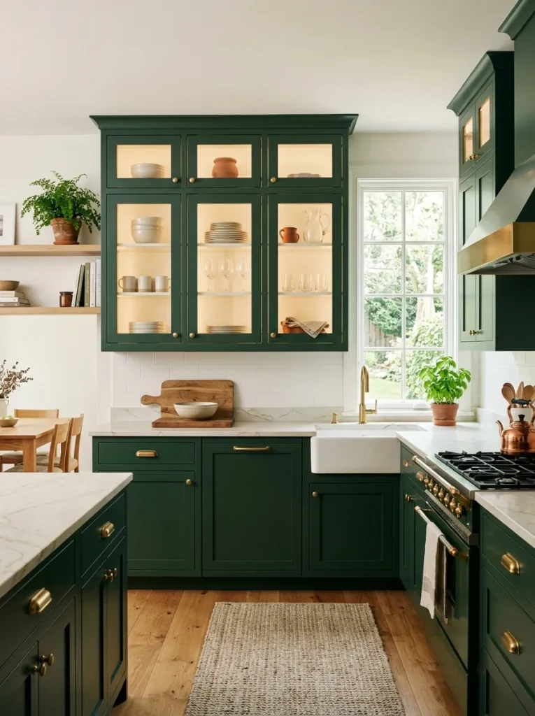
- Glass doors break up solid cabinetry and add visual depth.
- Displaying neutral dishes keeps the darker color from feeling too heavy.
- Interior lighting makes glass-front sections useful after dark.
- Use these cabinets selectively rather than covering every upper unit.
Glass-front cabinets can soften a strong cabinet color by creating moments of transparency across the wall. Instead of seeing one uninterrupted stretch of solid doors, the eye catches glimpses of ceramics, glassware, and carefully arranged kitchen pieces. This makes the cabinetry feel lighter while giving you an opportunity to display items that are both beautiful and useful. The idea works best when used selectively. Two or three glass-front doors can provide enough variation without turning the entire kitchen into an open display area that requires constant tidying.
What you place behind the glass matters just as much as the cabinet finish. Neutral plates, clear glasses, wooden boards, and simple pottery create a calm backdrop that lets the green remain prominent. Avoid filling shelves tightly because negative space helps the display look intentional. If the cabinets have internal lighting, choose a warm color temperature that complements brass hardware and natural wood. I’ve seen this detail work particularly well in evening kitchens because the illuminated glass sections become subtle decorative features while still helping homeowners quickly locate frequently used dishes and serving pieces.
Green And Cream
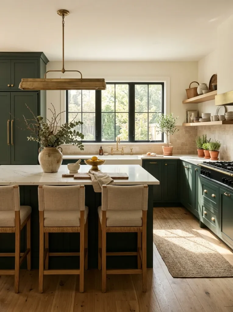
- Cream surfaces soften the intensity of deeper green cabinetry.
- Warm neutrals create a welcoming contrast without competing for attention.
- Light walls help bounce natural daylight around the room.
- Brass and wood details add warmth without making the palette busy.
Cream is one of the easiest colors to pair with rich green because it creates contrast without feeling harsh. Unlike bright white, a warm ivory or creamy shade can make the cabinetry feel softer and more inviting. This combination works beautifully in kitchens where you want bold color but still want the room to feel comfortable and timeless. Cream walls, stone counters, or a backsplash can each provide that lighter backdrop. The result is especially attractive in rooms with natural wood because all three elements share warm undertones and create a relaxed, cohesive foundation.
Pay attention to undertones when choosing your neutrals. A cream with yellow or beige undertones usually works best with warm greens, while a cooler white can make the same cabinets appear more blue. Test samples beside the actual cabinetry and flooring before making a final decision. Keep decorative pieces simple, using linen, ceramic, timber, and woven textures to reinforce the relaxed palette. In my experience, this pairing is forgiving when you update accessories later because cream and deep green work with many natural materials. That flexibility makes the scheme practical as well as visually appealing.
Green Cottage Style
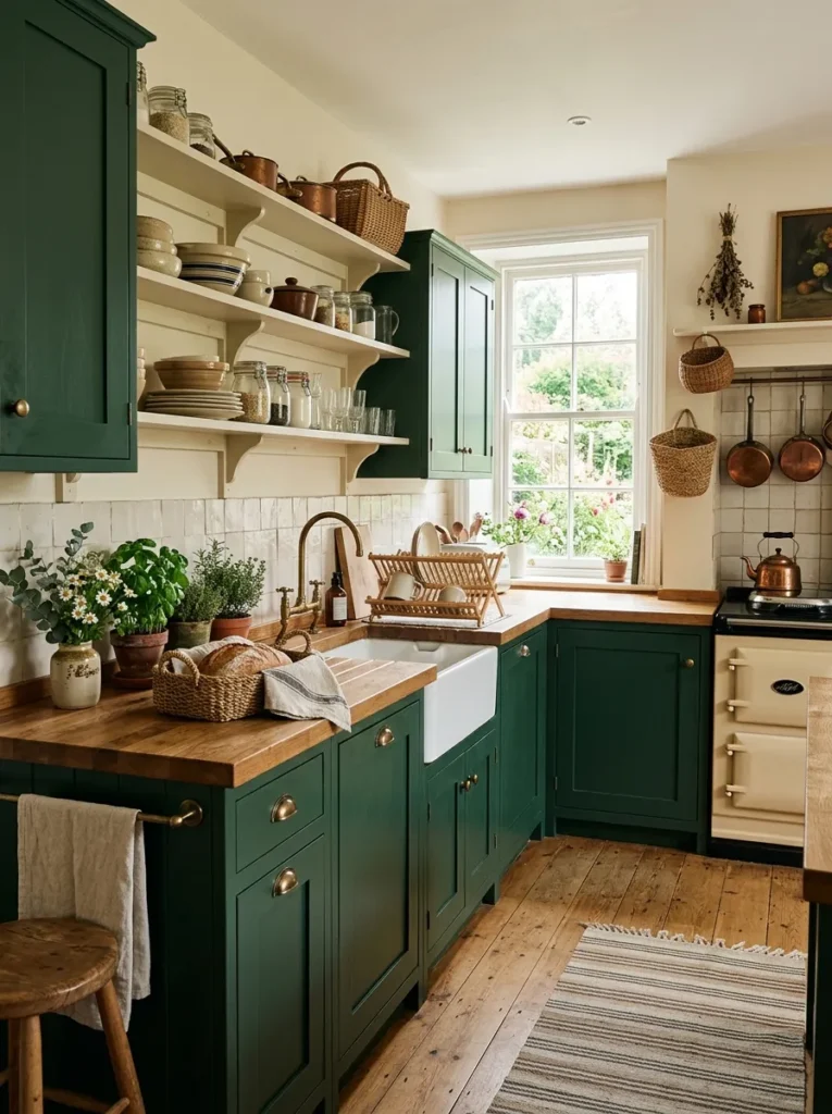
- Shaker doors make the rich color feel traditional and approachable.
- Butcher-block counters introduce warmth and natural texture.
- Handmade-looking tiles add subtle character without overwhelming the room.
- Open shelves can make a small cottage kitchen feel less enclosed.
A cottage-inspired kitchen becomes especially charming when traditional cabinet details meet a rich green finish. Shaker doors, cup pulls, natural wood, and handmade-looking tiles create a relaxed composition that feels collected rather than overly coordinated. The darker cabinetry adds depth, while cream walls and timber surfaces prevent the room from becoming visually heavy. This approach works particularly well in older homes where architectural character already exists. Instead of trying to make every surface perfectly modern, you can allow natural imperfections, visible grain, and simple decorative pieces to become part of the overall design.
For an authentic cottage feeling, prioritize materials that look comfortable and tactile. Butcher-block counters can add warmth, while ceramic tiles with slight variation create more character than perfectly uniform surfaces. Keep hardware practical and easy to grip, especially on frequently used drawers. A few open shelves can hold everyday dishes, herbs, or wooden boards without making the room feel staged. I’ve noticed that cottage kitchens look most convincing when they avoid too many decorative trends at once. Let the cabinet color, natural materials, and useful objects provide most of the personality.
Green With Marble
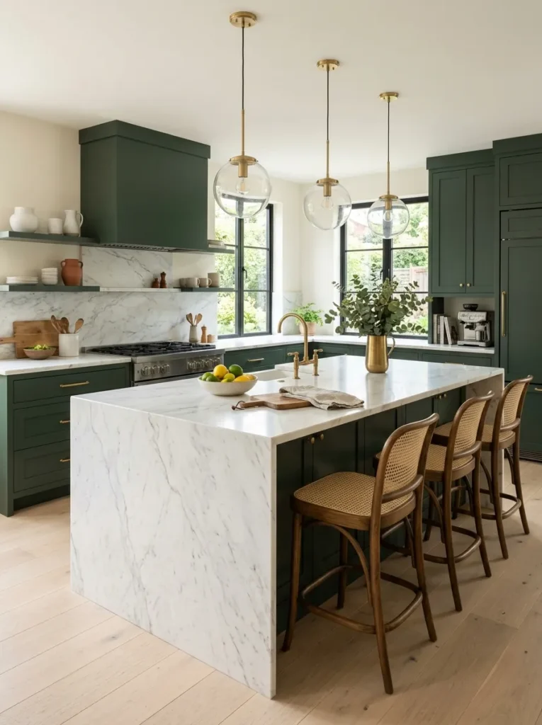
- White marble provides a bright counterpoint to saturated cabinetry.
- Fine veining adds movement while maintaining a refined appearance.
- Matte cabinet surfaces contrast beautifully with polished stone.
- Keep surrounding finishes simple so the marble remains visible.
Few combinations create as much contrast as deep green cabinetry with pale marble. The darker finish gives the stone a stronger presence, while white or cream marble reflects light and prevents the kitchen from feeling too dense. This pairing can work in both traditional and contemporary spaces because the final character depends on the cabinet profile, hardware, and lighting. Subtle gray veining keeps the countertop sophisticated without introducing another dominant color. When the marble has more dramatic movement, the cabinetry provides a calm background that allows the natural stone to become the centerpiece.
Before selecting the slab, view the actual stone alongside cabinet and flooring samples. Marble can vary considerably in veining, undertone, and overall movement, so a small showroom sample may not represent the finished surface. If the stone is highly expressive, choose simple hardware and understated backsplash details to maintain balance. For a practical kitchen, also consider how much maintenance the chosen stone requires and whether its surface suits your cooking habits. A pale quartz with marble-like veining can provide a similar visual effect when homeowners prefer a lower-maintenance countertop material.
Two-Tone Green Cabinets
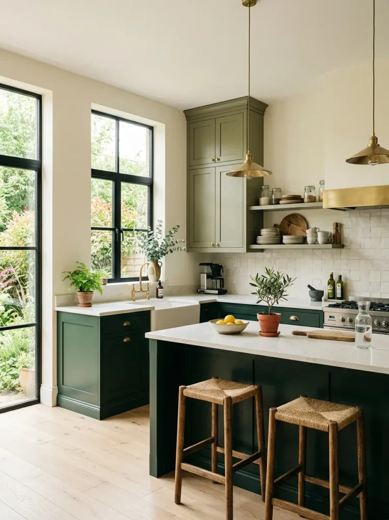
- Two green shades create depth without introducing a completely different color.
- Darker lowers visually ground the room and frame the workspace.
- Softer upper cabinets keep the eye level brighter and lighter.
- Repeating brass and wood details helps connect both cabinet finishes.
Using two related green shades can give cabinetry much more dimension than a single finish. A darker tone on the lower cabinets anchors the kitchen, while a softer olive or moss shade above creates a lighter transition toward the ceiling. This approach is especially useful when you love bold color but want to avoid making every surface equally intense. The subtle difference catches the eye without creating visual clutter. In a dark green kitchen, this technique can also help divide a large wall of cabinetry into more manageable, visually interesting sections.
The two shades should share a compatible undertone so they appear intentionally connected. Warm greens generally pair well with cream, natural oak, brass, and beige stone, while cooler greens can work with crisp white and gray accents. Keep countertops relatively quiet to prevent the cabinetry from competing with another strong pattern. You can reinforce the connection through matching handles, lighting, and wooden accessories. If you are unsure about committing to two permanent colors, test large samples beside your flooring and countertop first. View them throughout the day before deciding which shade should occupy the larger area.
Green Breakfast Nook
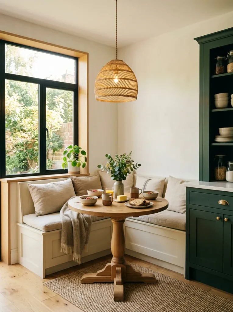
- A breakfast nook adds useful seating without requiring a large dining area.
- Natural wood furniture softens the surrounding darker cabinetry.
- Built-in benches can maximize seating in compact spaces.
- Light upholstery keeps the corner visually connected to the kitchen.
A small breakfast nook can make a bold kitchen feel more personal and useful. Placing a round wooden table beside rich green cabinetry creates a natural transition between the cooking area and casual dining space. The curved table shape is especially helpful in compact rooms because it improves circulation and removes sharp corners from busy walkways. A built-in bench can provide additional seating while using less floor space than separate chairs. This setup works beautifully for morning coffee, quick meals, homework, or casual conversations without requiring a formal dining room.
Keep the nook lighter than the surrounding cabinetry so it feels like a comfortable extension rather than another heavy element. Natural oak, cream upholstery, woven lighting, and pale walls can create that visual separation. Choose washable cushions or durable fabrics if the space will be used frequently, particularly by families. A small pendant positioned directly above the table can define the nook after sunset and create a warm focal point. I’ve noticed that adding one or two plants near a breakfast area also helps soften the stronger cabinet color while bringing a simple organic detail into the room.
Green Farmhouse Kitchen
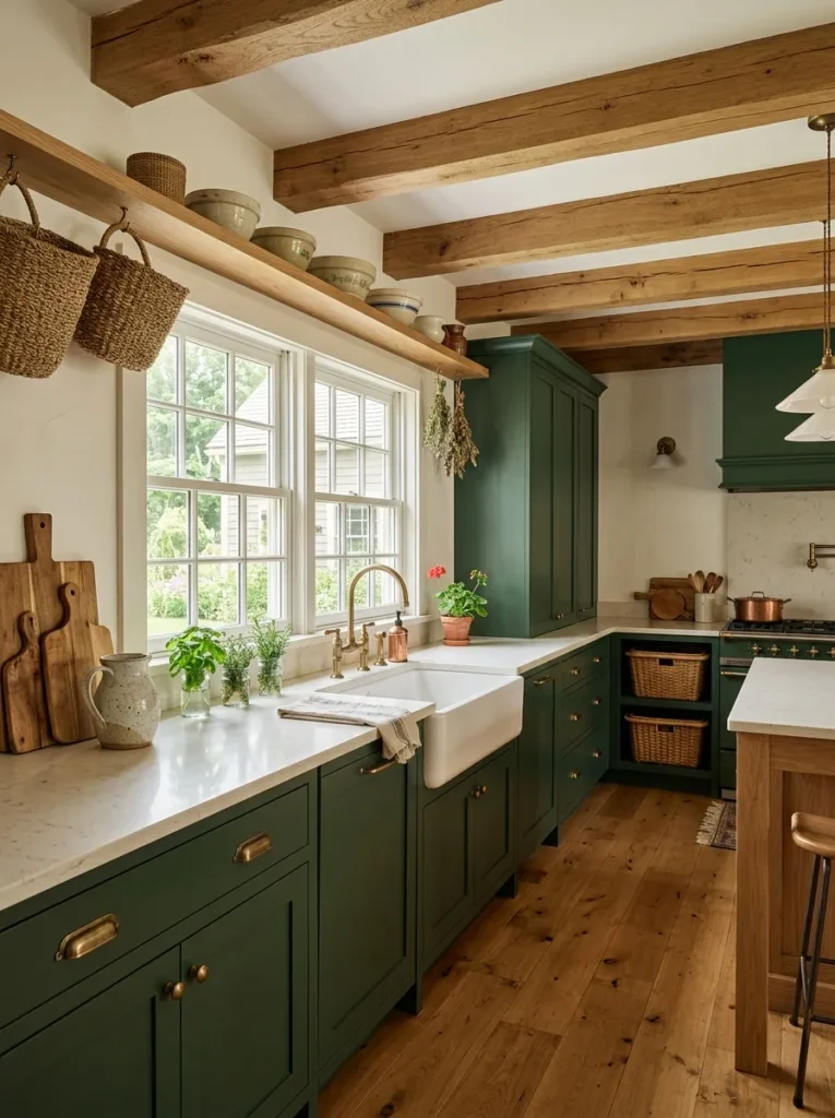
- Shaker cabinetry gives the color a timeless farmhouse character.
- An apron-front sink reinforces the traditional kitchen layout.
- Exposed wood and woven textures soften the darker cabinet finish.
- Cream surfaces keep the room bright and practical.
A farmhouse kitchen becomes more distinctive when traditional materials meet a deep, earthy cabinet color. Shaker doors, an apron-front sink, natural timber, and aged hardware already create a familiar foundation, while rich green cabinetry adds personality without abandoning the classic character. The color works particularly well against cream walls and light countertops because the contrast feels warm rather than stark. This style is also forgiving when everyday objects remain visible. Wooden boards, ceramic pitchers, woven baskets, and cooking tools can contribute to the design instead of making the room look perfectly staged.
For a convincing farmhouse arrangement, prioritize function and durable materials over excessive decoration. Choose hardware that feels comfortable in the hand, counters that can handle regular preparation, and flooring suited to frequent traffic. Natural wood beams or shelves can add architectural warmth if the room already has them, but they are not essential. Keep decorative accessories practical wherever possible, such as a ceramic utensil crock or basket for produce. That balance makes the space feel genuinely lived in. The finished kitchen should look welcoming and useful first, with its decorative character developing naturally from everyday materials.
Green Ceiling Cabinets
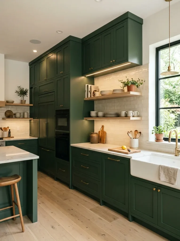
- Ceiling-height cabinetry makes better use of vertical storage.
- Continuous upper cabinets reduce awkward gaps above standard cupboards.
- Light countertops keep the taller green units from feeling overwhelming.
- Integrated lighting improves visibility across higher storage areas.
Taking green cabinetry all the way to the ceiling can make a kitchen feel taller and more custom. Instead of leaving an awkward strip of unused wall above standard cabinets, the continuous doors create one clean vertical plane. This approach is particularly effective in kitchens with high ceilings because the cabinetry visually connects the countertop to the upper architecture. The rich color adds depth, while pale counters and backsplash materials prevent the tall units from becoming too dominant. It also provides valuable storage for serving pieces, seasonal cookware, and appliances that are not needed every day.
Think about accessibility before filling every upper cabinet with everyday essentials. Reserve the highest compartments for occasional items and keep frequently used pieces within comfortable reach. Integrated lighting under or inside the cabinets can improve visibility and make the darker finish easier to use after sunset. If the room is small, choose a lighter countertop and backsplash to create contrast against the tall units. I’ve noticed that matching the cabinet color across different heights often makes a kitchen appear more intentional because the eye reads the entire wall as one architectural element rather than separate storage sections.
Green Peninsula Layout
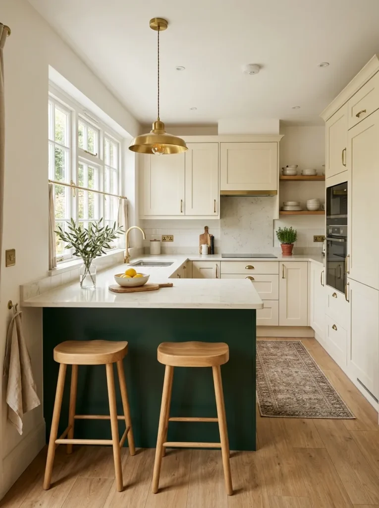
- A peninsula adds counter space without requiring a freestanding island.
- Deep green cabinetry can visually define the kitchen boundary.
- Open space beneath or beside the peninsula improves circulation.
- Wooden stools soften the darker finish and create casual seating.
A green peninsula can bring the visual impact of a kitchen island to rooms where a freestanding island simply will not fit. Attached to one wall or cabinet run, the peninsula provides additional preparation space, storage, and seating while preserving a more practical circulation path. The darker cabinet color gives the structure a clear visual identity and can help define the kitchen within an open-plan living area. This is especially useful when you want a stronger boundary between cooking and living zones without installing a full wall or making the room feel divided.
Measure the walking space carefully before finalizing the peninsula depth and seating arrangement. You need enough room for cabinet doors to open comfortably and for people to move through the kitchen without squeezing around stools. A pale countertop can visually lighten the structure, while natural wood seating adds warmth. If the peninsula faces a dining or living area, keep its styling relatively simple so it does not become a cluttered display. In my experience, this layout works best when the peninsula serves several purposes at once, such as food preparation, storage, casual dining, and a convenient gathering spot.
Minimal Green Kitchen
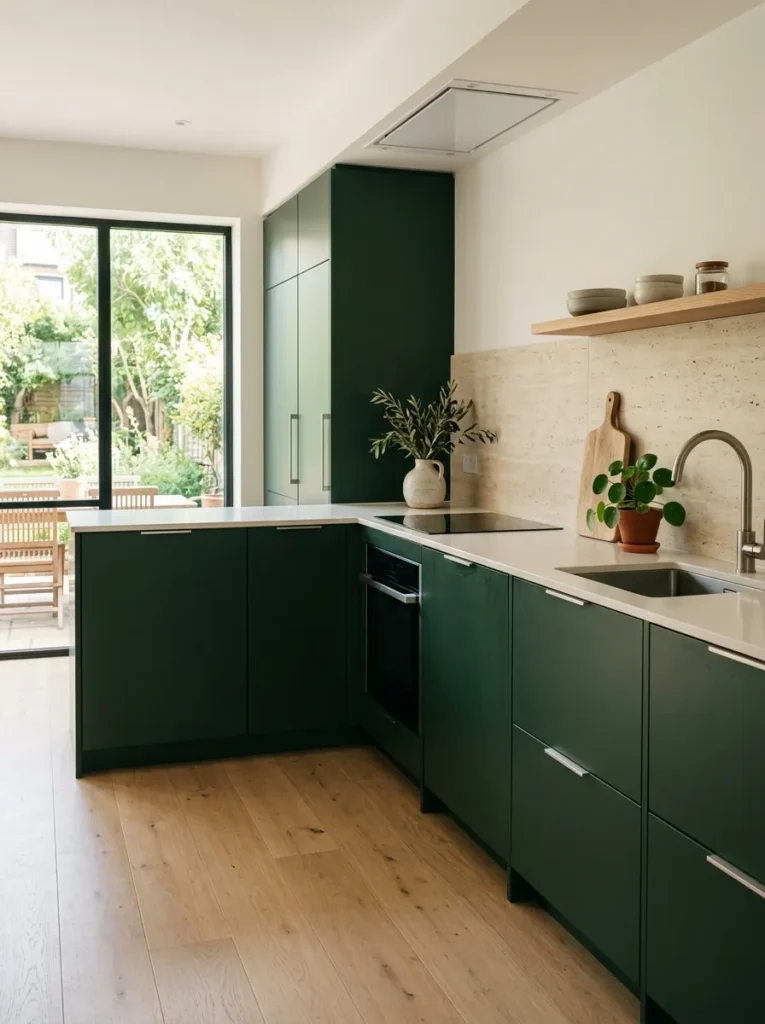
- Minimal detailing lets the cabinet color provide most of the visual interest.
- Concealed storage keeps counters clean and uncluttered.
- Pale surfaces create contrast and reflect natural light.
- A few natural accessories prevent the room from feeling sterile.
A minimalist approach can make rich green cabinetry feel surprisingly calm. Instead of adding multiple decorative features, let the cabinet color, clean lines, and carefully selected materials establish the character of the room. Flat or lightly detailed doors work particularly well because their uninterrupted surfaces emphasize the depth of the finish. Keep countertops mostly clear and choose appliances with integrated or streamlined appearances where possible. This creates a quiet backdrop that feels intentional rather than empty. The result is a kitchen that looks sophisticated while remaining easy to navigate and practical for everyday cooking.
Minimalism does not mean removing everything you use. It means giving frequently used objects a sensible place so surfaces stay visually controlled. Choose one or two materials to repeat, such as pale oak and warm stone, then introduce small accessories in matching neutral tones. A single plant, ceramic vessel, or wooden board can provide enough texture without creating clutter. I’ve noticed that this style is especially effective when lighting is planned carefully because clean surfaces reveal shadows and reflections more clearly. Warm under-cabinet lighting can add depth at night while maintaining the restrained appearance.
Green Window Wall
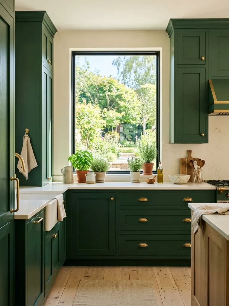
- Framing a window with rich cabinetry makes natural light the centerpiece.
- Pale countertops help reflect daylight throughout the room.
- A window above the work area adds both function and visual openness.
- Small herbs and natural materials reinforce the fresh connection with outdoors.
A large window can completely change how rich cabinetry looks throughout the day. Surrounding that window with deep green cabinets creates a strong architectural frame while allowing natural light to become part of the design. The contrast makes the window feel larger and gives the cabinetry a purposeful arrangement rather than simply filling available wall space. This setup works especially well above a sink or main preparation area, where daylight can make everyday tasks more pleasant. In a dark green kitchen, generous natural light also helps reveal subtle variations in the cabinet finish.
Keep the surfaces around the window relatively simple so the view remains part of the composition. Pale quartz, cream walls, and light oak flooring can reflect daylight and prevent the darker cabinetry from overwhelming the room. If privacy is necessary, choose lightweight window treatments that still allow natural light through. Small potted herbs on the sill can add useful greenery without taking up valuable counter space. In my experience, kitchens with strong connections to outdoor light often feel more inviting because the room changes naturally from morning to evening, giving the cabinet color a different character throughout the day.
Conclusion
A dark green kitchen can bring depth, personality, and warmth to your home while still feeling timeless and practical. Whether you choose bold cabinetry, natural wood, marble, brass accents, or a simple two-tone design, even a small update can create a noticeable transformation. Start with the idea that best fits your space, budget, and everyday needs rather than trying to change everything at once. I’ve seen how thoughtful details can completely reshape the feeling of a room. Save this article to Pinterest for your next kitchen project, try an idea that inspires you, and share it with someone planning their own beautiful kitchen makeover.